Creating Single-Cell Graphs
The SGPLOT procedure creates single-cell
graphs with a wide range of plot types including density, dot, needle,
series, bar, histograms, box, and others. The procedure can compute
and display loess fits, polynomial fits, penalized B-spline fits,
and ellipses. You can also add text, legends, and reference lines.
Options are available for specifying colors, marker symbols, and other
attributes of plot features. You can customize the axes by using axis
statements such as XAXIS and YAXIS.
Plot statements can
be combined to create more informative plots and charts. The following
example shows two series plots that are overlaid in a single graph.
Each plot is assigned to a different vertical axis. Data labels have
been added for easy reference.

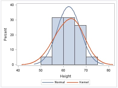
The following example
creates a graph with a histogram, a normal density curve, and a kernel
density curve.
For more information
about the SGPLOT procedure and the procedure syntax, see SGPLOT Procedure.