Types of Statistical Graphs
Box Plots
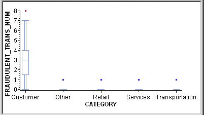
A box
plot displays summary statistics for the distribution of values for
a variable. The outer bounds of the box represent the first and third
quartiles. The line inside the box represents the median. The markers
outside the box, referred to as outliers, represent data points that
are outside of the 25th and 75th percentiles.
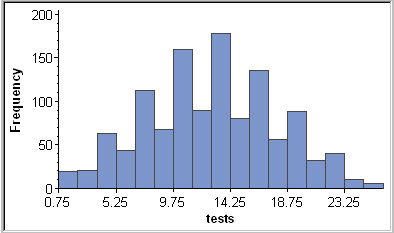
Histograms
A histogram
is a bar chart that displays the observed frequencies of data that
have been binned (divided into contiguous, equally spaced intervals).
The heights of the bars indicate the relative frequency of observations
in each bin. Histograms can also show binned response data if you
choose a response variable other than Frequency.