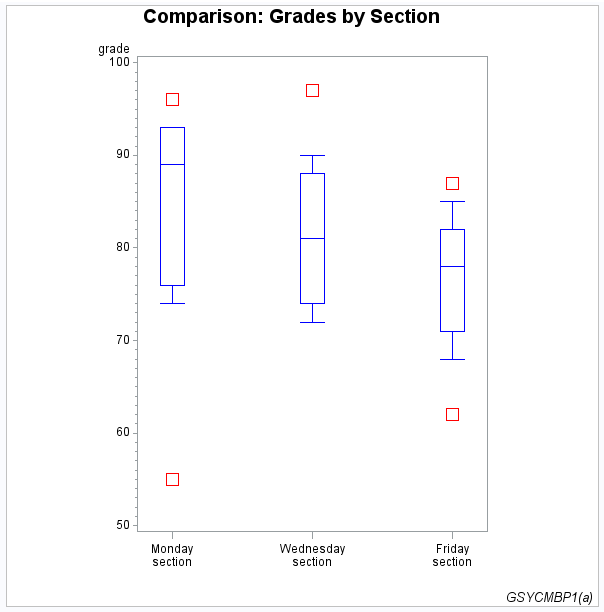
Producing Two-Dimensional Plots
Plots are useful for demonstrating the relationship
between two or more variables and frequently compare trends or data
values or depict movements of data values over time.
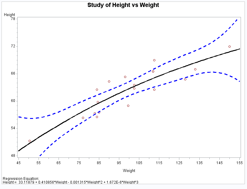
SAS/GRAPH uses the GPLOT procedure to produce
two-dimensional graphs that plot one or more dependent variables against
an independent variable within a set of coordinate axes. The GPLOT
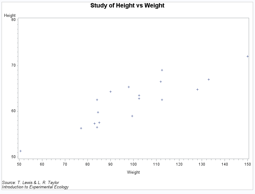
procedure can display the data points as individual symbols (as in
a scatter plot). It can also use interpolation methods specified by
the SYMBOL statement to join the points. You can request spline interpolation
or regression analysis, produce various high-low charts, or generate
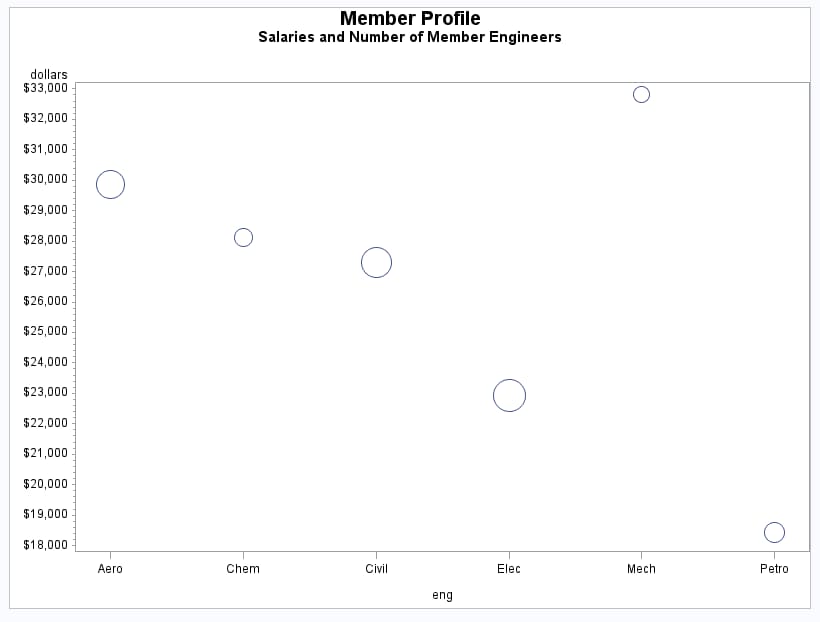
several other types of plots. The GPLOT procedure can also display
data as bubble plots in which circles of different sizes represent
the values of a third variable. See GPLOT Procedure for more information.
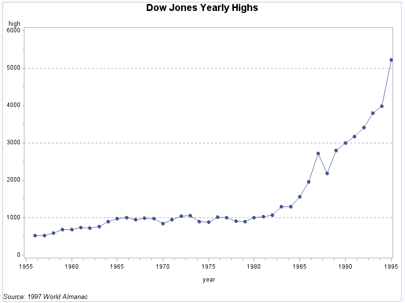
Simple Line Plots
Simple line plots show
the relationship of one variable to another, often as movements or
trends in the data over a period of time. Typically, each variable
value on the horizontal axis has only one corresponding value on the
vertical axis. The line connecting data points can be smoothed using
a variety of interpolation methods, including the Lagrange and the
cubic spline interpolation methods.