The following is an example of the code that can be used to create the triangular plot of ![]() -values for the data set
-values for the data set pop22. This data set is in the proper form for a PROC ALLELE input data set, containing columns of alleles for 150 markers.
   proc allele data=pop22 outstat=ldstats noprint maxdist=150;
      var a1-a300;
   run;

   proc casecontrol data=pop22 outstat=assocstats genotype;
      trait affected;
      var a1-a300;
   run;

   proc psmooth data=assocstats out=sm_assocstats bw=5 simes;
      id Locus;
      var ProbGenotype;
   run;

   %tplot(ldstats, sm_assocstats, ProbGenotype_S5);
Note that the output data set from PROC CASECONTROL can be used in place of the output data set from PROC PSMOOTH if you want
to use unadjusted ![]() -values. This code creates the plot in the TPLOT window shown in Figure 10.3.
-values. This code creates the plot in the TPLOT window shown in Figure 10.3.
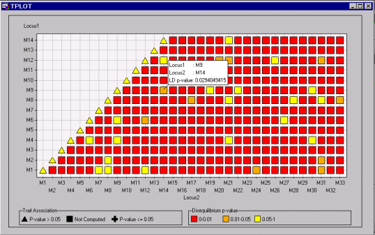
Figure 10.3 displays the bottom-left corner of the plot. The pop-up window is displayed by selecting Show Info About Points from the toolbar and holding the mouse pointer over the point shown. The orange color of this point indicates that the ![]() -value for testing that there is no linkage disequilibrium between M9 and M18 is between 0.01 and 0.05. The pop-up window
provides the exact value of this
-value for testing that there is no linkage disequilibrium between M9 and M18 is between 0.01 and 0.05. The pop-up window
provides the exact value of this ![]() -value.
-value.
Other parts of the plot can be viewed by selecting Scroll Data from the toolbar. Alternatively, the entire plot can be viewed in the window by selecting Format![]() Rescale Axes from the menu bar. This creates the view of the plot shown in Figure 10.4.
Rescale Axes from the menu bar. This creates the view of the plot shown in Figure 10.4.
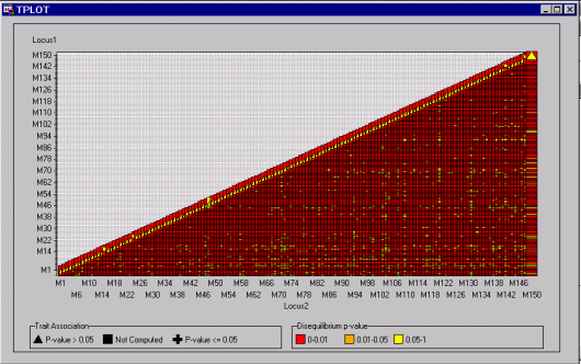
The view shown in Figure 10.4 displays all the data points at once.