| Creating Graphs |
Example: Create a 3-D Bar Chart
Open the Fitness Data Set
In this example, you create a bar chart using the Fitness data set. To open the Fitness data set, follow these steps:- Select Tools
 Sample Data ...
 - Select Fitness.
- Click OK to create the sample data set in your Sasuser directory.
- Select File Open By SAS Name ...
- Select Sasuser from the list of Libraries.
- Select Fitness from the list of members.
- Click OK to bring the Fitness data set into the data table.
Specify Chart and Grouping Variables
To create a 3-D vertical bar chart that compares among experimental groups the average amount of oxygen consumed given the time it takes to run 1.5 miles, follow these steps:- Select Graphs Bar Chart Vertical ... to display the Vertical Bar Chart dialog.
- Select runtime from the candidate list, and click Chart to make minutes to run 1.5 miles the charted variable.
- Under Bar type, select 3-D to make the bar chart three-dimensional.
- To compare among experimental groups, select group from the candidate list and click Group By.
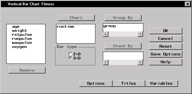
Figure 5.9: Chart and Grouping Variables
Specify Bar Chart Options
To specify your bar chart options, such as the number and appearance of the bars, follow these steps.- Click on the Options button to display the Bar Chart Options dialog.
- Under Number of bars, select N bars, and click on the down arrow until N = 3. Because a grouping variable was specified, bars for three runtime midpoints are displayed for each value of the experimental group.
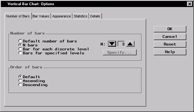
Figure 5.10: Number of Bars
- Select the Bar Values tab. Under Analysis variables, select oxygen from the candidate list and click on the Analysis button to make oxygen consumption your analysis variable.
- Under Statistic to chart, select Average to display the average oxygen consumption per runtime.
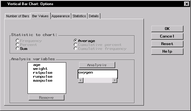
Figure 5.11: Bar Values
- Select the Appearance tab. Under Bar outline, click on the Color button. Select White from the Color Attributes list to make the bar outlines white.
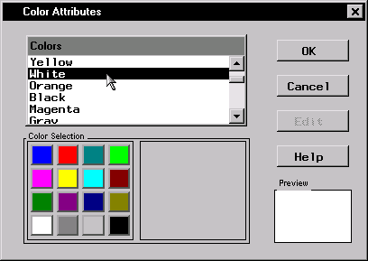
Figure 5.12: Bar Outlines
Click OK to close the Color Attributes window and return to the Bar Chart Options dialog.
- Still on the Appearance tab, select Group variable value under Change bar appearance with change in.
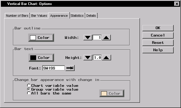
Figure 5.13: Bar Appearance
- Click OK to return to the Vertical Bar Chart dialog.
Specify Bar Chart Titles
To specify the titles for your bar chart, follow these steps:- Click on the Titles button in the Vertical Bar Chart dialog.
- In the Bar Chart tab, type Runtime and Oxygen Consumed in the first field.
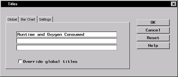
Figure 5.14: Bar Chart Title
- Click on the Global tab. Type Fitness Report in the first field. This global title is saved across all Analyst sessions until you change it.
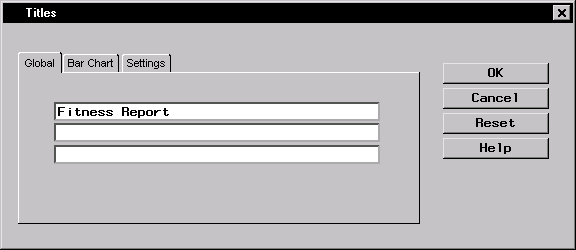
Figure 5.15: Global Title
- Click OK to save your title changes.
Generate Bar Chart
To display your bar chart, click OK in the Vertical Bar Chart dialog.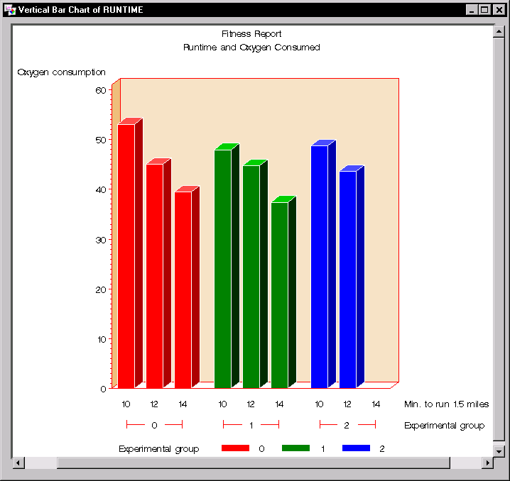 |
Figure 5.16: Vertical Bar Chart
As expected, larger amounts of oxygen are consumed by faster runners. Experimental group does not appear to affect this relationship or the average amount of oxygen consumed. No members of experimental group 2 were among the slowest runners.
Copyright © 2007 by SAS Institute Inc., Cary, NC, USA. All rights reserved.