Plot the Total Criminal Offenses over Time
To show the trend
of each criminal offense from 1989 to 2008, use a line plot.
-
On the SAS tab, click Tasks.
-
In the Tasks window, select Line Plot. The Choose Data dialog box appears.
-
To use the sorted data as your input data source, select SAS Data in Excel. This option uses the output data set that was generated by the Sort Data task and saved to the SAS server. The data set on the server is the same as the data in the SASDATA.SORTED_CRIME_DATA worksheet.
-
For the location of the results, select New worksheet. By default, the name of the new worksheet is Line Plot.
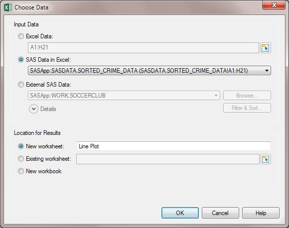 Click OK. The Line Plot task appears.
 -
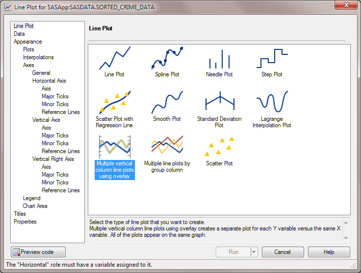
In the Line Plot panel, select Multiple vertical column line plots using overlay.
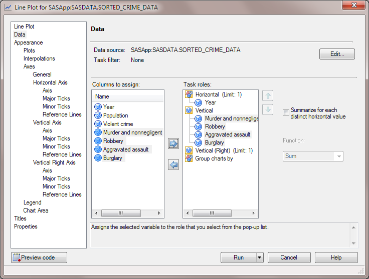
 In the selection pane, click Data.
 -
In the Data panel, complete these steps:
-
Assign the Year column to the Horizontal role.
-
Assign the Murder and nonnegligent manslaug, Robbery, Aggravated assault, and Burglary columns to the Vertical role.
 In the selection pane, click General under the Appearance > Axes heading.
 -
-
In the Appearance > Axes > General panel, select the Display Grid Lines check box.In the selection pane, click Axis under the Vertical Axis heading.
-
In the Appearance > Axes > Vertical Axis > Axis panel, enter
Number
                              of Offenses
in the Label field.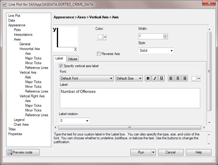 In the selection pane, click Titles.
 -
In the Titles pane, modify the title and the footnote for the line plot.To change the title:
-
In the Section area, select Graph. In the Text for section: Graph area, clear the Use default text check box.
-
Delete the default text and enter
Total Criminal Offenses over Time.
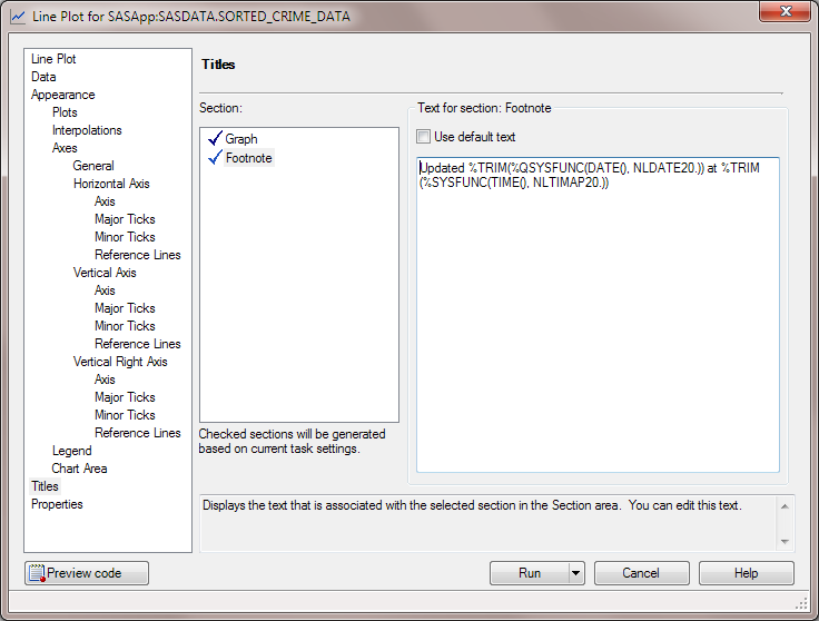
To change the footnote:-
In the Section area, select Footnote. In the Text for section: Footnote area, deselect the Use default text check box.
-
Modify the text of the footnote to read
Updated %TRIM(%QSYSFUNC(DATE(),
                                          NLDATE20.)) at %TRIM(%SYSFUNC(TIME(), NLTIMAP20.))
.
 Click Run. The generated line plot appears in the new Line Plot worksheet. Your results could look similar to the following display:
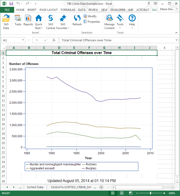 TipYou can customize the title of the plot and the footnote by using the formatting tools in Excel.
 -
Copyright © SAS Institute Inc. All Rights Reserved.
Last updated: April 27, 2017