You can annotate the standard statistical graphics in SAS/IML Studio with lines, curves, markers, polygons, and text.
This section presents an example program that shows how to combine these drawing methods to draw probability contours and a simple legend for a scatter plot. This program can be found in the file <IMLStudio>\Programs\Samples\Annotation Examples\ProbContours.sx, where <IMLStudio> is the directory in which you installed IML Studio.
The first part of the program is an IML module that computes probability contours for data sampled from a bivariate distribution.
/* Given column vectors X and Y that are assumed to come
   from a bivariate distribution, this module computes the
   probability contours for probabilities in the row vector
   p[1]...p[npts]. Upon return, the contours matrix has 2*n
   columns and npts rows. The ordered pairs for the
   probability contour for p[i] are returned in columns
   2*i-1 and 2*i of the contours matrix. */
start probContours( x, y, p, npts, contours );
    np = ncol(p);    /* number of p values    */
    n = nrow(x);     /* number of data points */
    xx = x || y;
    /* correct data for the mean */
    mean = xx[:,];
    xx = xx - mean @ j(n,1,1);
    /* find principle axes of ellipses */
    xx = xx` * xx / n;
    call eigen( v, e, xx );
    /* scale ellipses based on probability levels */
    c = -2 * log( 1-p );
    a = sqrt( c * v[1] );
    b = sqrt( c * v[2] );
    /* parameterize ellipses by angle */
    twoPi = atan(1) # 8;
    r = twoPi # T(0:npts-1) / npts;
    s = sin(r) * a;
    t = cos(r) * b;
    /* return ordered pairs on probability contours */
    s = e*(shape(s,1) // shape(t,1)) + T(mean)@j(1,npts*np);
    contours = shape(T(s), npts);
finish;
The next section of the program reads the mathematical and verbal SAT scores for a set of students as stored in the sample GPA data set:
declare DataObject dobj;
dobj = DataObject.CreateFromFile( "gpa" );
declare ScatterPlot plot;
plot = ScatterPlot.Create( dobj, "SATM", "SATV" );
plot.SetMarkerSize( 4 );
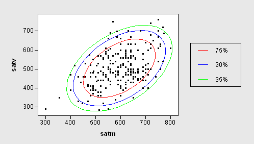
Assuming the SATM and SATV variables come from a bivariate normal distribution, the program calls the previously defined module to compute probability contours for 75%, 90%, and 95% probabilities.
/* call the module on specific data */
dobj.GetVarData( "SATV", satv );
dobj.GetVarData( "SATM", satm );
run probContours( satm, satv, {0.75 0.90 0.95}, 50, contours );
Next, the program draws the contours in the background of the scatter plot, with each contour in a different color.
/* Draw the contours in data coordinates */
plot.DrawSetRegion( PLOTBACKGROUND );
plot.DrawUseDataCoordinates();
plot.DrawSetPenColor( RED );
plot.DrawPolygon( contours[,1], contours[,2] );
plot.DrawSetPenColor( BLUE );
plot.DrawPolygon( contours[,3], contours[,4] );
plot.DrawSetPenColor( GREEN );
plot.DrawPolygon( contours[,5], contours[,6] );
By default, the graph foreground uses a normalized coordinate system [0,100] x [0,100]. To help the reader determine which contour corresponds to which probability, the program draws a legend in the right-hand margin area of the graph. Although the program could call the module DrawLegend to draw the legend automatically, for the sake of this example the program draws the legend manually.
First it draws a box.
/* Create a legend in the right margin of the Graph Area */
plot.SetGraphAreaMargins( -1, 0.3, -1, -1 );
plot.DrawSetRegion( GRAPHFOREGROUND );
plot.DrawSetPenColor( BLACK );
plot.DrawRectangle( 75, 40, 95, 70 );
Next, the program draws text and lines on the box.
plot.DrawSetTextAlignment( ALIGN_LEFT, -1 );
plot.DrawSetPenColor( RED );
plot.DrawLine( 78, 65, 82, 65 );
plot.DrawText( 85, 65, "75%");
plot.DrawSetPenColor( BLUE );
plot.DrawLine( 78, 55, 82, 55 );
plot.DrawText( 85, 55, "90%");
plot.DrawSetPenColor( GREEN );
plot.DrawLine( 78, 45, 82, 45 );
plot.DrawText( 85, 45, "95%");
The graph produced by this code is shown below.