The Simple HBar task
creates a simple horizontal bar chart. You can customize the title,
footnotes, axes, and legends for the horizontal bar chart.
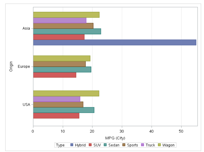
Example: Horizontal Bar Chart of Mileage by Origin and Type
To create this horizontal
bar chart:
In the Tasks section,
expand the Graphs folder and double-click Simple
HBar. The user interface for the Simple HBar task opens.
On the Data tab,
select the SASHELP.CARS data set.
Assign columns to these
roles:
Role
Column Name
Category
variable
Origin
Response
variable
MPG_City
Group variable
Type
To run the task, click .
Here are the results:
Assigning Data to Roles
To run the Simple HBar
task, you must assign a column to the Category variable role.
Option Name
Description
Role
Category
variable
specifies the variable
that classifies the observations into distinct subsets.
Response
variable
specifies a numeric
response variable for the plot.
Group variable
specifies a variable
that is used to group the data.
URL variable
specifies a character
variable that contains URLs for web pages to be displayed when parts
of the plot are selected within an HTML page.
Group Layout
Cluster
displays group values
as separate adjacent bars that replace the single category bar. Each
set of group values is centered at the midpoint tick mark for the
category.
Stack
overlays group values
without any clustering. Each group is represented by unique visual
attributes that are derived from the GraphData1... GraphDatan style
elements in the current style.
Statistics
Mean
calculates the mean
of the response variable.
Sum
calculates the sum of
the response variable.
Setting Options
Option Name
Description
Title and Footnote
You can specify a custom
title and footnote for the output. You can also specify the font size
for this text.
Bar Details
Apply bar
color
specifies the color
for the bars when a column is not assigned to the Group
variable role.
Transparency
specifies the degree
of transparency for the plot. The range is 0 (completely opaque) to
1 (completely transparent).
Apply bar
gradient
applies a gradient to
each bar.
Note: This option is available
only if you are running the second maintenance release for SAS 9.4
or later.
Data skin
specifies a special
effect to be used on all filled bars.
Bar Labels
Show bar
labels
displays the values
of the calculated response as data labels.
Category Axis
Reverse
specifies that the values
of the tick marks are displayed in reverse (descending) order.
Show values
in data order
places the discrete
tick values in the order in which they appear in the data.
Show label
enables you to display
a label for the axis. Enter this label in the Custom label box.
Response Axis
Show grid
creates grid lines at
each tick on the axis.
Drop statistics
suffix
removes the name of
the calculated statistic in the axis label. For example, if you are
calculating the mean, the axis label could be Weight (Mean).
Custom Label
enables you to customize
the label for the response axis. By default, the axis label is the
name of the variable.
Legend Details
Legend location
specifies whether the
legend is placed outside or inside of the axis area.
Graph Size
You can specify the
width and height of the graph in inches, centimeters, or pixels.