Line Chart Task

About the Line Chart Task

The Line Chart task assumes that the values in the category variable are discrete. The task groups these values into distinct categories. If you assign a column from the input data source to the Response variable role, you can select the statistic (either mean or sum) for the response values. By default, the task calculates the mean of the values for the response variable. If no response variable is assigned, a frequency chart by category is created.

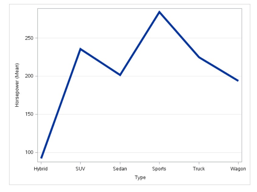
Example: Displaying the Mean Horsepower for Each Car Type

In this example, you want to display the mean horsepower for each car type in a line plot. The result shows that sports cars have the highest average horsepower and hybrid cars have the lowest average horsepower.
To create this example:
  1. In the Tasks section, expand the Graph folder and double-click Line Chart. The user interface for the Line Chart task opens.
  2. On the Data tab, select the SASHELP.CARS data set.
  3. Assign columns to these roles:
    Role
    Column Name
    Category variable
    Type
    Response variable
    Horsepower
  4. To run the task, click Submit SAS code.
Line Chart of Horsepower for Each Car Type

Assigning Data to Roles

To run the Line Chart task, you must assign a column to the Category variable role.
Option Name
Description
Role
Category variable
specifies the variable that classifies the observations into distinct subsets.
Response variable
specifies a numeric response variable for the plot.
Group variable
specifies a variable that is used to group the data.
URL variable
specifies a character variable that contains URLs for web pages to be displayed when parts of the plot are selected within an HTML page.
Statistics
Mean
calculates the mean of the response variable.
Sum
calculates the sum of the response variable.

Setting Options

Option Name
Description
Title and Footnote
You can specify a custom title and footnote for the output. You can also specify the font size for this text.
Line Details
Apply line color
specifies the color for the line when you do not assign a column to the Group variable role.
Line thickness
specifies the thickness (in pixels) of the line.
Transparency
specifies the degree of transparency for the plot. The range is 0 (completely opaque) to 1 (completely transparent).
Use solid line
specifies a solid pattern for the line.
Line Labels
Show line labels
displays the label from the response variable. If you assign a column to the Group variable role, each line is labeled with the group value.
Category Axis
Reverse
specifies that the values of the tick marks are displayed in reverse (descending) order.
Show values in data order
places the discrete tick values in the order in which they appear in the data.
Show label
enables you to display a label for the axis. By default, the label is the variable name.
To customize this label, enter this label in the Custom label box.
Response Axis
Show grid
creates grid lines at each tick on the axis.
Drop statistics suffix
removes the name of the calculated statistic in the axis label. For example, if you are calculating the mean, the axis label could be Weight (Mean).
Show label
enables you to display a label for the axis. By default, the label is the variable name.
To customize this label, enter this label in the Custom label box.
Legend Details
Show legend
specifies whether to display a legend in the output.
Legend location
specifies whether the legend is placed outside or inside of the axis area.
Graph Size
You can specify the width and height of the graph in inches, centimeters, or pixels.