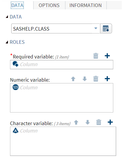
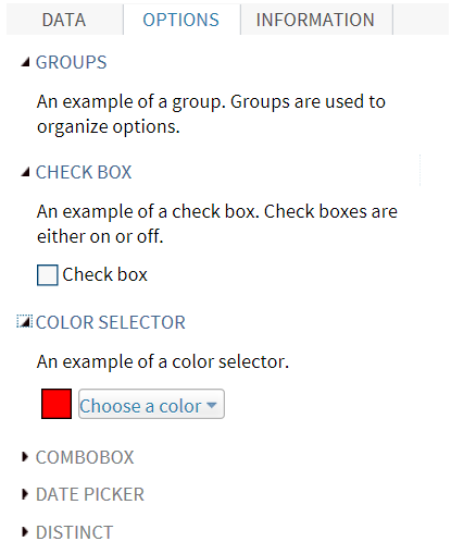
Example: UI Element for the Sample Task
The code for the sample
task creates a group for each input type. Here is the code for the
first three groups:
<UI>
   <Container option="DATATAB">
      <Group option="DATAGROUP" open="true"
         <DataItem data="DATASOURCE" />
      </Group>
      <Group option="ROLESGROUP" open="true">
         <RoleItem role="VAR"/>
         <RoleItem role="OPTNVAR"/>
         <RoleItem role="OPTCVAR"/>
      </Group>
   </Container>

   <Container option="OPTIONSTAB">
      <Group option="GROUP" open="true">
         <OptionItem option="labelEXAMPLE"/>
      </Group>

      <Group option="GROUPCHECK">
         <OptionItem option="labelCheck"/>
         <OptionItem option="chkEXAMPLE"/>
      </Group>

      <Group option="GROUPCOLOR">
         <OptionItem option="labelCOLOR"/>
         <OptionItem option="colorEXAMPLE"/>
      </Group>

...
   </Container>
</UI>
When you run this code,
the Data and Options tabs
appear in the interface.
Copyright © SAS Institute Inc. All rights reserved.