Example: UI Element for the Sample Task Definition
The code for the sample
task definition creates a group for each input type. Here is the code
for the first three groups:
<UI>
<Container option="DATATAB">
<Group option="DATAGROUP" open="true"
<DataItem data="DATASOURCE" />
</Group>
<Group option="ROLESGROUP" open="true">
<RoleItem role="VAR"/>
<RoleItem role="OPTNVAR"/>
<RoleItem role="OPTCVAR"/>
</Group>
</Container>
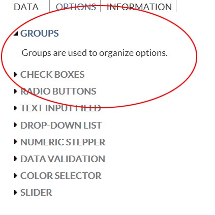
<Container option="OPTIONSTAB">
<Group option="GROUP0" open="true">
<OptionItem option="labelEXAMPLE"/>
</Group>
<Group option="GROUP1">
<OptionItem option="chkCheck"/>
<OptionItem option="chkEXAMPLE"/>
</Group>
<Group option="GROUP2">
<OptionItem option="labelEXAMPLE2"/>
<OptionItem option="radioButton1"/>
<OptionItem option="radioButton2"/>
<OptionItem option="radioButton3"/>
</Group>
...
</Container>
</UI>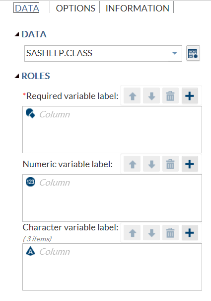
Copyright © SAS Institute Inc. All rights reserved.