Working with the Options Element
About the Options Element
The
Options element
identifies the options that are required in order to run the task.
The Option tag,
which is the only child of the Options element,
describes the assigned option.
|
Specifies the input
control for this option. Here are the valid values:
For more information,
see Supported Input Types.
|
|
Supported Input Types
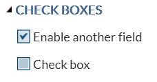
checkbox
This input type does
not have additional attributes. The valid values for
checkbox are
0 (unchecked) and 1 (checked).
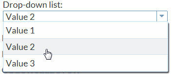
combobox
The code in the sample
task definition creates a combination box called Drop-down
list. This list contains three options: Value
1, Value 2, and Value
3.
<Option name="comboEXAMPLE" defaultValue="value2" inputType="combobox">
   Drop-down list:</Option>
<Option name="value1" inputType="string">Value 1</Option>
<Option name="value2" inputType="string">Value 2</Option>
<Option name="value3" inputType="string">Value 3</Option>
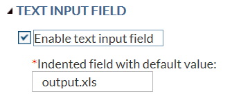
inputtext
The code in the sample
task definition creates a text box called Indented field
with default value. The default value for this option
is output.xls. If the user removes this text, the message “Enter
a filename” appears because a valid filename is required.
<Option name="txtEXAMPLE" defaultValue="output.xls" inputType="inputtext"
   width="100%"
   indent="1"
   required="true"
   promptMessage="Enter a filename"
   missingMessage"Missing filename">Indented field with default value:</Option>
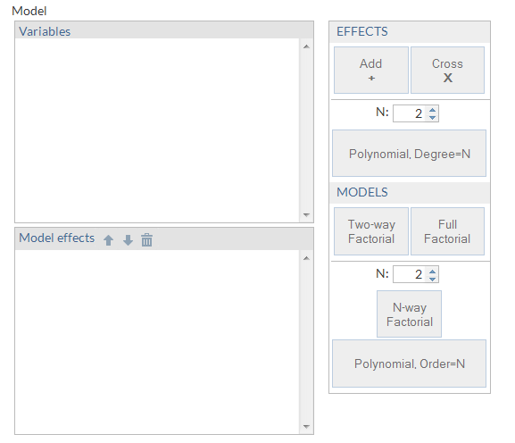
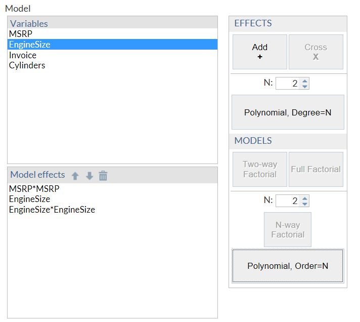
modelbuilder
A model is
an equation that consists of a dependent or response variable and
a list of effects. The user creates the list of effects from variables
and combinations of variables.
Note: At least one of the role
attributes (
roleContinuous or roleClassification)
is required. If both attributes are set to null, no variables are
available to create the model.
Here is some example
code for the model builder from the Generalized Linear Model task:
<Option excludeTools="THREEFACT,NFACTPOLY" inputType="modelbuilder"
   name="modelbuilder" roleClassification="classVariables"
   roleContinuous="continuousVariables"
   width="100%">Model</Option>
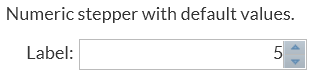
numstepper
The first example in
the sample task definition creates an option with an assigned default
value of 5.
<Option name="labelNumStepperEXAMPLE1" inputType="string">
   Numeric stepper with default values:</Option>
<Option name="basicStepperEXAMPLE" defaultValue="5" inputType="numstepper"
   indent="1">Label:</Option>
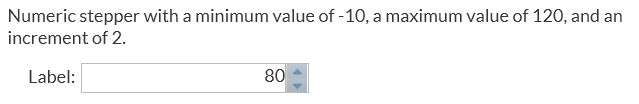
The second example in
the sample task definition creates an option with a specified minimum
value, maximum value, and increment.
<Option name="labelNumStepperEXAMPLE2" inputType="string">
   Numeric stepper with a minimum value of -10, a maximum value of 120, and
   an increment of 2.</Option>
<Option name="advancedStepperEXAMPLE" defaultValue="80" inputType="numstepper"
   increment="2"
   minValue="-10"
   maxValue="120"
   decimalPlaces="0,2"
   size="8em"
   indent="1">Label:</Option>
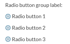
radio
The second example
in the sample task definition creates an option called Radio
button group label with the Radio button
1 button selected by default.
<Option name="labelEXAMPLE2" inputType="string">Radio button group label:</Option>
<Option name="radioButton1" variable="radioEXAMPLE" defaultValue="radioButton1"
   inputType="radio">Radio button 1</Option>
<Option name="radioButton2" variable="radioEXAMPLE"
   inputType="radio">Radio button 2</Option>
<Option name="radioButton3" variable="radioEXAMPLE"
   inputType="radio">Radio button 3</Option>
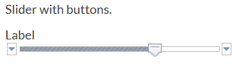
slider
The first example in
the sample task definition creates a slider option with buttons.
<Option name="labelSliderEXAMPLE1" inputType="string">
      Slider with buttons.</Option>
<Option name="labelSliderEXAMPLE1" defaultValue="80.00"
   inputType="slider" discreteValues="14" minValue="-10"
   maxValue="120">Label</Option>
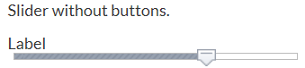
The second example in
the sample task definition creates a slider option without buttons.
<Option name="labelSliderEXAMPLE2"
   inputType="string">Slider without buttons.</Option>
<Option name="labelSliderEXAMPLE2" defaultValue="80.00"
   inputType="slider" discreteValues="14" minValue="-10"
   maxValue="120" showButtons="false">Label</Option>
string
This input type has
no attributes. The code for the sample task definition contains several
examples of the string input type. In the code for the slider option,
the explanatory text (Slider with buttons)
is created by the string input type.
<Option name="labelSliderEXAMPLE1" inputType="string">
   Slider with buttons.</Option>
<Option name="labelSliderEXAMPLE1" defaultValue="80.00"
   inputType="slider" discreteValues="14" minValue="-10"
   maxValue="120">Label</Option>
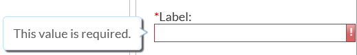
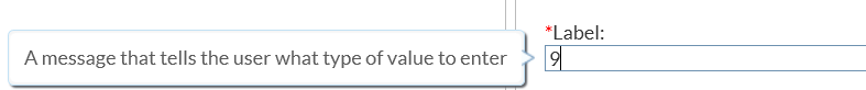
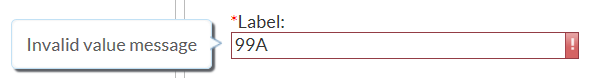
validationtext
The code for the sample
task definition creates a text box called Label.
<Option name="validationTextExample" defaultValue="99999"
   inputType="validationtext"
   required="true"
   width="100%"
   promptMsg="A message that tells the user what type of value to enter"
   invalidMsg="Invalid value message"
   missingMsg="This value is required."
   regExp="\d{5}">Label:
</Option>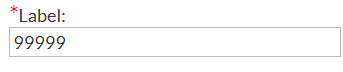
Copyright © SAS Institute Inc. All rights reserved.