Displaying Data and Results
|
|
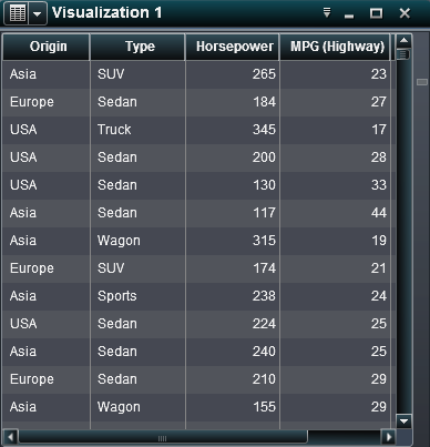
A table (also known
as a list table) is a two-dimensional representation of data. Values
are arranged in unlabeled rows and labeled columns. A table cannot
use a hierarchy.
In the designer, tables
contain aggregated data. You can add sparklines to a column (if the
data source contains a date data item). In the explorer, tables contain
raw data.
 Supported in the explorer.
Supported in the designer and viewers.
|
|
|
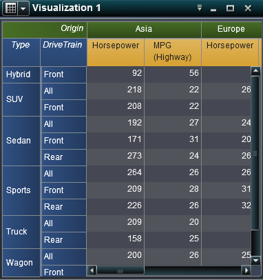
A crosstab (also known
as a crosstabulation table) shows an aggregate metric for the intersections
of two or more categories. In a crosstab, categories are typically
displayed in both the columns and the rows. Each cell value represents
the aggregated measure from the intersection of the categories in
the cell’s row and column. A crosstab uses less space than
a traditional table and is easier to read because data is grouped
both horizontally and vertically. A crosstab can use a hierarchy.
Frequency is displayed only when there are no measures in the crosstab.
Supported in the explorer.
Supported in the designer and viewers.
|
|
|
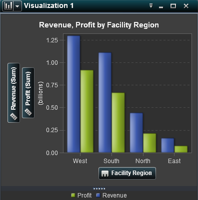
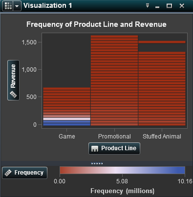
A bar chart consists
of vertical or horizontal bars that represent quantitative data. Use
bar charts to compare data that is aggregated by the distinct values
of a category.
You can apply grouping
and create lattices.
Supported in the explorer.
Supported in the designer and viewers.
|
|
|
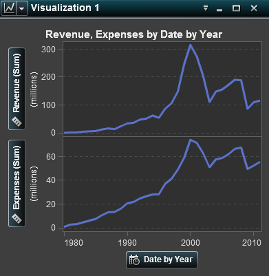
A line chart shows the
relationship of one variable to another, often as movements or trends
in the data over a period of time. Line charts summarize source data,
and typically are used to show how values change over time. You can
apply grouping and create lattices.
In the explorer, line
charts support time series. From a time series, you can generate a
forecast analysis that enables you to predict future values for the
series and visualize the probability range for those values.
Supported in the explorer.
Supported in the designer and viewers.
|
|
|
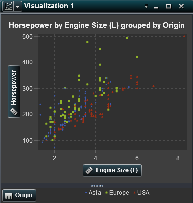
A scatter plot is a
two-dimensional plot that shows the joint variation of two data items.
Each marker (represented by symbols such as dots, squares, or plus
signs) represents an observation. The marker position indicates the
value for each observation. Use a scatter plot to examine the relationship
between numeric data items. You can apply grouping. (In the designer,
grouping is called "color.")
In the explorer, you
can apply statistical analysis with correlation and fit lines. When
you apply more than two measures to a scatter plot, a scatter plot
matrix compares each pairing of measures.
Supported in the explorer.
Supported in the designer and viewers.
|
|
|
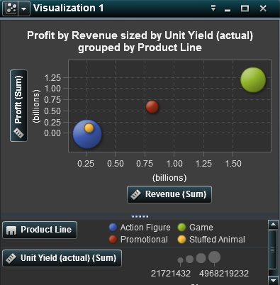
A bubble plot displays
the relationships among at least three measures. Two measures are
represented by the plot axes, and the third measure is represented
by the size of the plot markers. Each bubble represents an observation.
A bubble plot is useful for data sets with dozens to hundreds of values.
You can apply grouping and create lattices.
In the explorer, you
can use color to represent an additional measure and animate the bubbles
to display changes in the data over time.
Supported in the explorer.
Supported in the designer and viewers.
|
|
|
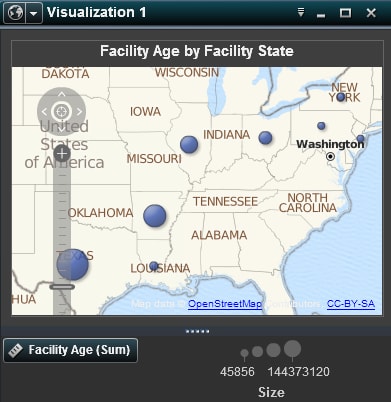
A geo map is a bubble
plot that is overlaid on a geographic map. Each bubble is located
at a geographic location or at the center of a geographical region.
A geo map requires a data item that contains geographical information
and is assigned to a geography role.
If you create a geo
map in the designer, you must assign measures for longitude and latitude.
Automatic mapping of columns (such as country or state) is available
only in the explorer. Certain exported geo maps (for example, geo
maps that use custom roles or data sets that have centroids) cannot
be fully modified in the designer.
Supported in the explorer.
Supported in the designer and viewers.
|
|
|
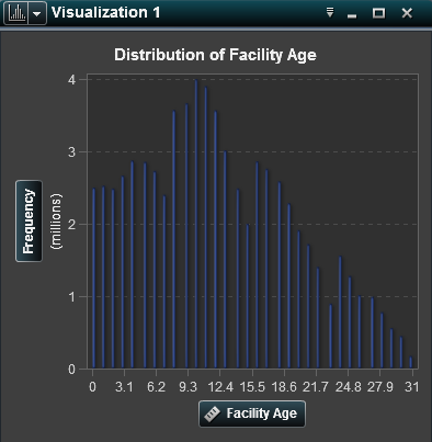
A histogram displays
the distribution of values for a single measure.
In the explorer, you
can select the bar orientation. You can select whether the values
are displayed as a percentage or as a count.
To add a histogram to
a report, create it in the explorer, and export it as a report object.
Supported in the explorer.
 Limited support in the designer and viewers.
|
|
|
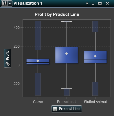
A box plot displays
the distribution of values for a single measure using a box and whiskers.
The size and location of the box indicate the range of values that
are between the 25th and 75th percentile. Additional statistical information
is represented by other visual features.
In the explorer, you
can create lattices and specify whether the average (mean) value and
outliers are displayed for each box.
To add a box plot to
a report, create it in the explorer, and export it as a report object.
Supported in the explorer.
Limited support in the designer and viewers.
|
|
|
A heat map displays
the distribution of values for two data items using a table with colored
cells. If you do not assign a measure to the color data role, then
a cell’s color represents the frequency of each intersection
of values. If you assign a measure to the color data role, then a
cell’s color represents the measure value of each intersection
of values.
To add a heat map to
a report, create it in the explorer, and export it as a report object.
Supported in the explorer.
Limited support in the designer and viewers.
|
|
|
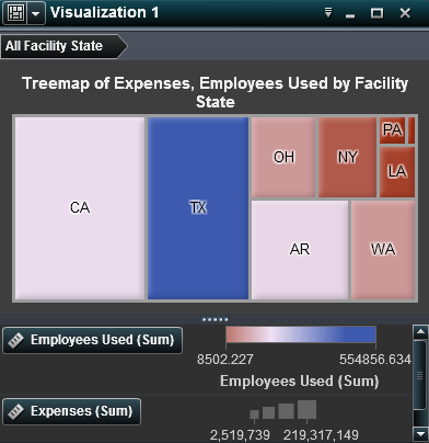
A treemap displays your
data as a set of rectangles (called tiles). Each tile represents a
category or a hierarchy node. The color of each tile represents the
value of the first measure. The size of each tile represents the value
of the second measure. For example, a sales data treemap might have
tile sizes that represent the number of orders and tile colors that
are derived from color gradients that represent sales.
Supported in the explorer.
Supported in the designer and viewers.
|
|
|
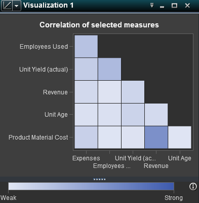
A correlation matrix
displays the degree of correlation between measures as a series of
colored rectangles. The color of each rectangle indicates the strength
of the correlation.
Supported in the explorer.
 Not supported in the designer or viewers.
|
|
|
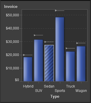
A targeted bar chart
is a bar chart that has pointers to target values. In this example,
the pointers appear above each bar.
Not supported in the explorer.
Supported in the designer and viewers.
|
|
|
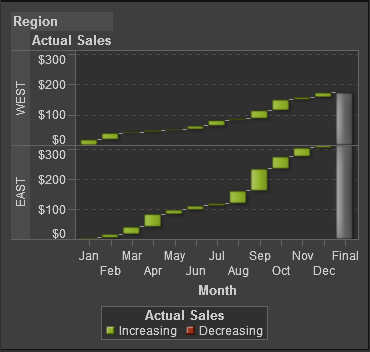
A waterfall chart (also
known as a progressive bar chart) shows how the initial value of a
measure increases or decreases during a series of operations or transactions.
The first bar begins at the initial value, and each subsequent bar
begins where the previous bar ends. The length and direction of a
bar indicate the magnitude and type (positive or negative, for example)
of the operation or transaction. The resulting chart is a stepped
cascade that shows how the operations or transactions lead to the
final value of the measure.
Not supported in the explorer.
Supported in the designer and viewers.
|
|
|
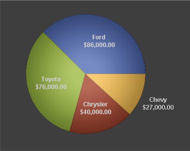
A pie chart is a circular
chart that is divided into slices by radial lines. Each slice represents
the relative contribution of each part to the whole.
Not supported in the explorer.
Supported in the designer and viewers.
|
|
|
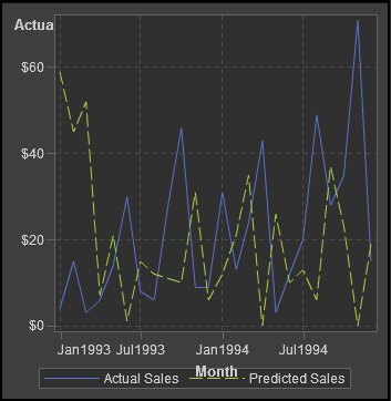
A time series plot shows
an ordered sequence of values that are observed at equally spaced
time intervals. A time series plot requires a date or date time category
data item that is continuous.
Supported in the explorer as a line chart.
Supported in the designer and viewers.
|
|
|
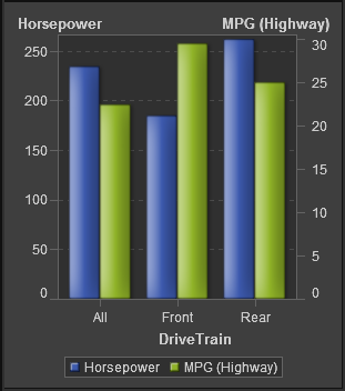
A dual axis bar chart
is a variation of the bar chart that has two measures. A measure is
on each axis.
Not supported in the explorer.
Supported in the designer and viewers.
|
|
|
A dual axis line chart
is a variation of the line chart that has two measures. A measure
is on each axis.
Not supported in the explorer.
Supported in the designer and viewers.
|
|
|
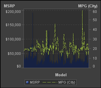
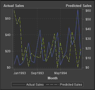
A dual axis bar-line
chart is a variation of the bar chart that has two measures. A measure
is on each axis, and the bar chart is overlaid by a line chart.
Not supported in the explorer.
Supported in the designer and viewers.
|
|
|
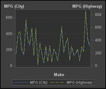
A dual axis time series
plot is a variation of the time series plot that has two measures.
A measure is on each axis.
Not supported in the explorer.
Supported in the designer and viewers.
|
|
|
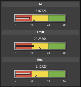
A bullet gauge is a
horizontal dashboard indicator (also known as a KPI chart) that compares
an actual value to a target value and compares them in intervals.
This example displays three bullet gauges. The actual value is indicated
by an inset horizontal bar.
Not supported in the explorer.
Supported in the designer and viewers.
|
|
|
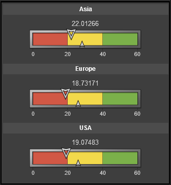
A slider gauge is a
horizontal dashboard indicator (also known as a KPI chart) that compares
an actual value to a target value and compares them in intervals.
This example displays three slider gauges. The actual value is indicated
by a downward-facing arrow.
Not supported in the explorer.
Supported in the designer and viewers.
|
|
|
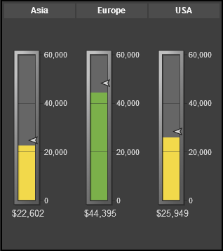
A thermometer gauge
is a vertical dashboard indicator (also known as a KPI chart) that
compares an actual value to a target value and compares them in intervals.
This example displays three thermometer gauges. The actual value is
indicated by a vertical bar.
Not supported in the explorer.
Supported in the designer and viewers.
|
|
|
A dial gauge is an arc-shaped
dashboard indicator (also known as a KPI chart) that compares an actual
value to a target value and compares them in intervals. The actual
value is indicated by an arrow that points outward from the inner
circle.
Not supported in the explorer.
Supported in the designer and viewers.
|
|
|
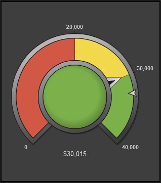
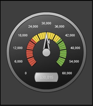
A speedometer gauge
is a circular dashboard indicator (also known as a KPI chart) that
compares an actual value to a target value and compares them in intervals.
The actual value is indicated by the larger pointer.
Not supported in the explorer.
Supported in the designer and viewers.
|