Using Tables to Display Results
For a definition and a
picture of each table type, see Tables.
About List Tables
By default, a list table
contains aggregated data with one row for each distinct combination
of category values. However, if the Show detail data check box has been selected, then all of the data is not aggregated.
Tip
To rearrange the columns in
a list table, drag and drop the column headings.
You can add sparklines to a column (if the data source contains a date data item) when aggregated data is displayed in the list table. For more
information, see Add Sparklines to a List Table.
Starting in the 6.4 release, list tables are sorted in ascending order by the first data item that you add. Only new list tables have a default sort selection.
The sorting of
data items in list tables in existing reports does not change. To sort the list table
by a column, click on the column heading. An arrow appears in the column heading to indicate the sorting.
Here are some key points
about list tables:
-
If you sort a list table, then the list table displays only the first 5,000 sorted rows. For more information, see Sort Data in a List Table.
-
You cannot select the totals in a list table.
-
List tables that show detail data cannot be the source of an interaction or a link.
About Crosstabs
You can show subtotals and totals by selecting the appropriate check box (or check
boxes) on the Properties tab for the crosstab. You can show a percentage of total or percentage of subtotal in a crosstab. For more information
about percentage of total or percentage of subtotal, see Create Derived Items for Measures.
You cannot add a sparkline to a crosstab.
You should consider placing lower cardinality (fewer distinct values) categories on the columns and higher cardinality (more distinct values) categories
on the rows. Crosstabs can help you improve readability especially when there are
several category data items to include in your table.
By default, frequency is displayed only when there are no measures in the crosstab.
If you add a category data item first, then the Frequency column is automatically added. When you add a measure data item, the Frequency column is automatically replaced by the measure that you added. If
you add a measure data item first, then the Frequency column is added only if you
manually add it.
Here are some key points
about crosstabs:
-
You can create a brush interaction for totals and subtotals in a crosstab.
-
A crosstab does not show data if the query is too large.
Specify Table Properties
To specify the properties
for list tables and crosstabs:
-
If it is not already selected, select the table in the canvas that you want to update.
-
In the right pane, click the Properties tab.
-
Update the general properties for the table. You can update the Name, Title, Format (for the title's font style), and Description.
-
Update the object-specific properties for the table. The available properties depend on the selected table type.Here are some details about the properties for list tables:
-
By default, the Enable selection in the viewers property is selected for list tables. This means that users who use the web viewer or a mobile device can select the list table, and click
 to see the list table name and any incoming filter information.
-
You can use the Data Options properties to enable sorting, show detail data, combine excluded rows into “all other,” and to show totals. These properties are available when you use summarized data. They apply to both ranks and post-aggregate filters.Note: By default, a list table contains aggregated data with one row for each distinct combination of category values. However, if the Show detail data check box has been selected, then all of the data is not aggregated. List tables that show detail data cannot be the source of an interaction or a link.For list tables, you can select the Combine excluded rows into “All Other” property, under the Data Options heading, to summarize all excluded rows. For more information, see Use the Combine Excluded Rows (or Cells) into “All Other” Properties.TipSelect the Show labels for totals property to turn off or turn on the aggregation labels for totals.
Here are some details about the properties for crosstabs:-
By default, the Enable selection in the viewers property is selected for crosstabs. This means that users who use the web viewer or a mobile device can select the crosstab, and click to see the crosstab name and any incoming filter information.
-
You can specify that you want to display missing labels as blanks instead of the string
(missing)being displayed. -
You can specify that you want an indented layout and totals and subtotals for columns, rows, or both.
-
You can specify the placement of totals and subtotals.
-
Specify Table Styles
To specify styles for
tables:
-
If it is not already selected, select the table in the canvas that you want to update.
-
In the right pane, click the Styles tab.
-
Update the styles for the table. The available styles depend on the selected table type. For example, you can specify Border and Fill, Cells, Column Headings, and Totals for list tables and crosstabs.Here are some details about the styles for list tables:
-
Select Wrap text to wrap text in the cells of a list table.
-
Select Enable alternating background color to specify that the color of every other row appears darker in the list table. Use the Alternating background color to specify the color of every other row in the list table. Use the Selection color style to specify the color of the selected row in the list table.
-
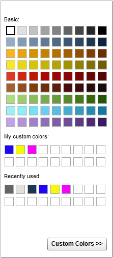
Your custom colors
are saved between SAS Visual Analytics sessions. Your custom colors
are displayed in the color palette. Here is an example:
A Color Palette in the Designer
Add Sparklines to a List Table
A sparkline is a small line graph without axes or labels that presents a single trend over time. A sparkline is about the size of one or two words, so it fits in a single cell and
repeats for
each row in a column. A sparkline does not have axes or labels. They are frequently
used to present stock trends or production rates over time. A sparkline is intended to be both succinct
and noteworthy.
In the designer, you can add sparklines to a column in a list table. The data source
for the list table must include a date, datetime, or time data item before you can
add a sparkline.
A sparkline in the designer can have up to 40 bins. (A bin is a way to group continuous values into a smaller number of intervals.) When the sparkline data is binned, it is grouped
by a boundary. A boundary is a minute, hour, day, month,
quarter, or year. For example, if there are two years’ worth of data, then the data
will be grouped by month, and the sparkline will have 24 bins (or one for each month).
If there is one month (30 days) of data, the sparkline will have 30 bins. If you have
two months of data, the sparkline will have two bins because the data is binned by
a month boundary. Having a lot of data for the list table does not guarantee that
the sparkline provides more detail because the designer prioritizes bin boundaries
over maximum number of bins.
The data tip values on the sparkline show the high and low values of the sparkline and the last
value in the sparkline.
The data tip values are affected by the boundary at which the data is binned and by
the aggregation of the data item. For example, suppose that the aggregation is Sum.
If the data is binned by day,
then the minimum and maximum values for a given day are displayed in the data tip.
However, if the data changes and it is binned by month, then the minimum and maximum
values for the sum of all days in the month are displayed in the data tip.
Note: The designer does not let
users control the binning of the sparkline.
The data for each sparkline
is displayed as a miniature time series plot. Here is an example of
a report that contains a simple list table with a sparkline and a
time series plot, which is filtered to represent the data shown in
the sparkline:
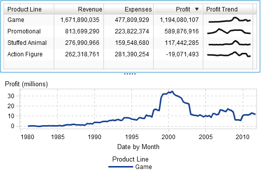
In the example, both the time series plot and the sparkline are using Profit for the measure. The time series plot has more detail than the sparkline because in the time series plot, the data is grouped at a more granular level. The sparkline shows the same overall
line as the time series plot, but has less detail.
The sparkline does not display the trend at the most granular date, datetime, or time
level. Instead,
the sparkline summarizes the trend depending on the unit of time that is used in the
list table. For example, the sparkline might be summarized for the month, quarter,
or year, depending on the data. The report designer cannot change the level of summary
in the sparkline.
To add a sparkline:
-
If it is not already selected, select the list table in the canvas that you want to update.
-
Right-click the list table, and then select Add Sparkline. The Add Sparkline window is displayed.
-
Enter a Column label.
-
For Time Axis, select a date, datetime, or time data item in the current data source.
-
Select a Measure (line).
-
(Optional) Select the Set baseline check box. Enter a Value, and select a Fill type. Your choices are Gradient or Solid.The Set baseline option draws a horizontal line through the graph at the point on the Y axis where the baseline value resides. Everything above or below the baseline is filled in with either a solid or gradient color.
-
Click OK. The sparkline is added to the last column in the list table. You can move the sparkline to another location in the table.
To edit a sparkline, right-click in the sparkline column in the list table, and then select Edit Sparkline. The Edit Sparkline window
is displayed. Update the information, and then click OK to
save your changes.
To delete a sparkline, right-click in the sparkline column in the list table, and
then select Remove
Sparkline.
Copyright © SAS Institute Inc. All Rights Reserved.
Last updated: January 8, 2019