Working with Roles
About Roles
When you create a custom graph object, you determine which data roles become available
for assignment. However, you do not assign data to those roles in the graph builder.
When the graph object becomes available to report designers for use in their reports,
the report designers assign data items to the available roles.
Create Optional Roles
When you drag and drop a graph element onto the canvas, the required roles for that graph element are created on the Role Definitions tab.
You can create additional, optional roles.
To create an optional
role:
-
On the Role Definitions tab, click Add Role. The Add Role window is displayed. The contents of the Add Role window vary depending on the current graph element.
-
Select the type of role that you want to create. For more information, see Types of Roles.
-
(Optional) You can change the default role name to provide a more meaningful name.
-
Select the data type, or classification, for the role. For information about the data types, see Working with Data Items in a Report.
-
(Optional) Select Required to require report designers to assign data to the role. If this option is not selected, then report designers can choose whether to assign data to the role.
-
If the Allow multiple data assignments check box is available, then you can select or clear the check box. When this option is selected, the role can have more than one measure assigned. For example, in a line chart, if multiple measures are assigned to the Y axis, then the graph shows a line for each measure.
-
Click OK.
Types of Roles
In addition to the standard
roles, such as Time, X, or Category, you can add the following roles
by clicking Add Role on the Role
Definitions tab. The roles that are available depend on the type of graph element.
-
The Color role specifies a data column that is used to color the data.The following example shows the heights of a group of students. A student’s gender is specified for the Color role.
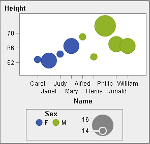 The Color role can be any data type. In this example, the Color role is assigned a Category data type.Note: When you add the Color role to a graph element in a data-driven lattice, the Measure data type is not always available. The Measure data type is not available for a bar chart, a waterfall chart, or a scatter plot.In some graph elements, such as a bar chart, the Group role also colors the graph based on the values of the group variable. In those graph elements, the Color role is used to color the data across a color gradient as shown in the following example. In this case, the Color role must be a Measure data type.In this example, the color gradient indicates the age range of the students.
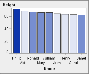
-
The Group role specifies a data column that is used to group the data. The graph elements for each unique group value are automatically distinguished by different visual attributes, such as color, line style, and so on. The Group role can be a Category data type or a Datetime data type.
-
The Data Label role specifies a data column that is used for data labels.
-
The Data Tip role specifies a data column that is used for data tips. The Data Tip role must be numeric.
-
The Target role specifies a data column that is used to generate a targeted bar chart. A targeted bar chart compares data that is summarized by the value of a category in reference to target values.
Copyright © SAS Institute Inc. All Rights Reserved.