Overview of Visualizations
About Visualizations
SAS Visual Analytics Explorer (the explorer) displays data by using visualizations. A visualization is an interactive visual representation of your data.
Visualization Types
You can assign any of the following types to your visualizations:
 |
Automatically selects the chart type based on the data that is assigned to the visualization. When you are first exploring
a new data set, automatic charts give you a quick view of the data.
For more information,
see Working with Automatic Charts.
|
|
|
Table
|
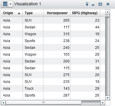 |
Displays the data as a table. Tables enable you to examine the raw data for each observation in the data source. You can rearrange the data columns and apply sorting.
For more information,
see Working with Tables.
|
|
Crosstab
|
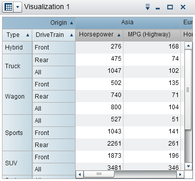 |
Displays the data as a crosstab. Crosstabs enable you to examine the data for intersections of hierarchy nodes or category values. You can rearrange the rows and columns and apply sorting. Unlike
tables, crosstabs display aggregated data.
For more information,
see Working with Crosstabs.
|
|
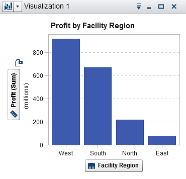
Bar Chart
|
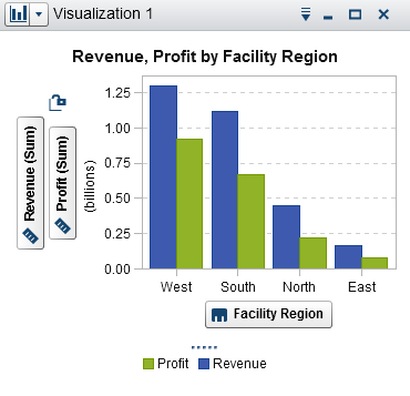 |
Displays the data as a bar chart. Bar charts are useful for comparing data that is aggregated by the distinct values of a category.
A bar chart consists of vertical bars or horizontal bars. You can apply grouping and
create lattices.
For more information,
see Working with Bar Charts.
|
|
Line Chart
|
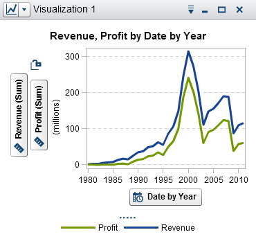 |
Displays the data as a line chart. A line chart is useful for data trends over time. Line charts support forecasting for predicting future values.
You can apply grouping and create lattices.
For more information,
see Working with Line Charts.
|
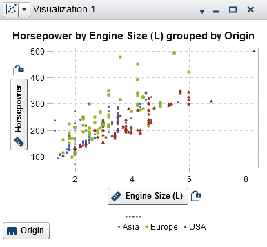 |
Displays the data as a scatter plot. Scatter plots are useful to examine the relationship between numeric data items.
In a scatter plot, you can apply statistical analysis with correlation and regression. Scatter plots support grouping.
When you apply more than two measures to a scatter plot, a scatter plot matrix compares each pair of measures.
For more information,
see Working with Scatter Plots.
|
|
|
Bubble Plot
|
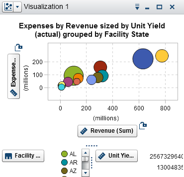 |
Displays the data as a bubble plot. A bubble plot displays the relationships among at least three measures. Two measures are represented
by the plot axes, and the third measure is represented by the size of the plot markers.
You can apply grouping and create lattices. By assigning a datetime data item to the plot, you can animate the bubbles to display changes in the data over time.
For more information,
see Working with Bubble Plots.
|
|
Network Diagram
|
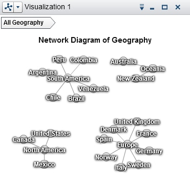 |
Displays a series of linked nodes. A network diagram displays the relationships between the values of categories or hierarchy levels.
You can indicate the values of measures through the sizes and colors of the nodes and the node links.
For more information,
see Working with Network Diagrams.
|
|
Sankey Diagram
|
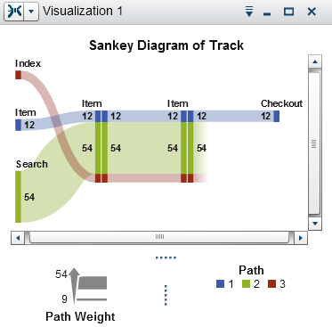 |
Displays a series of linked nodes, where the width of each link indicates the frequency
of the link or the value of
a measure. A Sankey diagram enables you to perform path analytics. Path analytics displays flows of data from one event (value) to another, as a series
of paths.
For more information,
see Working with Sankey Diagrams.
|
|
Histogram
|
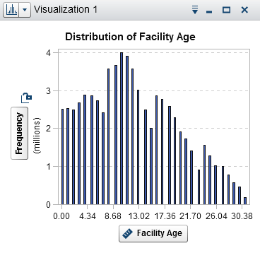 |
Displays the data as
a histogram. A histogram displays the distribution of values for a
single measure.
You can select the bar orientation, and you can select whether the values are displayed as a percentage or as a count.
For more information,
see Working with Histograms.
|
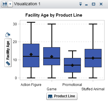 |
Displays the data as a box plot. A box plot displays the distribution of values for a single measure using a box
and whiskers. The size and location of the box indicate the range of values that are between the
25th and 75th percentile. Additional statistical information is represented by other visual features.
You can create lattices, and you can select whether the average (mean) value and outliers are displayed for each box.
For more information,
see Working with Box Plots.
|
|
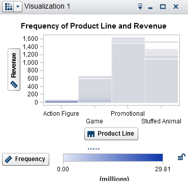 |
Displays the data as a heat map. A heat map displays the distribution of values for two data items using a table with colored cells. If you do not assign a measure to the Color data role, then a
cell’s color represents the frequency of each intersection
of values. If you assign a measure to the Color data
role, then a cell’s color represents the measure value of each
intersection of values.
For more information,
see Working with Heat Maps.
|
|
|
Geo Map
|
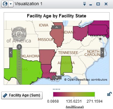 |
Displays the data as a geo map. A geo map displays your data as an overlay on a geographic map. You can display your data either as bubbles, as a scatter plot,
or as colored regions.
For more information,
see Working with Geo Maps.
|
|
Treemap
|
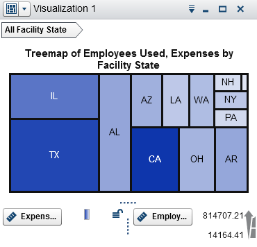 |
Displays the data as a treemap. A treemap displays your data as a set of rectangles
(called tiles). Each tile represents a category value or a hierarchy node. The size of each tile represents either the frequency of the category or the value
of a measure. The color of each tile can indicate the value of an additional measure.
For more information,
see Working with Treemaps.
|
|
Correlation Matrix
|
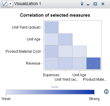 |
Displays the data as a correlation matrix. A correlation matrix displays the degree of correlation between measures as a series
of colored
rectangles. The color of each rectangle indicates the strength of the correlation.
For more information,
see Working with Correlation Matrices.
|
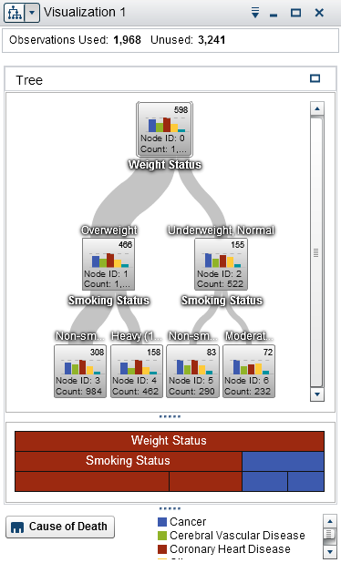 |
Displays the data as a decision tree. A decision tree displays a series of nodes as a tree, where the top node is the response data item, and each branch of the tree represents a split in the values of a predictor data item.
The splits enable you to see which values of the predictor data item correspond to
different distributions of values in the response data item.
For more information,
see Working with Decision Trees.
|
|
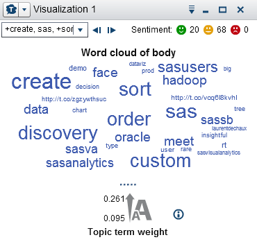 |
Displays a set of words from a character data item. Depending on the type of word cloud and your data roles, the size of each word in the cloud can indicate the relevance of the word to a topic, the frequency of the word in a
category, or the value of a measure.
You can use text analytics in a word cloud to identify topics and terms that appear
together in your data and to analyze the
sentiment of the documents in a topic.
For more information,
see Working with Word Clouds.
|
If SAS Visual Statistics is licensed at your site, then the following modeling visualizations are available:
-
Linear Regression
-
Logistic Regression
-
Cluster
For more information,
see Modeling Information.
Copyright © SAS Institute Inc. All Rights Reserved.