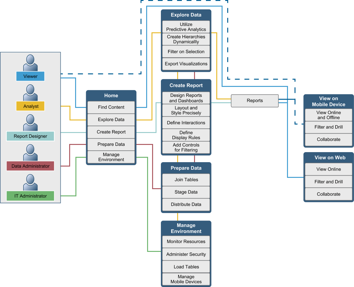
How Does SAS Visual Analytics Work?
You can use SAS Visual
Analytics to explore and view data, interact with and create reports,
and display reports on a mobile device or in a web viewer. You can
explore your data by using interactive visualizations such as charts,
histograms, and tables. Report authors can easily point and click
to query central sources of data. You can add filters and design the
layout using tables, graphs, and gauges using drag and drop to create
a well-formatted report.
Copyright © SAS Institute Inc. All rights reserved.