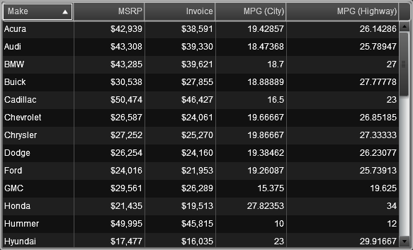
Using Tables to Display Results

Overview of the Table Types
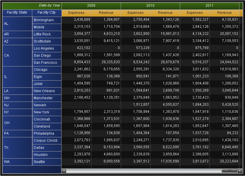
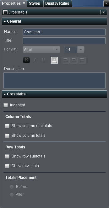
About List Tables

A list table is a two-dimensional representation of data in which the data values are arranged in unlabeled rows and labeled columns. List tables can use any data items from a data source. A list table cannot use a hierarchy.
A List Table
A List Table

About Crosstabs

A crosstab (also known as a crosstabulation table) shows an aggregate metric for the intersections of two or more categories. In a crosstab, a category is typically displayed on both the columns and the rows, and each cell value represents the aggregated measure from the intersection of the categories on the specific row and column. This type of table uses less space than a list table and is easier to read because data is grouped both horizontally and vertically.
A Crosstab
A Crosstab
Note: Frequency is displayed only when there are no measures in the crosstab.

Insert a Table into a Report

To insert a table into a report:
  • Drag the table icon from the Objects tab in the left pane and drop it onto the report canvas.
  • Select Insertthen selectTables and then select the menu item for the table object that you want to insert. The table is automatically placed in the report canvas. If you want the table to appear in a different place, then drag and drop it in a new location.
The following table lists the available table objects:
Icon
Table Type
list table icon
List Table
crosstab icon
Crosstab

Specify Table Properties

To specify the properties for tables:
  1. If not already selected, select the table in the report canvas that you want to update.
  2. In the right pane, click the Properties tab.
  3. Update the general properties for the table. Your choices are Name, Title, and Description.
  4. Update the object-specific properties for the table. For a list table, you can specify that you want detail data and totals. For a crosstab, you can specify that you want an indented layout; totals and subtotals for rows, columns, or both; as well as the placement of the totals and subtotals.
    Here is an example of the properties for crosstabs:
    Properties for a Crosstab
    Properties for a Crosstab

Specify Table Styles

To specify styles for tables:
  1. If not already selected, select the table in the report canvas that you want to update.
  2. In the right pane, click the Styles tab.
  3. Update the styles for the table. For a list table, you can customize the colors of Cells and Column headers. For crosstabs, you can customize the colors of Cells, Row headers, Column headers, and Measure headers.
    Here is an example of the styles for crosstabs:
    Styles for a Crosstab
    Styles for a Crosstab

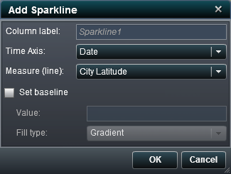
Add Sparklines to a List Table

A sparkline is a small line graph that presents a single trend over time. A sparkline fits in a single cell and does not have axes or labels. They are frequently used to present stock trends or production rates over time. A sparkline is intended to be both succinct and memorable. In SAS Visual Analytics Designer, you can add sparklines to a column in a list table.
To add sparklines:
  1. If not already selected, select the list table in the report canvas that you want to update.
  2. Right-click the list table and then select Add Sparkline. The Add Sparkline window is displayed.
    Add Sparkline Window
    Add Sparkline Window
  3. Enter a Column label.
  4. Select a Time Axis.
  5. Select a Measure (line).
  6. (Optional) Select the Set baseline check box. Enter a Value and select a Fill type. Your choices are Gradient or Solid.
  7. Click OK. The sparkline is added to the last column in the list table. You can move the sparkline to another location in the table.
To edit a sparkline, right-click in the sparkline column in the list table and then select Add Sparkline. The Add Sparkline window is displayed. Update the information and then click OK to save your changes.
To delete a sparkline, right-click in the sparkline column in the list table and then select Remove Sparkline.