Statistical Graphics Using ODS
LS-Means Diffogram with PROC GLIMMIX
This example is taken from the section Graphics for LS-Mean Comparisons in Chapter 45: The GLIMMIX Procedure. The following statements create a SAS data set that contains measurements from an experiment that investigates how snapdragons grow in various soils:
data plants;
   input Type $ @;
   do Block = 1 to 3;
      input StemLength @@;
      output;
   end;
   datalines;
Clarion   32.7 32.3 31.5   Clinton   32.1 29.7 29.1   Knox      35.7 35.9 33.1
ONeill    36.0 34.2 31.2   Compost   31.8 28.0 29.2   Wabash    38.2 37.8 31.9
Webster   32.5 31.1 29.7
;
The following statements run PROC GLIMMIX:
proc glimmix data=plants order=data plots=diffogram;
   class Block Type;
   model StemLength = Block Type;
   lsmeans Type;
run;
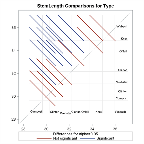
The PLOTS=DIFFOGRAM option produces a diffogram, shown in Figure 21.10, that displays all the pairwise least squares mean differences and indicates which are significant.
Figure 21.10: LS-Means Diffogram