The POWER Procedure
- Overview
-
Getting Started

-
Syntax

-
Details

-
Examples
 One-Way ANOVAThe Sawtooth Power Function in Proportion AnalysesSimple AB/BA Crossover DesignsNoninferiority Test with Lognormal DataMultiple Regression and CorrelationComparing Two Survival CurvesConfidence Interval PrecisionCustomizing PlotsBinary Logistic Regression with Independent PredictorsWilcoxon-Mann-Whitney Test
 - References
The default locations for plotting symbols are the points computed directly from the power and sample size algorithms. For example, Output 77.8.5 shows plotting symbols corresponding to computed points. The curves connecting these points are interpolated (as indicated by the INTERPOL= option in the PLOT statement).
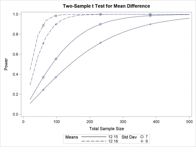
You can modify the locations of plotting symbols by using the MARKERS= option in the PLOT statement. The MARKERS= ANALYSIS option places plotting symbols at locations corresponding to the input specified in the analysis statement preceding the PLOT statement. You might prefer this as an alternative to using reference lines to highlight specific points. For example, you can reproduce Output 77.8.5, but with the plotting symbols located at the sample sizes shown in Output 77.8.1, by using the following statements:
proc power plotonly;
   twosamplemeans test=diff
      groupmeans   = 12 | 15 18
      stddev       = 7 9
      power        = .
      ntotal       = 232 382 60 98;
   plot x=n min=20 max=500
      markers=analysis;
run;
The analysis statement here is the TWOSAMPLEMEANS statement. The MARKERS= ANALYSIS option in the PLOT statement causes the plotting symbols to occur at sample sizes specified by the NTOTAL= option in the TWOSAMPLEMEANS statement: 232, 382, 60, and 98. The resulting plot is shown in Output 77.8.21.
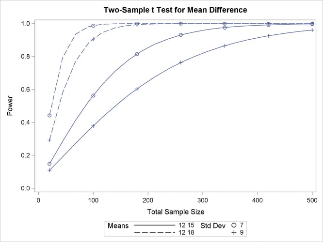
You can also use the MARKERS= NICE option to align symbols with the tick marks on one of the axes (the X axis when the X= option is used, or the Y axis when the Y= option is used):
   plot x=n min=20 max=500
      markers=nice;
The plot created by this PLOT statement is shown in Output 77.8.22.
Note that the plotting symbols are aligned with the tick marks on the X axis because the X= option is specified.

