Statistical Graphics Using ODS
Many styles are designed to make color plots where lines, functions, and groups of observations can be distinguished even when the plot is sent to a black-and-white printer. Hence, lines differ not only in color but also in pattern. Similarly, markers differ in both color and symbol. This is not true with the HTMLBLUE, PEARL, and SAPPHIRE styles, which are all-color styles.
You can easily modify any style to be an all-color style by using the ATTRPRIORITY= option. For example:
proc template;
   define style styles.StatColor;
      parent = statistical;
      style Graph from Graph / attrpriority = "Color";
   end;
run;
Alternatively, you can make an all-color style with the %MODSTYLE autocall macro. It creates a new style by modifying a parent
style and reordering the colors, line patterns, and marker symbols in the GraphDatan style elements (see the section Some Common Style Elements). By default, the macro creates a new style that distinguishes lines and groups only by color. The macro is documented in
the section Style Template Modification Macro.
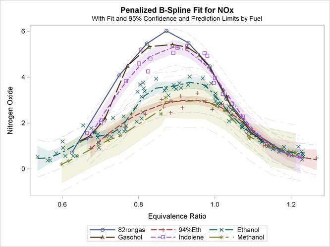
The following example illustrates the default use of the macro and is taken from the section Fitting a Curve through a Scatter Plot in Chapter 104: The TRANSREG Procedure. The data come from an experiment in which nitrogen oxide emissions from a single cylinder engine are measured for various
combinations of fuel and equivalence ratio. This gas data set is available from the Sashelp library.
The following statements fit separate curves for each group and produce Figure 21.53 and Figure 21.54:
ods graphics on;
ods listing style=statistical;

proc transreg data=sashelp.Gas ss2 plots=transformation lprefix=0;
   model identity(nox) = class(Fuel / zero=none) * pbspline(EqRatio);
run;

%modstyle(parent=statistical, name=StatColor)
ods listing style=StatColor;

proc transreg data=sashelp.Gas ss2 plots=transformation lprefix=0;
   model identity(nox) = class(Fuel / zero=none) * pbspline(EqRatio);
run;
The first PROC TRANSREG step uses the STATISTICAL style to create the fit plot in Figure 21.53, which uses different colors, line patterns, and markers for each group. Then the macro creates a new style, called STATCOLOR, that inherits its characteristics from the STATISTICAL style. Only the attributes of the lines and markers are changed. In Figure 21.54, which is created with the modified style, the groups are differentiated only by color. This is the easiest and most common way for you to use this macro. However, you can use it to perform other style modifications as illustrated in the section Changing the Default Markers and Lines. The macro is documented in the section Style Template Modification Macro.