Blocks
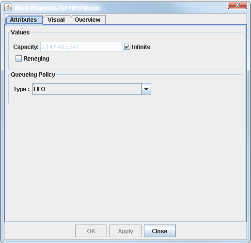
The Block Properties dialog box contains a description of a block’s functionality; it is used to edit block parameters and display properties. You open the Block Properties dialog box for a block by double-clicking on the block icon in a model window. Figure 6.1 shows the Block Properties dialog box for the Queue block. Blocks that have specific properties or parameters that can be edited have at least one tab for that purpose. For example, you use the Attributes tab in Figure 6.1 to edit the Queue block parameters. If a block supports the saving of data (such as the Number Holder block), then the Block Properties dialog box contains another tab labeled Save where you can specify options that are related to saving data.
All Block Properties dialog boxes have a Visual tab and an Overview tab. The Overview tab provides a description of the block’s functionality and includes a description of the block’s parameters and ports. The
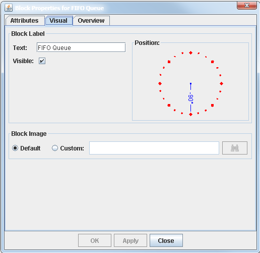
Visual tab provides controls to manage the display properties of a block. Figure 6.2 shows the Visual tab for the Queue block. You use the Block Label controls to edit the block label (using the Text field), to show or hide the label in the model window (using the Visible option), and to position the label around the block icon. For example, a position of ![]() places the label at the bottom of the icon, and a position of
places the label at the bottom of the icon, and a position of ![]() places it at the top of the icon. You use the Block Image controls to specify the block’s icon image. Each block has a default icon image. If you select the Custom option, then you need to specify the file path of the image file.
places it at the top of the icon. You use the Block Image controls to specify the block’s icon image. Each block has a default icon image. If you select the Custom option, then you need to specify the file path of the image file.
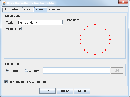
For blocks that have a display component, such as the Number Holder and the Histogram blocks, the Visual tab contains the To Display Component option, which you can use to show or hide the block’s display component. Figure 6.3 shows the Visual tab for the Number Holder block with the To Display Component option selected.


