| Animating Graphs |
Animating Selected Graphs
Line plots are an effective way to look at time-dependent data. You can animate line plots and other graphs by selecting them before using the animation dialog. This animates lines and other features in the graph, not just selected observations.
| Select CO, then SO2, then HOUR in the data window. |
The last variable you select, HOUR, will receive the X role in the line plot.
| Choose Analyze:Line Plot ( Y X ). |
This creates a plot with two overlaid lines. The lines are jagged because the data contain seven observations for each hour.
| Select the line plot by clicking on any edge. |
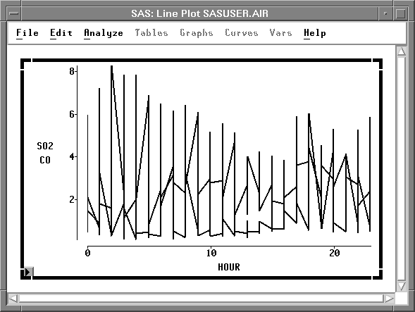
Figure 23.6: Selected Line Plot
| Select DAY in the animation dialog, then click the Apply button. |
This animates the line plot, showing pollutant concentrations for each day of the week.
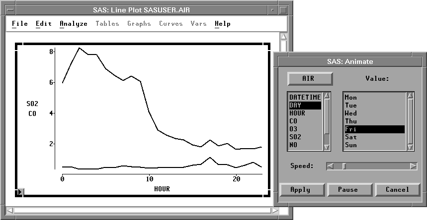
Figure 23.7: Animating a Line Plot
Notice the peak CO concentrations on weekday mornings and afternoons. These might be caused by increased automobile emissions during rush-hour traffic.
| When you are finished, click Cancel to close the animation dialog |
Copyright © 2007 by SAS Institute Inc., Cary, NC, USA. All rights reserved.