Note: See Clipping Extreme Points in the SAS/QC Sample Library.
In some control chart applications, the out-of-control points can be so extreme that the remaining points are compressed to a scale that is difficult to read. In such cases, you can clip the extreme points so that a more readable chart is displayed, as illustrated in the following example.
A company producing copper tubing uses ![]() and R charts to monitor the diameter of the tubes. Based on previous production, known values of 70mm and 0.75mm are available
for the mean and standard deviation of the diameter. The diameter measurements (in millimeters) for 15 batches of five tubes
each are provided in the data set NEWTUBES.
and R charts to monitor the diameter of the tubes. Based on previous production, known values of 70mm and 0.75mm are available
for the mean and standard deviation of the diameter. The diameter measurements (in millimeters) for 15 batches of five tubes
each are provided in the data set NEWTUBES.
data newtubes;
   label Diameter='Diameter in mm';
   do batch = 1 to 15;
      do  i = 1 to 5;
         input Diameter @@;
         output;
      end;
   end;
   datalines;
69.13  69.83  70.76  69.13  70.81
85.06  82.82  84.79  84.89  86.53
67.67  70.37  68.80  70.65  68.20
71.71  70.46  71.43  69.53  69.28
71.04  71.04  70.29  70.51  71.29
69.01  68.87  69.87  70.05  69.85
50.72  50.49  49.78  50.49  49.69
69.28  71.80  69.80  70.99  70.50
70.76  69.19  70.51  70.59  70.40
70.16  70.07  71.52  70.72  70.31
68.67  70.54  69.50  69.79  70.76
68.78  68.55  69.72  69.62  71.53
70.61  70.75  70.90  71.01  71.53
74.62  56.95  72.29  82.41  57.64
70.54  69.82  70.71  71.05  69.24
;
The following statements create the ![]() and R charts shown in Figure 17.168 for the tube diameter:
and R charts shown in Figure 17.168 for the tube diameter:
symbol value=plus;
title  'Control Chart for New Copper Tubes' ;
proc shewhart data=newtubes;
   xrchart Diameter*batch /
      mu0    = 70
      sigma0 = 0.75;
run;
Batches 2 and 7 result in extreme out-of-control points on the mean chart, and batch 14 results in an extreme out-of-control point on the range chart. The vertical axes are scaled to accommodate these extreme out-of-control points, and this in turn forces the control limits to be compressed.

You can request clipping by specifying the option CLIPFACTOR=factor, where factor is a value greater than one (useful values are typically in the range 1.5 to 2). Clipping is applied in two steps, as follows:
-
If a plotted statistic is greater than
 , it is temporarily set to , where
![\[ y\! _{\mbox{\scriptsize max}}=\mbox{LCL}+(\mbox{UCL}-\mbox{LCL}) \times \mi {factor} \]](images/qcug_shewhart0362.png)
If a plotted statistic is less than
 , it is temporarily set to , where
![\[ y\! _{\mbox{\scriptsize min}}=\mbox{UCL}-(\mbox{UCL}-\mbox{LCL}) \times \mi {factor} \]](images/qcug_shewhart0364.png)
-
Axis scaling is applied to the clipped statistics. Then the
 values are reset to the maximum value on the axis and the
  values are reset to the minimum value on the axis.
Notes:
-
Clipping is applied only to the plotted statistics and not to the statistics tabulated or saved in an output data set.
-
Because the factor must be greater than one, clipping does not affect whether a plotted statistic is inside or outside the control limits.
-
Tests for special causes are applied to the plotted statistics before they are clipped, and clipping does not affect how the tests are flagged on the chart. In some situations, however, clipping can make the patterns associated with the tests less evident on the chart.
-
When primary and secondary charts are displayed, the same clipping factor is applied to both charts.
-
A special symbol is used for clipped points (the default symbol is a square), and a legend is added to the chart indicating the number of points that were clipped.
The following statements create ![]() and R charts, shown in Figure 17.169, that use a clipping factor of 1.5:
and R charts, shown in Figure 17.169, that use a clipping factor of 1.5:
symbol value=plus;
title  'Control Chart for New Copper Tubes' ;
proc shewhart data=newtubes;
   xrchart Diameter*batch /
      mu0        = 70
      sigma0     = 0.75
      clipfactor = 1.5;
run;
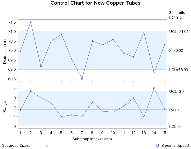
In Figure 17.169, the extreme out-of-control points are clipped making the points plotted within the control limits more readable. The clipped points are marked with a square, and a clipping legend is added at the lower right of the display.
Other clipping options are available, as illustrated by the following statements:
symbol value=plus;
title  'Control Chart for New Copper Tubes' ;
proc shewhart data=newtubes;
   xrchart Diameter*batch /
      mu0         = 70
      sigma0      = 0.75
      clipfactor  = 1.5
      clipsymbol  = dot
      cliplegpos  = top
      cliplegend  = '# Clipped Points'
      clipsubchar = '#';
run;

Specifying CLIPSYMBOL=DOT marks the clipped points with a dot instead of the default square. Specifying CLIPLEGPOS=TOP positions the clipping legend at the top of the chart. The options CLIPLEGEND=’# Clipped Points’ and CLIPSUBCHAR=’#’ request the clipping legend 3 Clipped Points. For more information about the clipping options, see the appropriate entries in Dictionary of Options: SHEWHART Procedure.