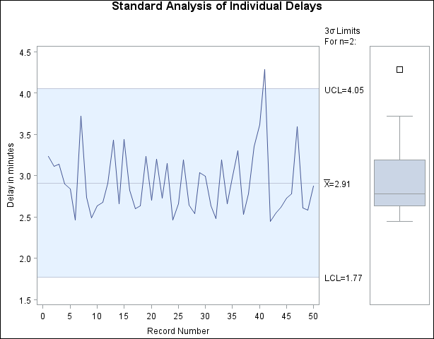
As a first step, the delays were analyzed using an X chart created with the following statements. The chart is displayed in Figure 17.215.
title 'Standard Analysis of Individual Delays';
proc shewhart data=Calls;
   irchart Time * Recnum /
      rtmplot   = schematic
      outlimits = delaylim
      nochart2 ;
   label Recnum = 'Record Number'
         Time   = 'Delay in minutes' ;
run;
You may be inclined to conclude that the 41st point signals a special cause of variation. However, the box plot in the right margin (requested with the RTMPLOT= option) indicates that the distribution of delays is skewed. Thus, the reason that the measurements are grouped well within the control limits is that the limits are incorrect and not that the process is too good for the limits.
Note: This example assumes the process is in statistical control; otherwise, the box plot could not be interpreted as a representation of the process distribution. You can check the assumption of normality with goodness-of-fit tests by using the CAPABILITY procedure, as shown in the statements that follow.