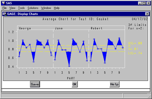
The average chart shows operator variability (reproducibility) and part-to-part variation. Press the button in the Measurements window and select . The average chart of the data is displayed, as shown in Figure A.11.
Note how most of the averages are beyond the control limits. Also, the out-of-control averages tend to be the same for each operator. This indicates that this study can detect part-to-part variation. If the averages were not outside the control limits, the part-to-part variation would be hidden in the gage variation.
Operator variability can be seen on the average chart by comparing the operator averages for each part. These averages will differ when there is variability.
Note that this is not a standard use of the Shewhart chart. Ordinarily the fact that the points fall outside the control limits would raise concerns that the process is out of control, but here the opposite conclusion is drawn.
You can save the average chart by pressing the button, as described for the range chart. Press the button to leave this window.