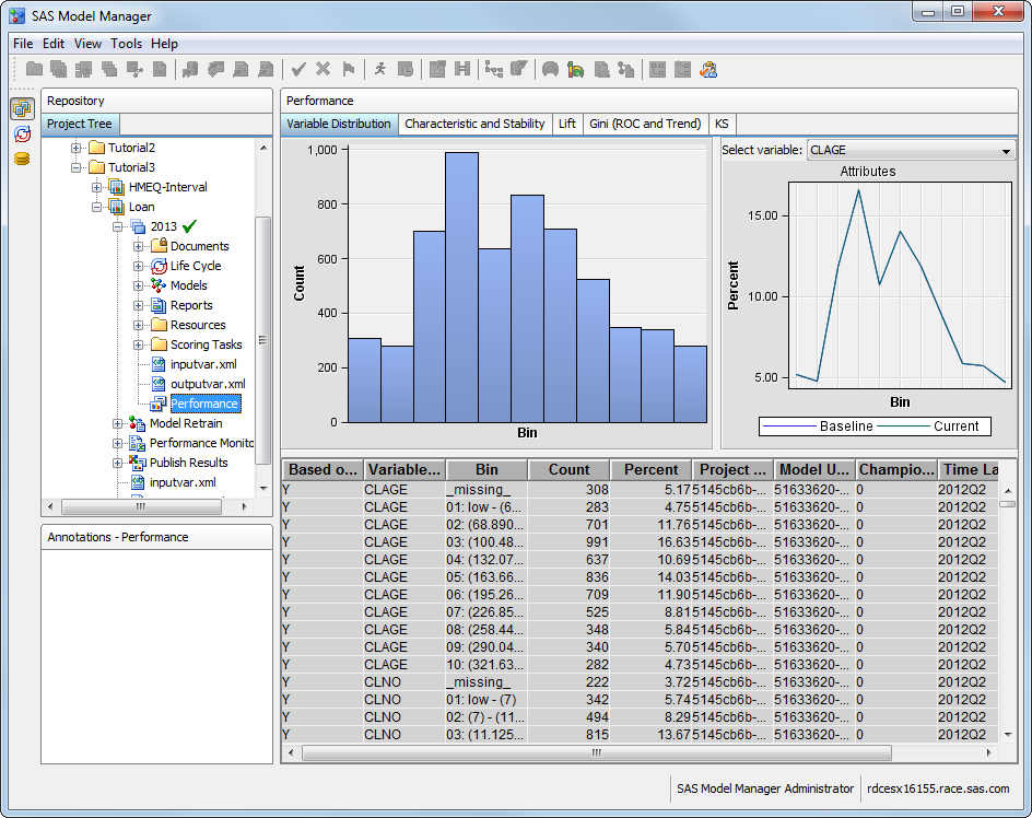
To demonstrate the Variable
Distribution chart features:
In the SAS Model Manager
Project Tree, expand Tutorial3, expand Loan,
and expand 2013.
Select the Performance node
to display the Performance charts.
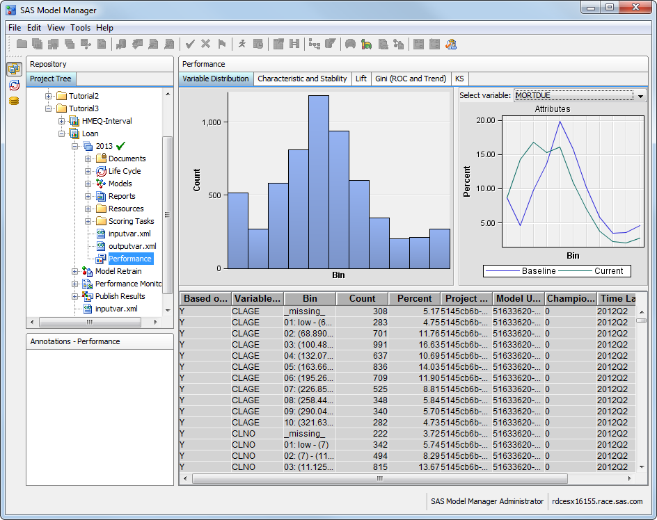
On the Variable
Distribution tab, click the Select variable box
and select MORTDUE. The training distribution
data and charts display the data for the MORTDUE variable.
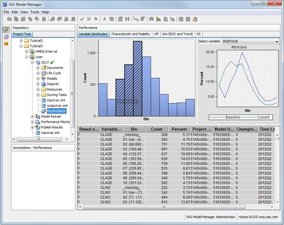
Click on a bar to highlight
the corresponding entry in the table. If necessary, move the scroll
bar to locate the highlighted entry in the table.
In the table, click
the highlighted row and drag the mouse to select multiple rows. The
associated bars in the chart are highlighted as you select the associated
rows.
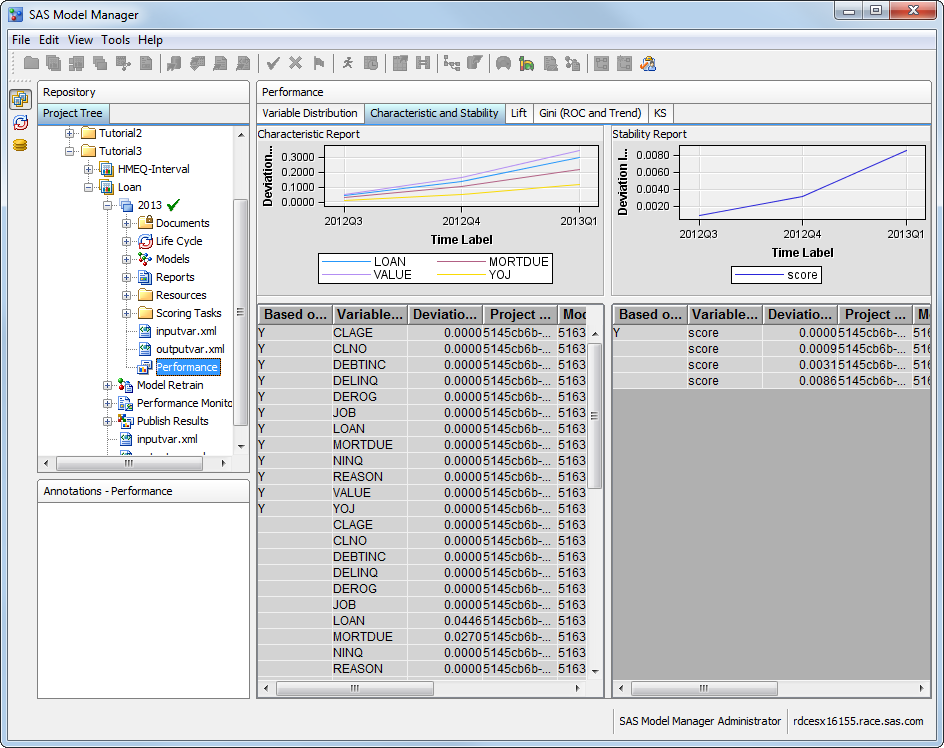
View the Characteristic and Stability Charts
To demonstrate the Characteristic
and Stability chart features:
Select the Characteristic
and Stability tab.
Select table entries
to highlight the corresponding chart points.
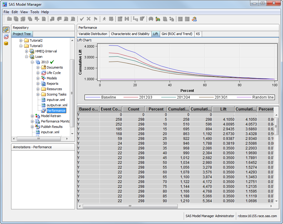
View the Lift Chart
To demonstrate the Lift
chart features:
Note: This chart is not displayed
for prediction models with an interval target.
Select the Lift tab.
To change the chart
to show markers:
Right-click the chart
and select Graph Properties.
In the Properties window,
select Line from the left-side menu.
Click the Markers tab,
and select the Show Markers check box.
Click Apply to
save the changes, and then click OK to close
the window.
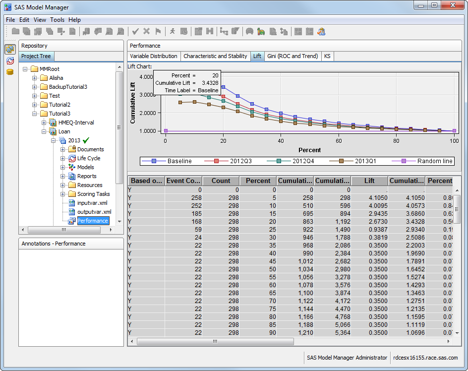
Move the pointer along
one lift marker. You should see a pop-up message when the pointer
is resting on a data point or is close to a data point.
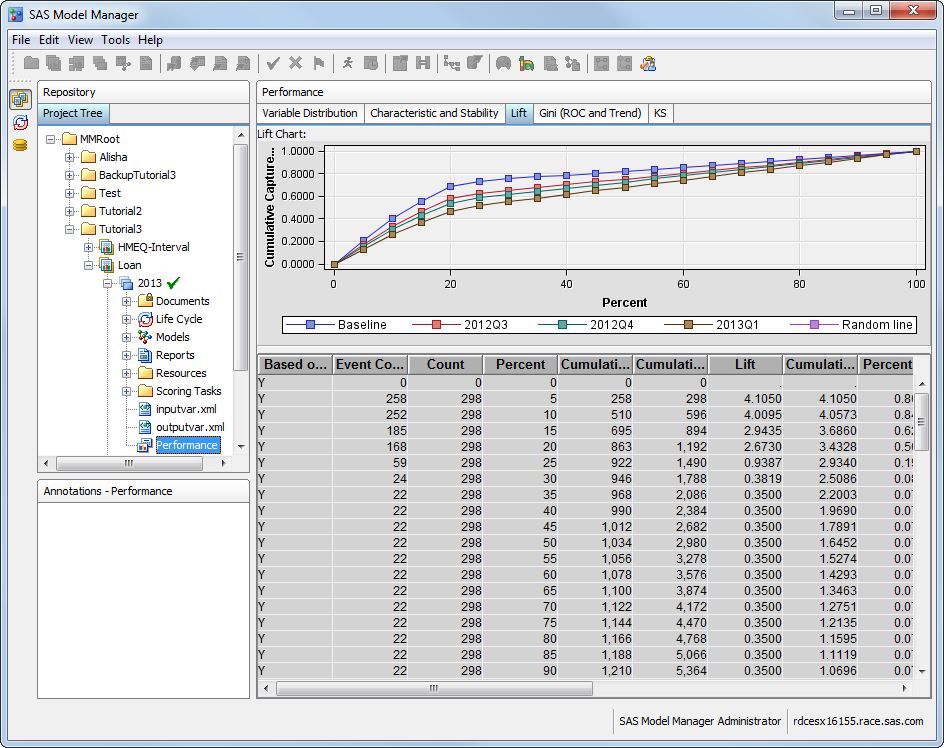
To chart the cumulative
captured response:
Right-click the chart
area.
Select Data
Options. The Data Options Dialog window
appears.
Click the Roles tab
if it is not already displayed. Select Y from
the Roles drop-down list.
Select the variable cuCapturedResp from
the Available Variables list box and click
the right-arrow to move it to the Assigned Variables list
box.
Select the cuLift variable
and click the left-arrow to remove it from the Assigned
Variables list box. The only variable in the Assigned
Variables box should be cuCapturedResp.
Click OK.
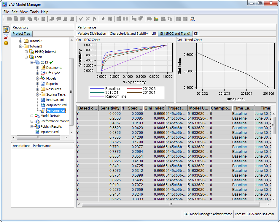
View the Gini (ROC and Trend) Charts
To view the ROC and
Gini charts, select the GINI (ROC and Trend) tab.
Note: This chart is not displayed
for prediction models with an interval target.
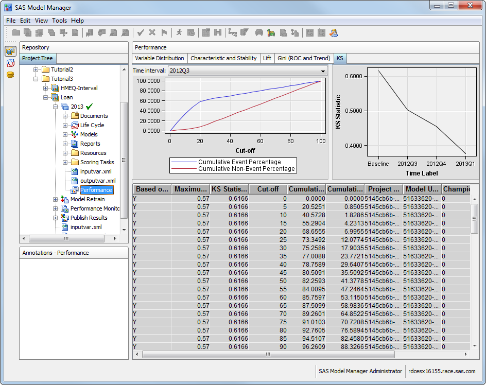
View the Kolmogorov-Smirnov (KS) Chart
To view the KS chart
from the SAS Model Manager user interface:
Note: This chart is not displayed
for prediction models with an interval target.
Select the KS tab.
Select a different time
point from the drop-down list of the Time Interval field.
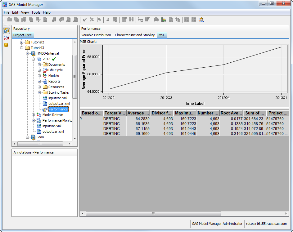
View the Mean Squared Error (MSE) Chart
To view the MSE chart
from the SAS Model Manager user interface:
Note: This chart is displayed only
for prediction models with an interval target.
In the SAS Model Manager
Project Tree, expand Tutorial3, expand HMEQ-Interval,
and expand 2013.
Select the Performance node
to display the Performance charts.