Types of Performance Monitoring
Overview of the Types of Performance Monitoring
After a champion model is in production, you can monitor the performance of the model by analyzing the performance
results. You can create the performance output interactively using the Edit Performance Definition wizard on the Performance page of a project or you
can submit batch programs within SAS.
You can create the following
types of performance output:
Summary Results
The Summary results
summarize the number of models, the number of versions, the number
of scoring tests, and the number of reports. The summary information
enables you to compare the contents of folders, projects, and versions.
You view the Summary results by selecting Actions View Summary.
Data Composition Reports
The Variable Distribution report shows you the distributions for a variable in one
or more time periods, which enables you to see the differences and changes over time.
The Characteristic and Stability reports detect and quantify shifts in the distribution
of variable values that occur in input data and scored output data over time. By analyzing these shifts, you can gain insights on scoring input and
output variables.
Model Monitoring Reports
The model monitoring reports are a collection of performance assessment reports that
evaluate the predicted and actual target values. The model monitoring reports create several charts:
-
Lift
-
Gini - ROC (Receiver Operating Characteristic)
-
Gini - Trend
-
KS
-
MSE (Mean Squared Error) for prediction models
When you create Data
Composition reports and Model Monitoring reports, you can set performance
index warnings and alerts. When certain thresholds are met, SAS Model Manager
can send a warning and alert notification to email addresses that
you configure either in the Edit Performance Definition wizard or in a SAS program.
You view the Data Composition
reports and the Model Monitoring reports on the Results tab
on the Performance page.
Summary Results
The Summary results
summarizes the contents of different folders and projects.
The contents of the
Summary results is dynamic and is updated according to the selected
project. The scope of the information that is reported is defined
by the collection of folders and objects that exist beneath the folder
that is selected.
To view the Summary
results, select ActionsView
Summary.
Use the following sections
to evaluate and compare the contents of the project:
General
Use the General section to browse the number of models, the number of versions, and the number of scoring tests.
Summary of Reports
Use the Summary
of Reports section to browse the number of reports that are available on the Reports page for the
selected object.
Model Target Variable Report
Use the Model
Target Variable Report to see the frequency with which target variables are used in the models that exist for the selected object. Each unique model target variable is reported, listing the number of models that use that variable as a target variable.
Model Input Variable Report
Use the Model
Input Variable Report to see the frequency with which input variables are used in the models for a folder or project. Each unique model input variable is reported, listing the number of models that use that variable as an input variable.
Data Composition Reports
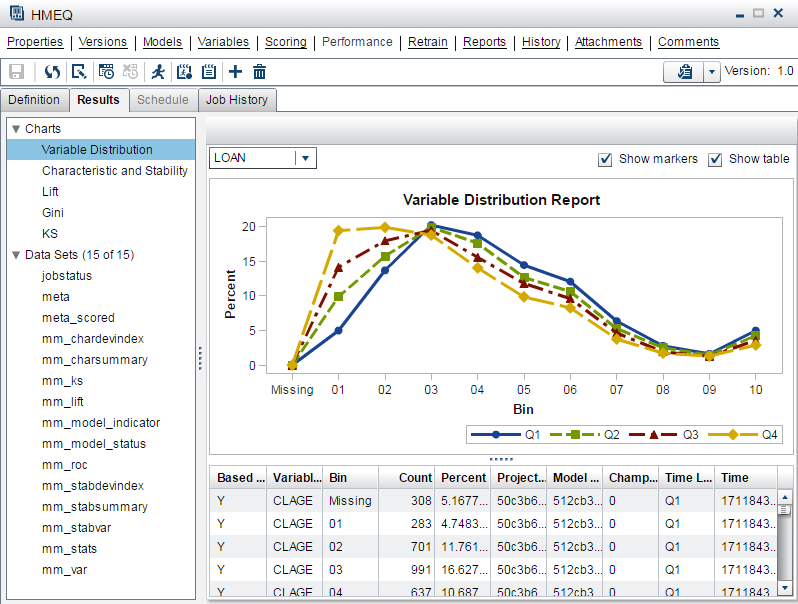
Variable Distribution Report
Select the Results tab
on the Performance page to view the Variable
Distribution report. The variable distribution chart is a graphical representation of distributions over a period of time for the
selected variable. Each line plot represents the data for a specific period of time. The Y-axis is the percentage of
observations in a bin that is proportional to the total count.
To change the variable that appears in the chart, select a variable from the drop-down list.
Here is an example of
a Variable Distribution report. By placing the cursor over a point
in the chart, you can view the data for that point.
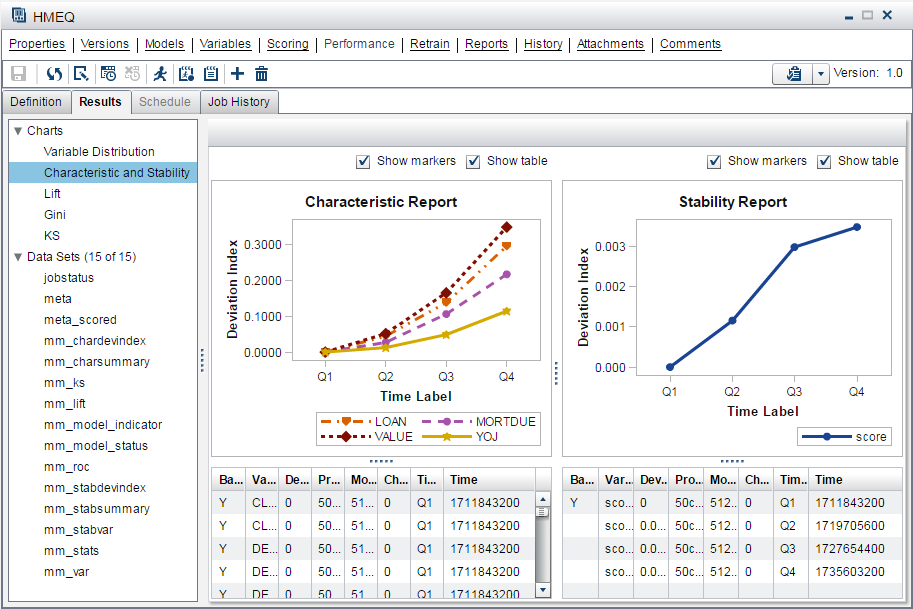
Characteristic and Stability Reports
Together, the Characteristic and Stability reports detect and quantify shifts that
can occur in the distribution of model performance data, scoring input data, and the scored output data that a model produces.
Note: For each time period that
you execute a performance definition, SAS Model Manager
creates a new point on the charts. Line segments between points in
time do not appear on the charts unless you specify at least three
data sources and collection dates as part of the performance definition.
Characteristic Report
The Characteristic
report detects and quantifies the shifts in the distribution of variable
values in the input data over time. These shifts can point to significant
changes in customer behavior that are due to new technology, competition,
marketing promotions, new laws, or other influences.
To find shifts, the Characteristic report compares the distributions of the variables
in these two data sets:
-
the training data set that was used to develop the model
-
a current data set
If large enough shifts
occur in the distribution of variable values over time, the original
model might not be the best predictive or classification tool to use
with the current data.
The Characteristic report uses a deviation index to quantify the shifts in a variable's values distribution that can occur between
the training data set and the current data set. The deviation index is computed for
each predictor variable in the data set, using this equation:

Numeric predictor variable values are placed into bins for frequency analysis. Outlier values are removed to facilitate better placement
of values and to avoid scenarios that can aggregate most observations into a single
bin.
If the training data set and the current data set have identical distributions for
a variable, the variable's deviation index is equal to 0. A variable with a deviation
index value that is P1>2 is classified
as having a mild deviation. The Characteristic report uses the performance measure
P1 to count the number of variables that receive a deviation index value that is greater
than 0.1.
A variable that has a deviation index value that is P1>5 or P25>0 is classified as
having a significant deviation. A performance
measure P25 is used to count the number of variables that have significant deviations,
or the number of input variables that receive a deviation index score value that is
greater than or equal to 0.25.
Stability Report
The Stability report evaluates changes in the distribution of scored output variable values as models score data over time, and detects and quantifies shifts in the distribution
of output variable values in the data that is produced by the models. If an output
variable from the training data set and the output variable from the current data
set have identical distributions, then that output variable's deviation index is equal
to 0. An output variable with a deviation index value that is greater than
0.10 and less than 0.25 is classified as having a mild deviation. A variable that
has a deviation index value that is greater than 0.30 is classified as having a significant
deviation. Too much deviation in predictive variable output can indicate that model
tuning, retraining, or replacement might be necessary.
Here is an example of
Characteristic and Stability reports. By placing the cursor over a
point in the chart, you can view the data for that point.
Model Monitoring Reports
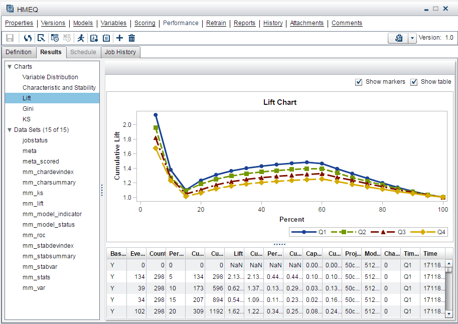
Lift Report
The Lift report provides a visual summary of the usefulness of the information that
is provided by a model for predicting a binary outcome variable. Specifically, the report summarizes the utility that you can expect by using the
champion model as compared to using baseline information only. Baseline information is the prediction accuracy performance of
the initial performance monitoring definition or batch program using operational data.
A monitoring Lift report can show a model's cumulative lift at a given point in time or the sequential lift performance of a model's lift over
time. To detect model performance degradation, you can set the Lift report performance
indexes Lift5Decay, Lift10Decay,
Lift15Decay, and Lift20Decay. The data that underlies the Lift report is contained
in the report file mm_lift.sas7bdat. This file is available on the Attachments page.
Here is an example of
a monitoring Lift report. By placing the cursor over a point in the
report, you can view the data for that point.
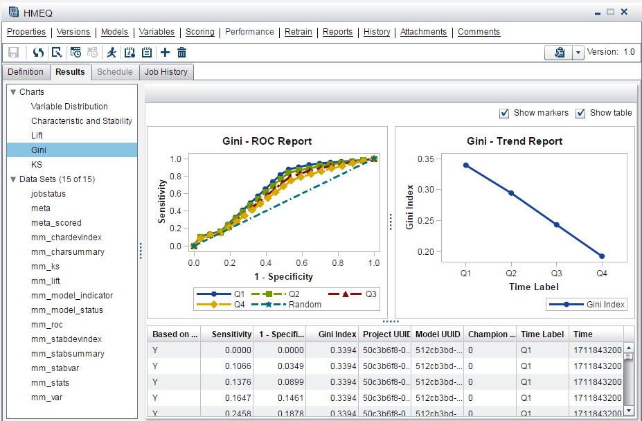
Gini (ROC and Trend) Report
The Gini
(ROC and Trend) reports show you the predictive accuracy of a model that has a binary target. The plot displays sensitivity information about the y-axis and 1-Specificity information
about the x-axis. Sensitivity is the proportion of true positive events. Specificity
is the proportion of true negative events. The Gini index is calculated for each ROC curve. The Gini coefficient, which represents the area under the ROC curve, is a benchmark statistic that can be used to summarize the predictive accuracy of a model.
Use the monitoring Gini
(ROC and Trend) report to detect degradations in the
predictive power of a model.
The data that underlies
the monitoring Gini (ROC and Trend) report
is contained in the report component file mm_roc.sas7bdat.
The following chart
is an example of a monitoring Gini (ROC and Trend) report.
By placing the cursor over a point in the chart, you can view the
data for that point.
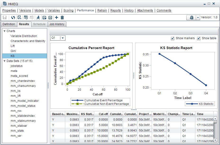
KS Report
The KS report contains the Kolmogorov-Smirnov (KS) test plots for models with a binary
target. The KS statistic measures the maximum vertical separation, or deviation between
the cumulative distributions of events and non-events. This trend report uses a summary data set that plots the KS statistic and the KS probability cutoff values over time.
Use the KS report to
detect degradations in the predictive power of a model. To scroll
through a successive series of KS performance depictions, select a
time interval from the Time Interval list box. If model performance is declining, it is indicated by the decreasing distances
between the KS plot lines.
To detect model performance degradation, you can set the ksDecay performance index
in the KS report.
The data that underlies
the KS chart is contained in the report component file mm_ks.sas7bdat.
The following report
is an example of a KS report. By placing the cursor over a point in
the chart, you can view the data for that point.
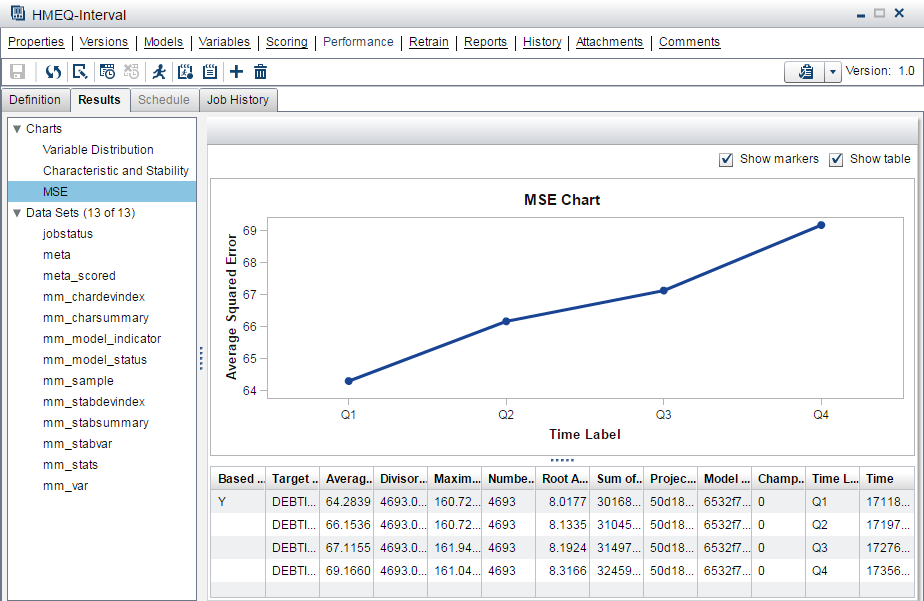
Mean Squared Error Report
The Mean Squared Error (MSE) report checks the accuracy of a prediction model with an interval target by comparing the estimation derived from the test data and the actual outcomes that are associated with the test data for different time
periods.
The following report
is an example of an MSE report.
Copyright © SAS Institute Inc. All Rights Reserved.
Last updated: February 14, 2017