Domain Intelligence Offered by SAS IT Resource Management
Introduction to SAS IT Resource Management Domain Intelligence
SAS IT Resource Management
offers a wide variety of reports that provide analytical intelligence
about IT resources, all of which are delivered by Gallery Manager.
Gallery Manager is the
single source of performance and capacity information about the IT
infrastructure. It is designed to deliver IT Intelligence to any individual
in an organization that wants that information. For example, see
the following gallery that shows one page of a public gallery.
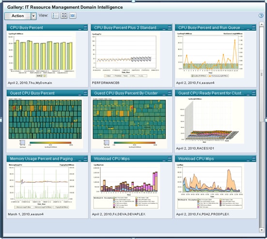
Each of the reports
shown in a gallery has a particular value to individuals throughout
an organization. The selection of a report type to communicate an
IT domain intelligence fact is best made by understanding both the
message and the target audience. Over 4,000 unique reports are supplied
with SAS IT Resource Management. Each of these reports can be used
as is, or copied and edited to satisfy the unique needs of an organization.
Charts to Communicate Forecasts, Predictions, and Analytical Results
Using Charts to Present Analytic Results
SAS IT Resource Management
delivers sets of supplied reports that communicate trends, forecasts,
predictions, and analytical results. It also delivers SAS analytical
calculation and illustration capabilities as well as specific implementations
of these capabilities for the purpose of IT performance management
and capacity planning. One such example of these special implementations
is the exhaust forecast chart. This type of chart calculates and graphs
the amount of time that is predicted for a particular aspect of an
IT resource to reach a threshold.
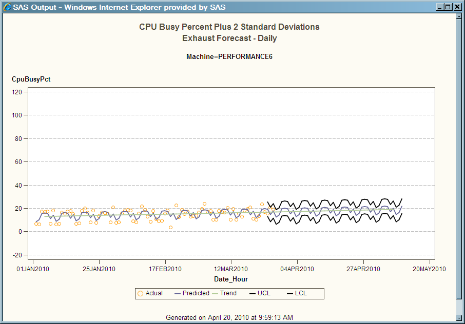
Example of Using Forecast Charts with Microsoft System Center Operations Manager Data
As illustrated
in the preceding exhaust forecast chart, the actual measurements (shown
as yellow points) are used to create a forecast for the CPU Busy Percent
with 2 Standard Deviations (shown in the purple line). This purple
line indicates the variations over the reported time period (daily).
Next, this chart shows the trend line (the green smooth line on the
chart). Finally, the upper and lower confidence boundaries are presented
as an indication of the accuracy of the predicted and forecasted values
presented on the chart.
Using Forecast Charts for Performance Management and Capacity Planning
A primary
job function of the capacity manager is to appropriately size the
IT enterprise to accommodate the needs of the business that it services
in terms of the availability and performance of IT resources. Successfully
performing this task requires the capacity planner to:
Exhaust reports
are an excellent means to accomplish this task. Exhaust reports are
possible through the delivery of SAS statistics and advanced analytic
capabilities with SAS IT Resource Management. For any IT element for
which a fixed capacity exists (such as CPU, disk, memory, bandwidth,
and so on), exhaust reports are essential. These reports can predict,
with adequate lead time to respond, the exhaustion of those IT resources.
Exhaust reports can also be used to anticipate the obsolescence of
resources from the IT enterprise. SAS analytics can forecast and predict
any aspect of the IT data available from the SAS IT Resource Management
solution.
The forecast chart is
configured to accommodate the amount of time that will be required
to procure, install, and configure additional components to meet the
demand for this server to ensure that the IT enterprise sustains the
business that it supports.
IT performance data
from Windows and UNIX systems is derived from many sources. SAS IT
Resource Management supports adapters for many of them, including
those from HP, BMC, Microsoft, Demand Technology, and many UNIX operating
system providers. Therefore, a consolidated IT performance data warehouse,
such as the one delivered by SAS IT Resource Management, enables this
data to be analyzed in a coordinated and consolidated fashion. SAS
IT Resource Management also delivers special key metric summarizations
of this data that presents the most common measurements for these
systems across the multiple adapters that deliver them. This facilitates
long-term trending and analysis for and across all systems that are
represented in the IT data warehouse.
Tile Charts
Using Tile Charts
Tile charts are rectangular
tree maps. They enable you to view a large quantity of hierarchical
data in a limited space. Each unique category combination is represented
by a rectangular tile whose size and color are determined by response
variables. These tiles are placed in a hierarchical arrangement. You
can drill down into a tile to view it in more detail. You can also
link to reports that are associated with tiles.
Using Tile Charts for Performance Management and Capacity Planning
To maximize
the performance and capacity of any IT environment, you can create
a consolidated IT performance data warehouse, and provide the tools
to analyze and statistically enrich the data within it. Given this
premise, tile charts are ideal for use by performance managers and
capacity planners to provide both a first glance and a detailed view
that enables for the evaluation of large volumes of data. The scenarios
that illustrate the value of this report technique include the evaluation
of large volumes of data for outlying measurements that are likely
indicators of issues that need to be addressed in the IT infrastructure.
Tile charts have been used by SAS IT Resource Management customers
for the purposes of server consolidation, server virtualization, workload
load balancing, creating high availability resource groups in support
of critical business processing, orchestrating and defining the cloud,
network tuning, and so on.
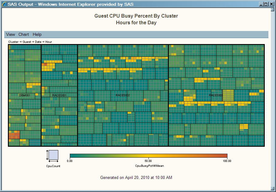
Tile charts are used
by performance managers and capacity planners to evaluate large volumes
of data that would otherwise be extremely difficult to work with.
In the preceding display, the size of each tile shows the CPU count
and the color indicates the CPU Busy Percent weighted mean. This provides
an overall status of the VMware environment from a cluster perspective
for a period of time. You can drill down to view the guests that are
allocated to this tile.
From this single image,
the performance manager can identify the utilization issues that need
attention. These issues are easily identifiable because they are represented
on the tile chart by boxes with the most intense colors. Starting
with this one quick view, the performance manager can prioritize issues.
Virtualization technologies are recently gaining wide-scale adoption
for distributed system environments. Much intelligence can be gained
by understanding which application workloads and system technologies
best lend themselves to virtualization. The performance and availability
of virtual environments demands that the appropriate amount of memory
be allocated to the hosts that support each virtual server.
The SAS IT Resource Management adapter for VMware vCenter
includes a data acquisition transformation. This transformation gathers
configuration information, including the allocation of VMware guests
to VMware hosts, on a periodic basis. Evaluation analysis topics that
are made possible through the data acquisition transformation include
topics unique to virtual environments such as memory ballooning, opposing
host failover commitment analysis, and host memory heap analysis.
Three-Dimensional Bar Charts
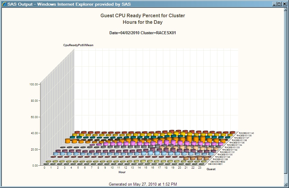
Example of Using Three-Dimensional Bar Charts with VMware vCenter Server Data
In the preceding
display, the vertical bar chart shows the CPU Ready Percent for all
guests that are allocated to a VMware cluster. In VMware environments,
closely monitoring the CPU Ready Percent measurement is critical.
This measurement is the percentage of time for which a virtual machine
has work that is ready to be performed but for which there is no physical
machine ready to process that work. In well-tuned environments, this
measurement should never exceed 10%. It should typically be a value
of less than 5% in order to ensure that the needs of each of the consumers
of virtual resources are satisfied. Any value in excess of this recommendation
is cause for additional IT performance evaluation.
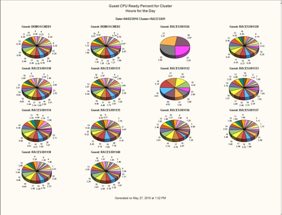
For an alternative view
of this data, right-click anywhere on the chart to display pie charts
for each guest in the cluster. Pie charts create simple, group, or
stacked charts that represent the relative contribution of the parts
to the whole by displaying data as wedge-shaped "slices" of a circle.
Each slice represents a category of data. The size of a slice of the
pie represents the contribution of the data to the total chart statistic.
As shown in the preceding
display, the graph toolbar provides a button ( ) that enables you to rotate the graph. You can also
zoom into the graph by clicking
) that enables you to rotate the graph. You can also
zoom into the graph by clicking  .
.
) that enables you to rotate the graph. You can also
zoom into the graph by clicking .
The pie charts enable
performance and capacity analysts to gain a detailed perspective for
a particular measurement that is associated with a designated resource.
In the preceding example, if a particular cluster had a guest with
a disproportional value for CPU Ready Percent, that value would be
easily identifiable in a pie chart view.
Tabular and Line Plot Reports
Using Tabular Reports
Tabular reports enable you
to generate crosstabulation tables, also known as contingency tables,
from your data. Tabular reports are used extensively for communicating
performance and capacity information. They typically present measurements
in ranked orders to focus the report consumer's attention most appropriately.
Using the Tabular Report for Performance Management and Capacity Planning
For the purposes
of IT performance management and capacity planning, tabular reports
are good for displaying measurements to view and understand the relationship
(cause and effect or correlation) between them. Examples include
the analysis of directly related measurements like CPU and Run Queue
or Memory and Paging. Tabular reports are also useful for readily
identifying suspect performance values that warrant further investigation.
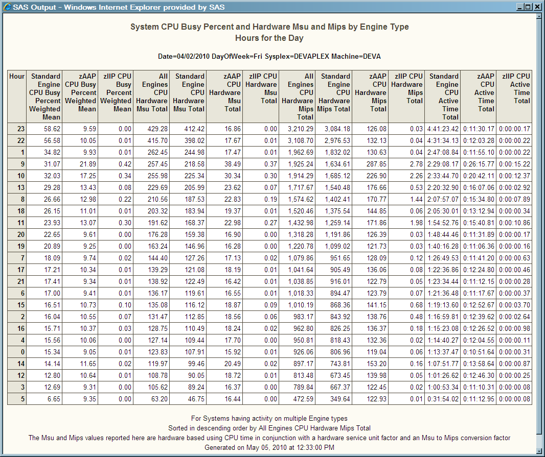
Example of Using a Tabular Report with IBM System Management Facility RMF - System Data
The preceding tabular report shows the available CPU
Busy, hardware millions of instructions per second (MIPS), hardware
millions of service units per second (MSUs), and CPU Active Time for
all engine types that are available on a particular mainframe system
for each hour of the day. The report includes standard, System z Integrated
Information Processor (ZIIP), and System z Application Assist Processor
(ZAAP) engine types. The report is sorted by All Engines CPU Hardware
Mips Total. It presents the consolidation of key metrics data that
is fundamental to managing the CPU performance and capacity of an
IBM mainframe system.
The System CPU Busy Percent measurements
that were used to create this report came from RMF data. SAS IT Resource
Management obtains RMF data through MXG. For other sources of
data that are made available to SAS IT Resource Management through
MXG, see Adapters That Are Supported by SAS IT Resource Management.
SAS IT Resource Management
accommodates the analysis of mainframe and special purpose processors
as well as the unique applications that operate on these systems.
SAS IT Resource Management can provide an analysis of the eligible
Java work (that is, work that can be performed on a lower cost special-purpose
engine) so that the cost advantages of implementing special purpose
engines can be explored. In the preceding report, the MSU values are
calculated using appropriate CPU active times (based on the type of
processor) in conjunction with a hardware service unit factor that
corresponds to the CPU model on which the resource is consumed. The
MIPS values in the report are calculated from the resulting MSU values
by multiplying with an MSU to MIPS conversion factor that also corresponds
to the CPU model.
SAS IT Resource Management
adapters enhance the value of IT mainframe performance measurements
by providing mainframe processor performance data in the following
various formats:
IBM Large System Performance
Reference (LSPR) tables are owned by and available from IBM. They
are used as reference information to enable the calculation of MIPS
and MSUs from the expended CPU time. Hardware MSUs are used in the
physical engine type calculations for systems and logical partitions
(LPARs). Software MSUs are used for application measurements.
Note: SAS and IBM worked together
as partners to understand and create methods to accommodate full capacity
and sub-capacity machines. This methodology includes the adjustment
of machine model numbers for full capacity machines to calculate the
most accurate MIPS and MSU values.
For more information,
see the “How MSU and MIPS Columns Are Included in Staged Tables
for the SMF Adapter” topic in the “Working with MXG
Code to Stage Data” section of Appendix 2, “Data Sources
Supported by SAS IT Resource Management Adapters” in the SAS
IT Resource Management: Administrator’s Guide.
Stacked Bar Reports
Using Stacked Bar Reports
Stacked bar reports show the relative magnitude of data
by displaying bars of varying height. Each set of color-coded segments
in a bar represents a category of data. Stacked bar charts are most
useful when the relative magnitude of the segments in the bars is
more, or as, significant as the exact magnitude of any particular
bar. Stacked bar charts display the color-coded segments for each
category of data, one on top of the other.
Using the Stacked Bar Report for Performance Management and Capacity Planning
Reports
of this type are essential to understanding the allocation of specific
resources to workloads for a host system, network component, or virtual
system environment. These reports also help create load-balancing
strategies and enable users to adjust their workloads in order to
minimize the use of resources.
Evaluating workload
measurements, such as transaction counts, I/O and exception rates,
response times, and CPU, disk, and memory performance attributes,
is crucial for ensuring service quality and assessing charges that
should be allocated to business units that share computer resources.
Stacked charts are useful for understanding the parts of a whole entity,
whether that entity is a resource, a segment of time, or any other
quantifiable object. Facts that are communicated by stacked charts,
along with other data, are effective in determining the proper allocation
of resources to the business tasks that must be accommodated. For
example, certain business processing must take place in a given time
period. Therefore, the resource to accommodate this processing must
be available.
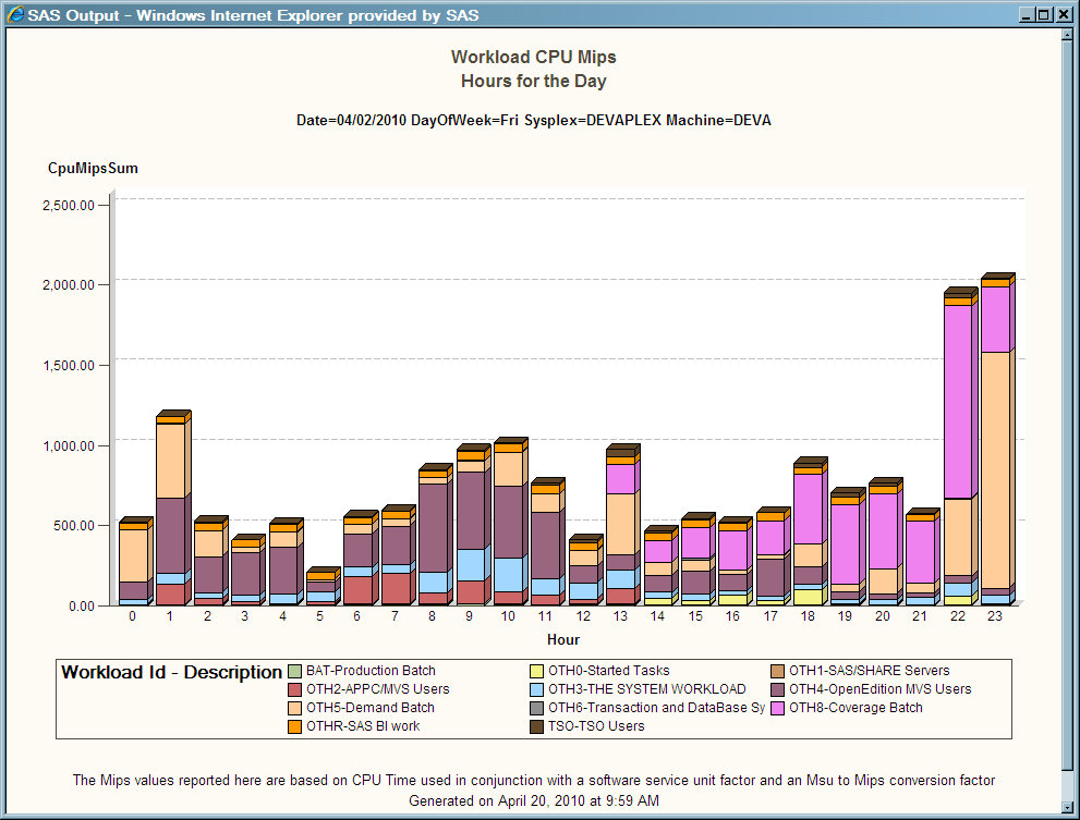
Example of Using the Stacked Bar Report with IBM System Management Facility RMF - Workload Data
The
presentation of any data in a stacked bar chart enables you to make
quick comparative observations. Viewing the resource utilization and
workload components of an IT resource over the hours of a day enables
the IT performance manager to understand how that resource can best
be allocated and used.
In the preceding report,
the CPU resource (specified in Mips) is segmented by the applicable
active workloads defined to the system (typically through the RMF
Workload Manager). Workload usage of the resource can be reviewed
and analyzed. This analysis enables capacity planners to understand
exactly how much of the resource is being used by workloads and when
those resources are being used.
Line Plots
Using Line Plots
Using Line Plots for Performance Management and Capacity Planning
Line plots are
used extensively for the purposes of performance management and capacity
planning. They are a quick and easy way to understand variations on
a single metric or comparative cause and effect relationships between
multiple variables. For example, the CPU utilization of a resource
over the course of an hour, day, week, or month can yield valuable
information about the business cycles that are being accommodated
by that resource. These facts are essential to planning for the capacity
of that device. Similarly, evaluating the relationship between CPU
utilization and system run queues, as well as memory utilization and
paging rates, yields facts that can help capacity planners to configure
resources that can best accommodate assigned workloads.
Establishing and understanding
the utilization and availability profiles of resources and sets of
resources is useful for managing the performance and capacity of those
machines. This type of time-based analysis enables you to readily
identify exceptions to anticipated performance activities.
For example, at 9:00
a.m. resource utilization increases to accommodate the beginning of
the work day, and you can observe user login activity. You can observe
a decrease in utilization around noon when employees are at lunch.
This observation is followed by another peak that ends around 5:00
p.m. when the work day ends. Overnight, peaks and valleys in utilization
illustrate batch processing activities, routine system maintenance
work such as backups, and lulls that are associated with business
inactivity. Viewing this behavior over long periods of time and over
various periods of time (days, weeks, quarters, or months) enables
IT profiles to be characterized. These profiles provide information
that is useful in the following ways:
Business cycles and
the performance and capacity of IT systems all change over time. The
good news for IT performance managers is that these changes can be
analyzed and reported on over different time periods. This information
enables IT performance managers to make the correct and best IT business
decisions. For example, performance measurements of a particular resource
can be analyzed over time to assess its performance, utilization,
and availability. From this assessment, the IT response to business
events, economic drivers, or natural weather occurrences can be analyzed.
If necessary, adjustments to the configuration of IT enterprise can
be identified to accommodate these occurrences in the future.
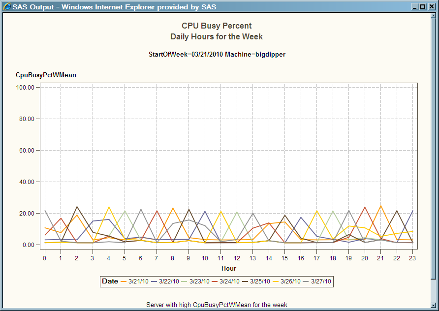
Example of Using Line Plots with HP Performance Agent Data
In the following
example, the CPU utilization of a particular UNIX machine is being
evaluated. SAS IT Resource Management can obtain UNIX data through
the following adapters:
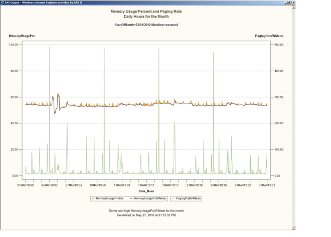
Using Line Plots with Multiple Vertical Columns for Performance Management and Capacity Planning
Comparing the three lines on the following graph provides a perspective
that shows how seemingly small variations in the maximum and mean
memory measurements for a particular UNIX device relate to the paging
rates that are associated with that device. This long-term (monthly)
analysis can prompt more detailed memory analysis activity to ensure
that the system is configured with an adequate quantity of memory
for the processing allocated to this device.
Horizontal Bar Chart
Using Horizontal Bar Charts for Performance Management and Capacity Planning
Stacked bar charts illustrate the
comparative volume of a measurement or measurements typically over
a time period. From a performance management and capacity planning
perspective, bar charts are used for comparative analysis and to get
a good perspective on the measurements being analyzed. You might
consult these charts to prioritize issues or to quantify the severity
of issues.
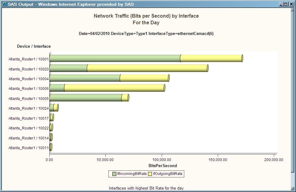
Example of Using Horizontal Bar Charts with Simple Network Management Protocol Data
The one element of the IT infrastructure that is common across large
portions of the enterprise is the network. The best source of information
that can be used to measure the performance and to assess the health
of that network is a repository of Simple Network Management Protocol
(SNMP) data.
The preceding chart
shows the network interfaces that have the highest incoming and outgoing
bit rates over the course of a day. Charts of this type establish
an understanding of what is normal and expected activity with respect
to network traffic. Deviations to measurements of this type and the
trends associated with them should be more thoroughly analyzed.
SAS IT Resource Management
provides a reference table that identifies the type of devices that
are charted. (For example, in the preceding chart, the reference table
was used to determine that the device measurements pertained to the
traffic on a Type1 device.)
For information about
this lookup table, see “Working with the ITMS_SNMP_DeviceType
Lookup Table” topic in the “Accessing Raw Data for SNMP”
section of Appendix 2, “Data Sources Supported by SAS IT Resource
Management Adapters” in the SAS IT Resource Management:
Administrator’s Guide.
SNMP measurements are
essential for understanding the status and components of a network
and the devices that are serviced by the network. These measurements
can show the status of the network's routers, hubs, and switches as
well as the status of the network's links and interfaces. Network
administrators and performance analysts must be able to understand
the behavior and error rates that are associated with network devices
over time. In that way, they can identify and replace faulty hardware
components that contribute to the overall degradation of the network.
SNMP also communicates the utilization status and highlights instances
where thresholds that were established for that utilization have been
exceeded. All of this information, and its analysis, is used to best
allocate traffic to the network and to tune its flow across individual
network components.
SAS IT Resource Management
enables you to import MIB definitions that can be used to create the
metadata for SNMP staged tables.
Prior releases of SAS
IT Resource Management used the repository of SNMP data that was created
by the HP Network Node Manager and the Tivoli NetView snmpColDump
utility. Newer releases of the HP and Tivoli network management system
products do not support the snmpColDump utility. Accordingly, SAS
IT Resource Management now supports data collection of SNMP data from
a round-robin database to which the data is written. As a convenience
for our customers, SAS IT Resource Management continues to support
the collection of SNMP data from the repository created by the HP
and Tivoli snmpColDump utility.
Bubble Plots
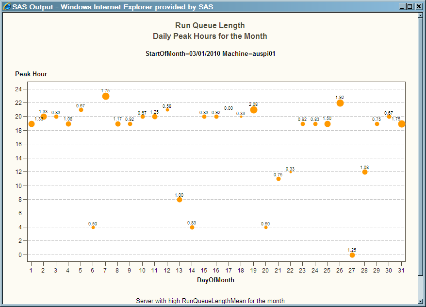
Example of Using Bubble Plots with Microsoft System Center Operations Manager
In the preceding display, Run
Queue Length measurements from Microsoft System Center Operations
Manager for a particular machine is evaluated for each day of the
month and over each hour of the day. This analysis enables performance
managers to understand when Run Queue Lengths are at their peak so
that systems can be sized or work can be prioritized and allocated
or reallocated to alternate devices.