Traditional Graphics in the IML Procedure
An Introductory Graph
Suppose that you have data for ACME Corporation’s stock price and you want a simple PRICE  DAY graph to see the overall trend of the stock’s price. The data are as follows.
|
Day |
Price |
|
|---|---|---|
|
0 |
43.75 |
|
|
5 |
48.00 |
|
|
10 |
59.75 |
|
|
15 |
75.5 |
|
|
20 |
59.75 |
|
|
25 |
71.50 |
|
|
30 |
70.575 |
|
|
35 |
61.125 |
|
|
40 |
79.50 |
|
|
45 |
72.375 |
|
|
50 |
67.00 |
|
|
55 |
54.125 |
|
|
60 |
58.750 |
|
|
65 |
43.625 |
|
|
70 |
47.125 |
|
|
75 |
45.50 |
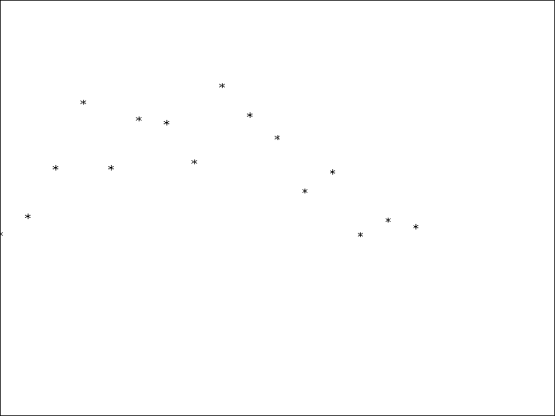
To graph a scatter plot of these points, enter the following statements. These statements generate Figure 17.1.
proc iml;                            /* invoke PROC IML   */
   call gstart;                      /* start graphics    */
   xbox={0 100 100 0};
   ybox={0 0 100 100};
   day=do(0,75,5);                   /* initialize day    */
   price={43.75,48,59.75,75.5,       /* initialize price  */
       59.75,71.5,70.575,
       61.125,79.5,72.375,67,
       54.125,58.75,43.625,
       47.125,45.50};
   call gopen;                       /* start new graph   */
   call gpoly(xbox,ybox);       /* draw a box around plot */
   call gpoint(day,price);           /* plot the points   */
   call gshow;                       /* display the graph */
Figure 17.1: Scatter Plot

The GSTART statement initializes the graphics session. It is usually called only once. Next, open a graphics segment (that is, begin a new graph) with the GOPEN call. The GPOINT call draws the scatter plot of points of DAY versus PRICE. The GSHOW call displays the graph.
Notice also that, for this example, the x coordinate of the data is DAY and that  . The y coordinate is PRICE, which ranges from
  . The data are displayed properly because the default ranges are from 0 to 100 on both the x and y axes. A later example uses the GWINDOW statement to change the default ranges so that you can handle data with any range
of values.
Of course, this graph is quite simple. By the end of this chapter, you will learn how to add axes and titles, scale axes, and connect the points with lines.