Axis Properties
Example: Change Positions of Axis Tick Marks
To change the default tick marks for the axis of an interval variable:
-
Open the
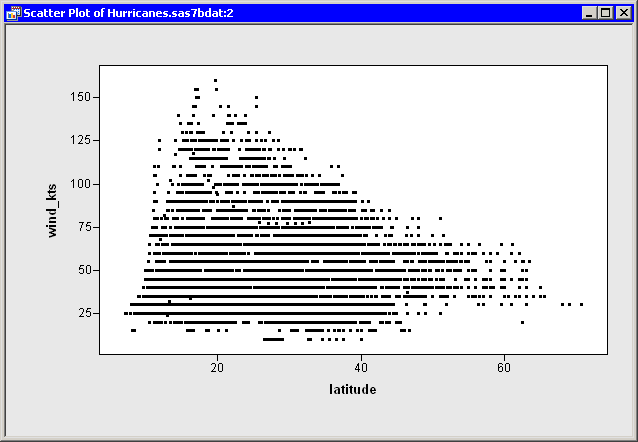
Hurricanesdata set, and create a scatter plot ofwind_ktsversuslatitude.The scatter plot appears. (See Figure 10.1.) Note that the
latitudeaxis has only a few tick marks. You might decide to add a few additional tick marks.Figure 10.1: A Scatter Plot
-
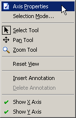
Right-click the horizontal axis of the plot, and select from the pop-up menu, as shown in Figure 10.2.
Figure 10.2: The Axis Pop-up Menu
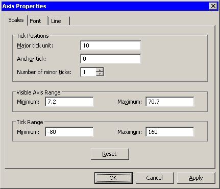
The Axis Properties dialog box appears, as shown in Figure 10.3. This is a quick way to determine the anchor location, tick unit, and tick range for an axis.
Figure 10.3: Axis Properties Dialog Box
-
Change the Major tick unit value to
10. -
Change the Anchor tick value to
0. -
Change the Number of minor ticks value to
1. -
Click .
The
latitudeaxis updates, as shown in Figure 10.4.
Figure 10.4: A Scatter Plot with Custom Tick Marks
