Multivariate Analysis: Canonical Correlation Analysis
Plots Tab
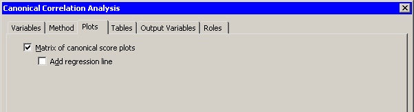
You can use the Plots tab to create plots that graphically display results of the analysis. (See Figure 28.9.)
Creating a plot adds canonical variables to the data table. The following plots are available:
- Matrix of canonical score plots
-
creates a plot for each pair of canonical variables that summarizes the strength of the relationship between the variables.- Add regression line
-
adds a least squares regression line to each score plot. The regression line predicts the ith canonical variable in the second group from the ith canonical variable in the first group.
Figure 28.9: The Plots Tab