Model Fitting: Linear Regression
You can use the Linear Regression analysis to create a variety of residual and diagnostic plots, as indicated by Figure 21.7. This section briefly presents the types of plots that are available. To provide common reference points, the same five observations are selected in each set of plots.
Partial leverage plots are an attempt to isolate the effects of a single variable on the residuals (Rawlings, Pantula, and Dickey, 1998, p. 359). A partial regression leverage plot is the plot of the residuals for the dependent variable against the residuals for a selected regressor, where the residuals for the dependent variable are calculated with the selected regressor omitted and the residuals for the selected regressor are calculated from a model in which the selected regressor is regressed on the remaining regressors. A line fit to the points has a slope that is equal to the parameter estimate in the full model. Confidence limits for each regressor are related to the confidence limits for parameter estimates (Sall, 1990).
Partial leverage plots for the previous example are shown in Figure 21.10. The lower left plot shows residuals of no_home. The confidence bands in this plot contain the horizontal reference line, which indicates that the coefficient of no_home is not significantly different from zero.
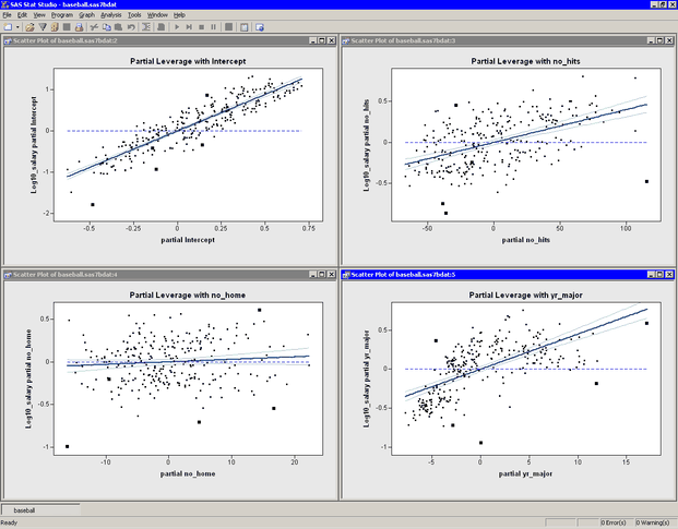
Figure 21.11 shows the residuals plotted against the three explanatory variables in the model. Note that the Residuals vs. yr_major plot shows a distinct pattern. The plot indicates that players who have recently joined the major leagues earn less money,
on average, than their veteran counterparts with 5–10 years of experience. The mean salary for players with 10–20 years of
experience is comparable to the salary that new players make.
This pattern of residuals suggests that the example does not correctly model the effect of the yr_major variable. Perhaps it is more appropriate to model log10_salary as a nonlinear function of yr_major. Also, the low salaries of Steve Sax, Graig Nettles, and Steve Balboni might be unduly influencing the fit.
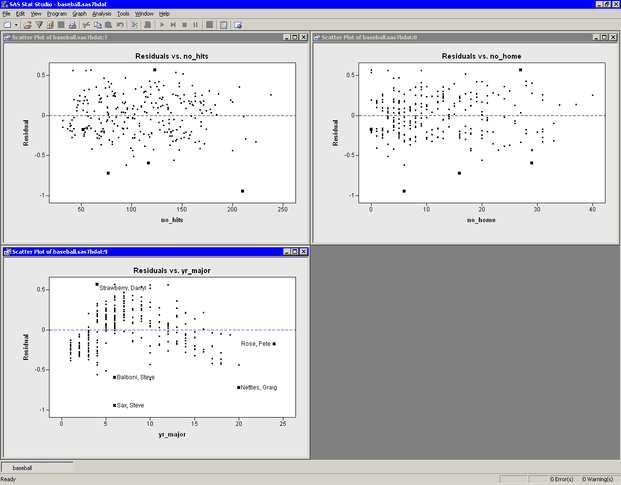
Figure 21.12 shows several residual plots.
The Q-Q plot (upper left in Figure 21.12) shows that the residuals are approximately normally distributed. Three players with large negative residuals (Steve Sax, Graig Nettles, and Steve Balboni) are highlighted below the diagonal line in the plot. These players seem to be outliers for this model.
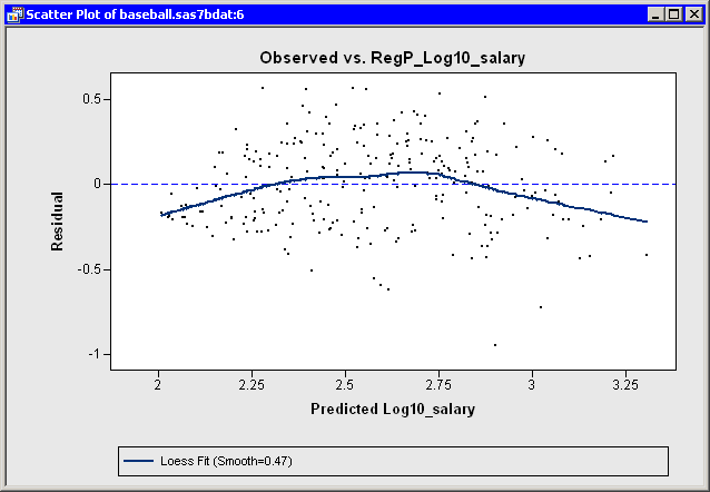
The Residuals vs. Predicted plot is located in the upper right corner of Figure 21.12. As noted in the example, the residuals show a slight "bend" when plotted against the predicted value. Figure 21.13 makes the trend easier to see by adding a loess smoother to the residual plot. (See Chapter 18: Data Smoothing: Loess, for more information about adding loess curves.) As discussed in the previous section, this trend might indicate the need
for a nonlinear term that involves yr_major. Alternatively, excluding or downweighting outliers might lead to a better fit.
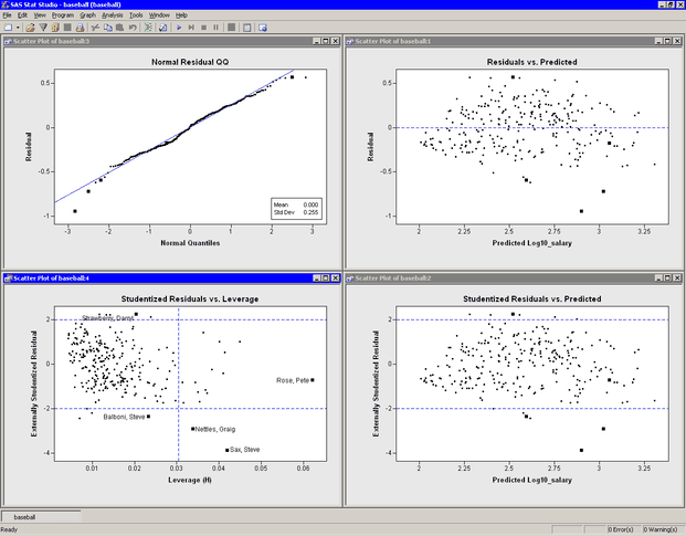
The lower right plot in Figure 21.12 is a graph of externally studentized residuals versus predicted values. The externally studentized residual (known as RSTUDENT in the documentation of the REG procedure) is a studentized residual in which the error variance for the ith observation is estimated without including the ith observation. You should examine an observation when the absolute value of the studentized residual exceeds 2.
The lower left plot in Figure 21.12 is a graph of (externally) studentized residuals versus the leverage statistic. The leverage statistic for the ith observation is also the ith element on the diagonal of the hat matrix. The leverage statistic indicates how far an observation is from the centroid of the data in the space of the explanatory variables. Observations far from the centroid are potentially influential in fitting the regression model.
Observations whose leverage values exceed ![]() are called high leverage points (Belsley, Kuh, and Welsch, 1980). Here p is the number of parameters in the model (including the intercept) and n is the number of observations used in computing the least squares estimates. For the example,
are called high leverage points (Belsley, Kuh, and Welsch, 1980). Here p is the number of parameters in the model (including the intercept) and n is the number of observations used in computing the least squares estimates. For the example, ![]() observations are used. There are three regressors in addition to the intercept, so
observations are used. There are three regressors in addition to the intercept, so ![]() . The cutoff value is therefore 0.0304.
. The cutoff value is therefore 0.0304.
The Studentized Residuals vs. Leverage plot has a vertical line that indicates high leverage points and two horizontal lines that indicate potential outliers. In Figure 21.12, Pete Rose is an observation with high leverage (due to his 24 years in the major leagues), but not an outlier. Graig Nettles and Steve Sax are outliers and leverage points. Steve Balboni is an outlier because of a low salary relative to the model, whereas Darryl Strawberry’s salary is high relative to the prediction of the model.
You should be careful in interpreting results when there are high leverage points. It is possible that Pete Rose fits the model precisely because he is a high leverage point. Chapter 22: Model Fitting: Robust Regression, describes a robust technique for identifying high leverage points and outliers.
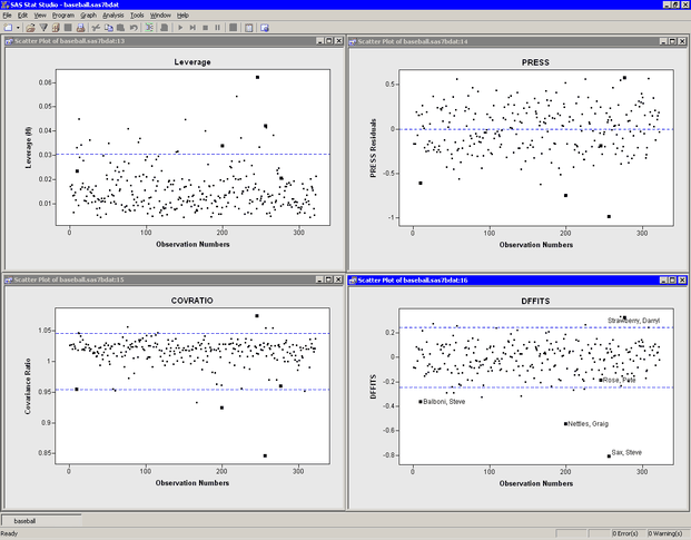
Previous sections discussed plots that included Cook’s D statistic and the leverage statistic. Both of these statistics are influence diagnostics. (See Rawlings, Pantula, and Dickey 1998, p. 361, for a summary of influence statistics.) Figure 21.14 show other plots that are designed to identify observations that have a large influence on the parameter estimates in the model. For each plot, the horizontal axis is the observation number.
The upper left plot displays the leverage statistic along with the cutoff ![]() .
.
The upper right plot displays the PRESS residuals. The PRESS residual for observation i is the residual that would result if you fit the model without using the ith observation. A large press residual indicates an influential observation. Pete Rose does not have a large PRESS residual.
The lower left plot displays the covariance ratio. The covariance ratio measures the change in the determinant of the covariance matrix of the estimates by deleting the ith observation. Influential observations have ![]() , where c is the covariance ratio (Belsley, Kuh, and Welsch, 1980). Horizontal lines on the plot mark the critical values. Pete Rose has the largest value of the covariance ratio.
, where c is the covariance ratio (Belsley, Kuh, and Welsch, 1980). Horizontal lines on the plot mark the critical values. Pete Rose has the largest value of the covariance ratio.
The lower right plot displays the DFFIT statistic, which is similar to Cook’s D. The observations outside of ![]() are influential (Belsley, Kuh, and Welsch, 1980). Pete Rose is not influential by this measure.
are influential (Belsley, Kuh, and Welsch, 1980). Pete Rose is not influential by this measure.