In this example, you create scatter plots of the latitude and longitude variables of the Hurricanes data set. The scatter plots are made for subsets of the hurricane data that correspond to the nine values of the month variable. (The data set does not contain any cyclones for January, February, or March.)
To create a scatter plot for each value of a BY variable:
-
Select → from the main menu.
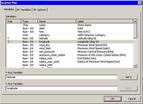
The Scatter Plot dialog box appears. (See Figure 12.3.)
-
Select the
latitudevariable, and click . Select thelongitudevariable, and click . -
Click the BY Variables tab.
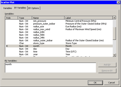
The BY Variables tab is shown in Figure 12.4.
-
Scroll down in the list of variables and select the
monthvariable. Click . -
Click the BY Options tab.
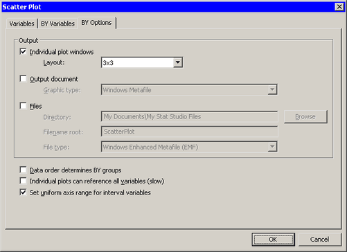
The BY Options tab is shown in Figure 12.5.
-
Select for the option. Click .
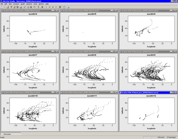
Nine scatter plots appear, one for each month 4–12, as shown in Figure 12.6.
Note that the X and Y axes are all set to a common range. This makes it easier to compare data characteristics across BY groups. If you want each plot to scale its axes independently, you can clear on the BY Options tab.
A few features of the data are apparent.
-
Many tropical cyclones occur in September (
month=9). -
There is no apparent relationship between month and the shape of cyclone trajectories.
It is not clear from this display whether the origin of cyclones varies with the month. Perhaps storms in May (month=6) originate farther west than September storms (month=9), but more investigation is needed. The next example continues this investigation.


