In this section you create a line plot of the co and wind variables versus the datetime variable of the Air data set. The co variable is a measurement of carbon monoxide. The wind variable is a measurement of wind speed. The datetime variable is the hour and date of each measurement.
To create a line plot:
-
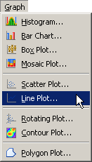
Select → from the main menu, as shown in Figure 6.11.
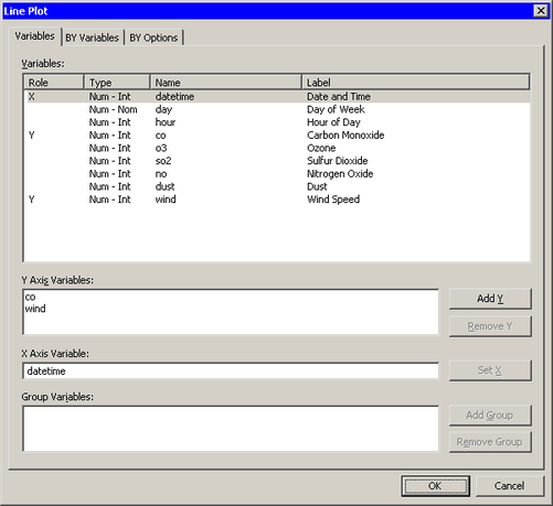
The Line Plot dialog box appears. (See Figure 6.12.)
-
Select the
covariable. Hold down the CTRL key and select thewindvariable. Click . -
Select the variable
datetime, and click . -
Click .
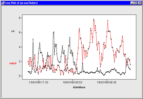
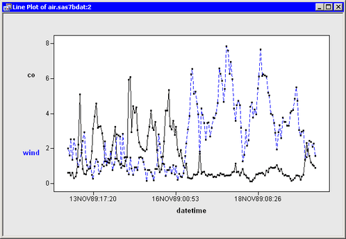
A line plot appears (Figure 6.13), which shows the carbon monoxide and wind measurements for each hour of a seven-day period. By default, the two lines are displayed in different colors. You can change the color and line style of the lines, as shown in the remainder of this example.
-
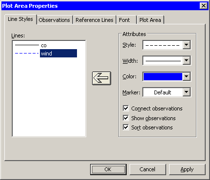
Right-click near the center of the plot, and select from the pop-up menu.
The Plot Area Properties dialog box appears. (See Figure 6.14.)
-
Select
windin the Lines list. -
Change the line style to dashed and the color to blue.
-
Click the large left arrow in the center of the dialog box to apply the changes to the
windline. -
Click .
The line plot now looks like the plot in Figure 6.15. The carbon monoxide line shows periodic behavior for the first half of the week, followed by extremely low values for the second half of the week. The wind values are low for the first half of the week, but much stronger for the second half. These data might indicate that sufficiently strong winds can blow away carbon monoxide.
You can click any observation marker to select the observation. You can click while holding down the CTRL key to select multiple observations. You can draw a selection rectangle to select a group of observations. You can also select the lines themselves by clicking a line segment that is away from any observation. If you open the dialog box shown in Figure 6.14, selected lines in the line plot are also selected in the Lines list in the dialog box.
Note: If you plot multiple Y variables, then an observation in the data table is represented by multiple markers in the line plot. Clicking any marker in the plot selects the entire corresponding observation.