Basic Display Features of Equated Plots
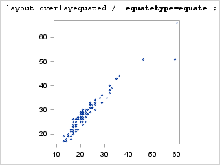
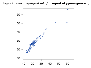
Types of Equated Axes
The EQUATETYPE= option of the LAYOUT OVELAYEQUATED statement
manages the display of the axes. The following values are available:
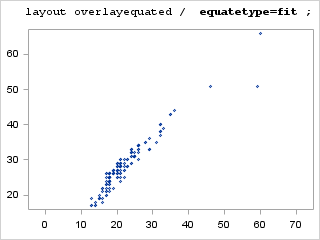
X and Y axes have equal
increments between tick values. The data ranges of both axes are compared
to establish a common increment size. The axes can be of different
lengths and have a different number of tick marks. Each axis represents
its own data range. One axis can be extended to use available space
in the plot area. This is the default.
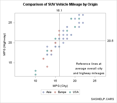
proc template;
  define statgraph mpg;
    mvar TYPE;
    begingraph;
      entrytitle "Comparison of " TYPE " Vehicle Mileage by Origin";
      entryfootnote halign=right "SASHELP.CARS";
      layout overlayequated / equatetype=fit;
        scatterplot x=mpg_city y=mpg_highway / group=origin
          name="s" markerattrs=(size=7px);
        referenceline x=eval(mean(mpg_city)) /
          curvelabel=eval(put(mean(mpg_city),4.1));
        referenceline y=eval(mean(mpg_highway)) /
          curvelabel=eval(put(mean(mpg_highway),4.1));
        discretelegend "s";
        layout gridded / columns=1 halign=right valign=bottom;
          entry "Reference lines at";
          entry "average overall city";
          entry "and highway mileages";
        endlayout;
      endlayout;
    endgraph;
  end;
 run;

 %let type=SUV;
 proc sgrender data=sashelp.cars template=mpg;
   where type="&type";
 run;
Defining Axes for Equated Layouts
Axes for the OVERLAYEQUATED
layout are similar to axes for the OVERLAY layout with the following
exceptions:
Managing Axes in an OVERLAY Layout discusses many of the axis options
that are available for managing graph axes.
-
XAXISOPTS= and YAXISOPTS= options are supported (with a different set of suboptions from those of OVERLAY), but X2AXISOPTS= and Y2AXISOPTS= options are not supported. Some of the supported options are DISPLAY, LABEL, GRIDDISPLAY, DISPLAYSECONDARY, OFFSETMAX, OFFSETMIN, THRESHOLDMAX, THRESHOLDMIN, and TICKVALUEFORMAT.
To illustrate how to
control axes for the equated layout, we will look at a simplified
version of the PPPLOT template that is supplied with PROC UNIVARIATE,
which is delivered with Base SAS. The following code shows a SAS program
that can be used to run PROC UNIVARIATE:
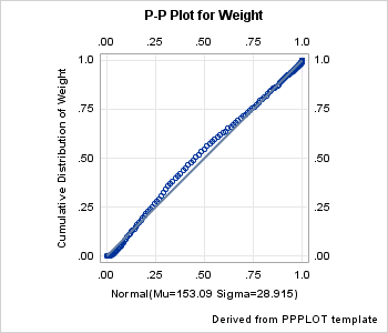
ods graphics on;

proc univariate data=sashelp.heart;
  var weight;
  ppplot / normal square;
run;
quit;
When the code is run,
it creates the following plot. The plot uses the PPPLOT template,
which is stored in the BASE.UNIVARIATE.GRAPHICS folder of the SASHELP.TMPLMST
item store:
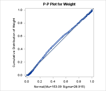
In PROC UNIVARIATE,
the PPPLOT statement creates a probability-probability plot (also
referred to as a P-P plot or percent plot), which compares the empirical
cumulative distribution function (ecdf) of a variable with a specified
theoretical cumulative distribution function such as the normal. If
the two distributions match, the points on the plot form a linear
pattern that passes through the origin and has unit slope. Thus, you
can use a P-P plot to determine how well a theoretical distribution
models a set of measurements.
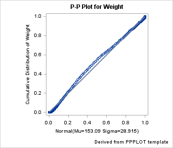
The supplied PPPLOT
template uses several dynamics to pass in values for options, but
in essence, the following template is equivalent. The dynamics for
the title and axis labels have been converted into literals appropriate
for this set of data.
proc template;
define statgraph pp_plot;
  begingraph;
    entrytitle "P-P Plot for Weight";
    entryfootnote halign=right "Derived from PPPLOT template";

    layout overlayequated /  equatetype=square
            xaxisopts=(label="Normal(Mu=153.09 Sigma=28.915)"
                       thresholdmin=1 thresholdmax=1)
            yaxisopts=(label="Cumulative Distribution of Weight"
                       thresholdmin=1 thresholdmax=1)
            commonaxisopts=(viewmin=0.0 viewmax=1.0) ;

      scatterplot x=Theoretical y=Empirical;
      lineparm x=0 y=0 slope=1 / lineattrs=GraphFit;
    endlayout;

  endgraph;
end;
run;
This simplified template
produces a similar plot if it is rendered with the same data as the
UNIVARIATE plot. An ODS OUTPUT statement can convert the output object
from UNIVARIATE into a SAS data set:
ods graphics on;
ods select ppplot;
ods output ppplot=ppdata;
proc univariate data=sashelp.heart;
  var weight;
  ppplot / normal square;
run;
quit;

proc sgrender data=ppdata
              template=pp_plot;
run;
 layout overlayequated /  equatetype=square
    xaxisopts=(label="Normal(Mu=153.09 Sigma=28.915)"
               thresholdmin=1 thresholdmax=1
               tickvalueformat=3.2
               display=(label tickvalues)
               displaysecondary=(tickvalues)
               griddisplay=on)
    yaxisopts=(label="Cumulative Distribution of Weight"
               thresholdmin=1 thresholdmax=1
               tickvalueformat=3.2
               display=(label tickvalues)
               displaysecondary=(tickvalues)
               griddisplay=on)
    commonaxisopts=(viewmin=0.0 viewmax=1.0
               tickvaluesequence=(start=0 end=1 increment=.25) );