Output for Grouped versus Non-Grouped Data
Non-Grouped Data
The Default Appearance of Non-Grouped Output
For the SGPLOT and SGPANEL
procedures, many plots use the same style element, GraphDataDefault,
for graphics elements such as lines, bars, and markers. These plots
have the same default appearance.
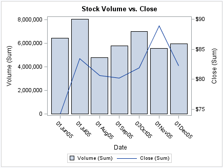
In
the graph that is produced by the following code, the bar chart and line chart
use visual attributes from the GraphDataDefault element. The visual
attributes for the line (and markers if specified) are designed to
coordinate with the bar fill areas.
Default Appearance of Non-Grouped Bars and Lines
However, when identical
plot types are overlaid, the procedures instead use style elements
named GraphData1 to GraphDatan (where
n=12 for most styles).
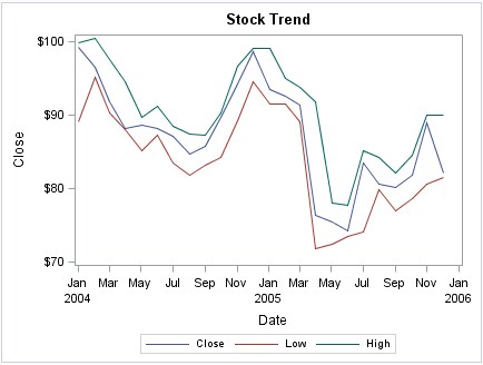
In the following graph,
the series lines have different colors and are easy to distinguish.
The plots use the GraphData1, GraphData2, and GraphData3 style elements.
Default Appearance When Three Series Plots Are Overlaid
The GraphDatan style
elements use different marker symbols and fill colors to ensure that
the plots differ in appearance. All line and marker colors are of
different hues but with the same brightness, which means that all
12 colors can be distinguished but none stands out more than another.
Fill colors are based on the same hue but have less saturation, making
them similar but more muted than the corresponding contrast colors.
Line patterns can also
vary depending on the style that is used for the graph. Some styles
vary line patterns so that elements in color plots can be distinguished
even when the plot is sent to a black-and-white printer. Line patterns
do not vary for the HTMLBlue style or any style that is defined with
the ATTRPRIORITY="Color" option.
Note: If you have a bar-line overlay
with multiple lines, the lines cycle through GraphDatan,
whereas the bar remains GraphDataDefault.
Other plots use more
specialized style elements for their appearance. For example, the
line attributes for density, loess, PBSpline, and regression curves
are determined by the GraphFit style element.
-
If you have multiple fit plots (loess, regression, or PBSpline), the behavior is like the density curves. For one fit, GraphFit is used. For two fits, GraphFit and GraphFit2 are used. For three or more, all fits switch to GraphDatan. (This behavior also applies to the SGSCATTER procedure when multiple fits are specified.)
In general, if all of
the plots have the same statement name (all scatter, all series, and
so on), then the plots automatically cycle.
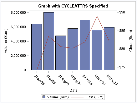
The CYCLEATTRS | NOCYCLEATTRS
options in the SGPLOT and SGPANEL procedure statements can be used
to manually control whether the plots have unique attributes. CYCLEATTRS
forces cycling in situations where cycling is not automatic. The NOCYCLEATTRS
option forces cycling to be off. These options are described in the
next section.
Changing the Appearance of Non-Grouped Output
You can use plot options
to specify particular GraphDatan style
elements for your plots in order to achieve a different appearance.
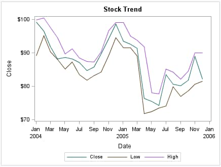
In the following graph,
the style elements GraphData3, GraphData4, and GraphData5 are used
to change the default appearance of the series lines in the graph.
Overlaid Series Plots with Particular GraphDatan Elements
Specified
Note: To achieve a different appearance
for the series lines, you can use any style element that has line
properties. However, the GraphDatan style
elements are ideally suited for this purpose. The GraphDatan style
elements have been carefully constructed with different hues but with
the same brightness, which means that all 12 colors can be distinguished
but none stands out more than another.
For more information,
see Specifying a Style Element.
Sometimes, you might
want to control one or more attributes of a style element. You can
use plot options to override, or hardcode, an attribute in the style
element.
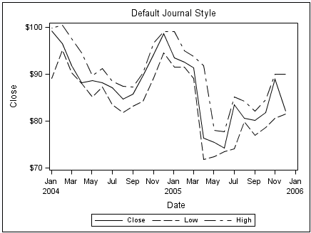
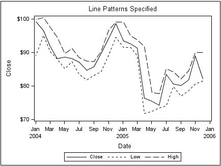
The following two graphs
show the same plots before and after the PATTERN= option is used.
The PATTERN= option is used with two series lines to force a different
line pattern.
The Effect of Specifying a Hardcoded Line Pattern
For more information,
see Specifying Hardcoded Values and Specifying a Style Element with Hardcoded Values.
You can also use the
CYCLEATTRS | NOCYCLEATTRS options in the SGPLOT and SGPANEL procedure
statements to control whether the plots have unique attributes. CYCLEATTRS
forces cycling in situations where cycling is not automatic. If the
plots do not have unique attributes by default, then you can specify
the CYCLEATTRS option to force unique attributes for each plot in
the graph. The NOCYCLEATTRS option prevents the procedure from assigning
unique attributes.
Grouped Data
The Appearance of Grouped Output
The GROUP= option is
used to plot data when a classification or grouping variable is available.
By default, this option automatically uses the GraphDatan style
elements for the presentation of each unique group value. In general,
you cannot specify the line or marker properties for specific group
values directly, as you can for non-grouped data.
Consider the following
option specification for a line: LINEATTRS= (PATTERN=2). When this
line option is used, the line pattern is set as a style override.
However, this override applies equally to all group values. The same
is true for overrides of color or line thickness. This means that
you can set one or more fixed appearance attributes for all group
values, but you cannot directly assign unique visual properties to
an individual group value. For example, you cannot specify LINEATTRS=
(PATTERN=2 4) because this statement is not valid.
Making the Appearance of Grouped Data Independent of Data Order
When unique group values
are gathered, they are internally recorded in the order in which they
appear in the data. They are not subsequently sorted. This means that
if an input data source is modified, sorted, or filtered, the order
of the group values and their associations with GraphDatan might
change.
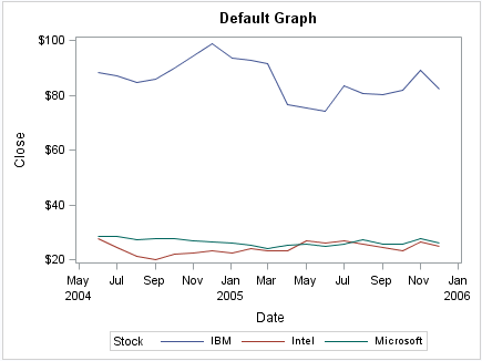
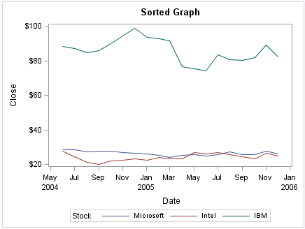
Because the position
of the data in the sorted data set has changed, the sorted graph uses
different GraphDatan style
elements for the group values.
In many cases, this
might not be a problem if you do not care which line pattern, marker
symbols, or colors are associated with particular group values. However,
in some cases you might care. For example, if you create many plots
grouped by gender, you might want a consistent set of visual properties
for females and males across plots, regardless of the input data order.
SG attribute maps enable
you to ensure that particular visual attributes are applied based
on the GROUP= value of the data instead of the position of the data
in the data set.
-
Modify the SG procedure and its plot statements to use the data in the SG attribute map. You can use attribute maps in the SGPLOT, SGPANEL, and SGSCATTER procedures.Attribute mapping is supported in the PLOT statement of the SGSCATTER procedure. In the SGPLOT and SGPANEL procedures, any plot statement that supports GROUP variables supports attribute mapping. For more information, see SGPANEL and SGPLOT Statements That Do Not Support Attribute Mapping.
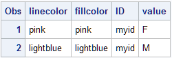
Here is an example
of an SG attribute map data set called MYATTRMAP. The observations
in this data set contain the group value (VALUE) and the attributes
(LINECOLOR, FILLCOLOR).
Listing of the SG Attribute Map Data Set MYATTRMAP
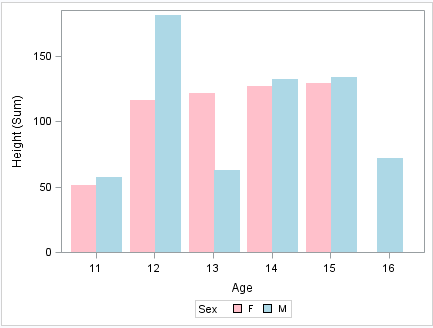
The following output
shows a bar chart that uses the MYATTRMAP data set for its pink and
blue bar colors. The FILLCOLOR= values determine the color of the
bars, and the LINECOLOR= values determine the color of the border
edges around the bars.
You use a standard
syntax to specify colors, line thickness, line patterns, and marker
symbols. For more information about this syntax, see the following
topics:
-
Specifying Colors in SAS/GRAPH Programs in SAS/GRAPH: Reference
For complete
information about attribute maps, see Using SG Attribute Maps to Control Visual Attributes.