Controlling Axis Features
Overview
Setting the Axis Type
Within any given layout
in the graph display, each plot axis is always of a particular type.
In the default cases, the axis type is always LINEAR, DISCRETE, or
TIME.
The axis options for
each layout statement include a TYPE= option that enables you to specify
an axis type that overrides the default selection mechanisms. When
you override the default axis type, you must be sure to specify the
correct axis type for the plots that you are defining. For every plot
in the template language, the documentation indicates what axis types
it supports. Plots statements that are specified in the template are
ignored if they are incompatible with the axis type.
Each axis type has features
specific to that type, and the following axis options enable you to
specify features for the different types:
LINEAROPTS = (linear-suboptions)
DISCRETEOPTS = (discrete-suboptions)
TIMEOPTS= (time-suboptions)
LOGOPTS = (log-suboptions)
One or more of these
options can be specified for an axis, but the specified settings are
applied only to the axis type that supports them.
For example, a bar chart
has two axes – a TYPE=DISCRETE axis for the X axis and a TYPE=LINEAR
axis for the Y axis. If a numeric column (for example, Age) is assigned
to the X role, this column’s values are always treated as discrete
values, never as a continuous range of values. You cannot request
another axis type for the X axis, but you can request a different
axis type for the Y axis.
Sometimes you want a
specialized axis type depending on the nature of the data. For example,
if the data have a very large range of values (orders of magnitude
apart), you could request that the values be displayed on a logarithmic
scale. To set a logarithmic scale, use the TYPE=LOG axis option.
Time series data benefit
from displaying the X axis with a TYPE=TIME axis. A TIME axis type
requires that the column values are SAS Date, Time, or Datetime values.
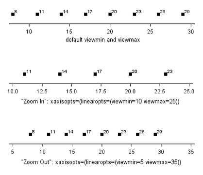
Adjusting the Axis View
The VIEWMIN= and VIEWMAX=
axis options can be used to adjust the view of an axis. You can specify
minimum data values to include in the display, maximum data values,
or both (the specified values might be adjusted by the threshold calculation).
By default, the VIEWMIN= value is the minimum data value for the specified
axis and the VIEWMAX= value is the maximum data value for the specified
axis.
A VIEWMIN= value that
is greater than the data minimum or a VIEWMAX= value that is less
than the data maximum acts like a “zoom in” operation.
The adjusted view reduces the range of values represented on the axis
and can sometimes exclude markers, lines, or fills that would normally
appear.
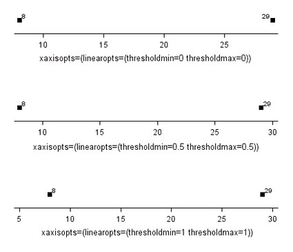
Adjusting Axis Thresholds
On a continuous, linear
axis, the THRESHOLDMIN = and THRESHOLDMAX = axis options can be used
to set a bias for including one more tick mark outside of either end
of the data range (or VIEWMIN to VIEWMAX range). The threshold range
is from 0 (do not include the tick mark) to 1 (include the tick mark).
The default is 0.30. The bias at the minimum end of the axis is calculated
using the THRESHOLDMIN= value and the minimum data value (by default)
or the VIEWMIN= value (if set).
The bias at the maximum
end of the axis is calculated using the THRESHOLDMAX= value and the
maximum data value (by default) or the VIEWMAX= value (if set).
Specifying THRESHOLDMIN=0
and THRESHOLDMAX=0 prevents the tick marks from extending beyond the
data range. Specifying THRESHOLDMIN=1 and THRESHOLDMAX=1 ensures that
the data range is bounded by tick marks.
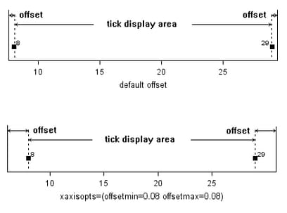
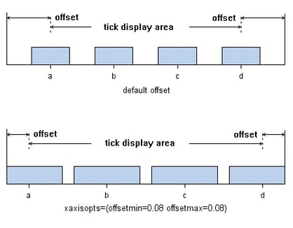
Adjusting Axis Offsets
The OFFSETMIN = and
OFFSETMAX = axis options can be used to reserve an area at the minimum
end of an axis, the maximum end, or both ends. No tick marks are displayed
in the reserved areas.
The offset range is
from 0 to 1, and the specified value is used to calculate the offset
as a percentage of the full axis length. The larger the offset area
that is reserved, the less space is available for the tick display
area. The default offset reserves just enough area to fully display
markers and other graphical features near the ends of an axis.