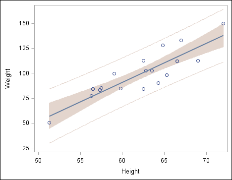
Example: Add a Regression Overlay and Set Plot Properties

About This Example

In this example, you overlay a regression plot with confidence limits on a scatter plot. You also do the following:
  • remove the title and footnote
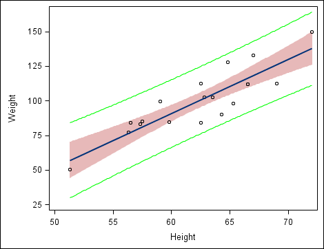
  • change the style element for one section of the plot, and explicitly override a style attribute for a different section
  • change the graph's style and examine the appearance of the modified sections
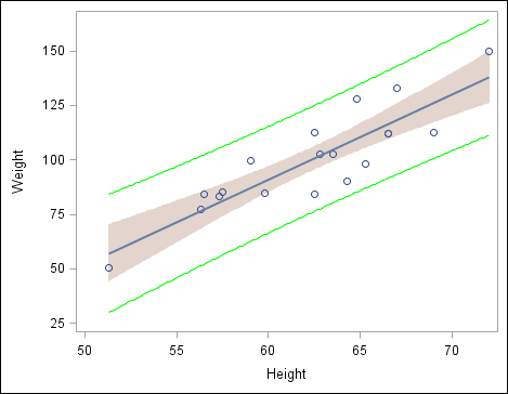
  • restore the style attribute override to its automatic value
Here is the graph that you create in this example:
Scatter Plot with Confidence Limits
There are several ways to create and customize this graph. The following steps show one way to create the graph.

Step One: Create the Graph and Assign Data

To create the graph and assign data:
  1. Open the Graph Gallery if it is not already open. For instructions, see Open and Use the Graph Gallery.
  2. On the Basic tab, double-click the ScatterPlot icon. The Assign Data dialog box opens.
  3. In the Assign Data dialog box, keep the default values. These are as follows:
    • SASHELP is selected from the Library list box.
    • CLASS is selected from the Data Set list box.
    • HEIGHT is selected from the X list box.
    • WEIGHT is selected from the Y list box.
  4. Click OK.
  5. Click and drag the Regression plot icon from the Plot Layers panel to the scatter plot. The Assign Data dialog box opens.
  6. In the Assign Data dialog box, do the following:
    • Keep the Fit an existing plot check box selected.
    • Select the CLM and CLI model band check boxes.
  7. Click OK.

Step Two: Remove the Title and Footnote

This example is concerned primarily with plot properties. You do not need the title or footnote.
To remove the title and footnote:
  1. At the top of the graph, right-click the placeholder title and select Remove Title from the pop-up menu.
  2. In the bottom left corner of the graph, right-click the placeholder footnote and select Remove Footnote from the pop-up menu.

Step Three: Change Plot Properties

First, you change the style element that is assigned to one section of the plot. Then you explicitly override the style attribute for a different section.
To change the plot properties:
  1. Right-click anywhere within the plot area and select Plot Properties. The Cell Properties dialog box opens and displays the Plots tab.
  2. From the Plot list box, select modelband if it is not already selected. This selection corresponds to the CLM band. By default, the Fill check box is selected.
  3. From the Style Element list box, select GraphConfidence2. The CLM band fill changes color.
  4. From the Plot list box, select modelband2. This selection corresponds to the CLI band. By default, the Outline check box is selected.
  5. From the Color list box, select the bright green color (bright green color). The CLI band outline changes color.
  6. Click OK.
Your graph looks similar to the following display.
Scatter Plot with Modified Confidence Limits

Step Four: Change the Graph's Style

To change the graph's style:
  1. Right-click the graph and select Graph Properties. The Graph Properties dialog box opens.
  2. From the Style list box, select Statistical.
  3. Click OK.
Your graph looks like the following display.
Scatter Plot with Modified Confidence Limits
The CLM band is suitable to the new style, whereas the CLI outline clashes with the style. The CLI clash occurs because you earlier overrode the style element that is associated with the CLI outline. In the next step, you restore the automatic value for the style element.

Step Five: Restore the Automatic CLI Plot Color

To restore the automatic value for the CLI color:
  1. Right-click anywhere within the plot area and select Plot Properties. The Cell Properties dialog box opens and displays the Plots tab.
  2. From the Plot list box, select modelband2 if it is not already selected. This selection corresponds to the CLI band.
  3. From the Color list box, select Auto. The CLI band outline changes color.
  4. Click OK.
Your graph looks like the following display.
Scatter Plot with Confidence Limits