You can
create a multi-cell graph that has a scatter plot matrix layout. Here
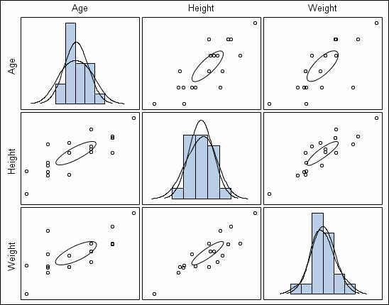
is an example of a scatter plot matrix:
Here are
the characteristics of scatter plot matrices:
-
The matrix is a data-driven graph
based on matrix variables.
-
The diagonal cells can be populated
with a histogram and up to two density plots.
-
The non-diagonal cells contain
a scatter plot for the crossing variables with an optional mean or
prediction ellipse. When you change the plot properties for the scatter
markers, the change is applied to all non-diagonal cells. (Exception:
The wall and outline properties apply to all cells.)
-
You cannot change the properties
of the histograms, density plots, and ellipses.
To create
a scatter plot matrix:
-
Select
File NewFrom
Graph Gallery
NewFrom
Graph Gallery. The Graph Gallery opens.
-
-
Select
the predefined matrix graph that you want to use. You can choose from
two different types:
-
NxN matrix: The first four predefined
matrix graphs in the Graph Gallery create an NxN matrix. This matrix
crosses all the values of one list of variables with all others, creating
a square matrix with diagonal cells.
-
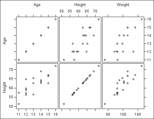
MxN matrix: The last two graphs
in the Graph Gallery create an MxN matrix. This type of matrix crosses
two lists of variables and creates a rectangular matrix without any
diagonal cells.
-
Click
OK. The Assign Data dialog box opens.
-
Specify
the SAS library and data set you want to use for the plot by selecting
the appropriate items from the
Library and
Data Set list boxes.
-
In the
Roles section, select the check box for each variable
that you want in the graph. If you want to select all items, then
select the check box in the heading.
For an
MxN matrix, select the variables from two lists, one for column variables
and another for row variables.
-
(NxN matrices
only) In the
Diagonal Cells section, select
the plot types for the diagonal cells. You can choose a histogram
and up to two density plots.
-
If you
want an ellipse to appear in the cells, do the following:
-
Check
the
Ellipse check box.
-
Select
either
Mean or
Predicted.
-
You can
either change the
Alpha value or keep the
default value.
For an
NxN matrix, the ellipse appears in the non-diagonal cells.
-
If you
want a more descriptive name for the plot, enter the name in the
Name field. This name identifies the plot in the Assign
Data dialog box as well as in the Cell Properties dialog box.
By default,
the designer uses generic names for each plot. It is good practice
to assign a descriptive name that indicates a response variable or
some identifying characteristic of the plot.
-
Here is
an MxN rectangular matrix: