Create and Deploy a Custom Theme
You can use predefined
base themes to create custom themes in SAS Theme Designer for Flex.
The following steps show you how to create and deploy a custom theme.
-
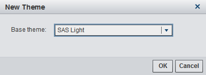
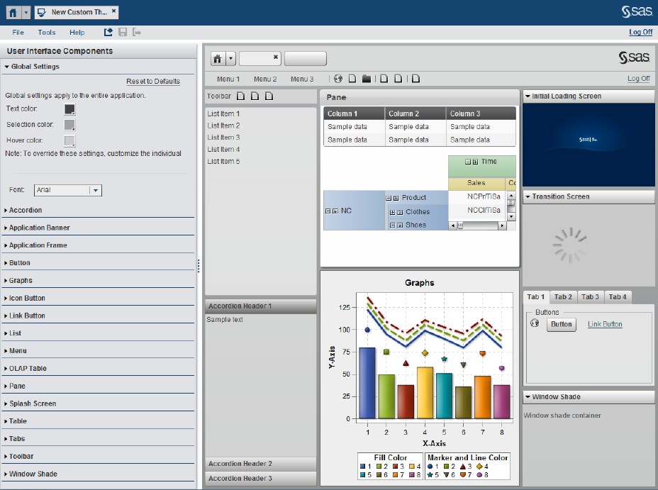
In the New Theme dialog box, select one of the predefined base themes. In the display below, the SAS Light base theme is selected.Click OK. The new theme is generated and ready to customize. The initial look and feel of the theme is determined by the predefined base theme that you selected. In the right pane, different components of the theme are displayed. The right pane provides an automatic, instant preview as you work. The left pane contains the User Interface Components that you can modify for your custom theme. See User Interface Componentsfor more information.Note: After you create and deploy a custom theme, you can use that theme as a basis for future themes. Such dependent relationships among themes are dynamic. For example, if you change Theme A, that change affects all themes that are based on Theme A (except for any design elements that are explicitly specified in the dependent themes).
-
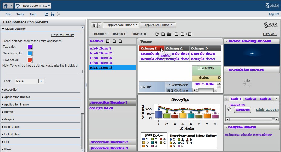
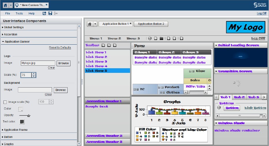
Select the components that you want to change from the User Interface Components panel. The impact of each change is instantly shown in the right pane.All of the design elements are listed in the User Interface Components pane. The sample application on the right contains examples of all of the available components. Changes that you make to certain user interface components affect other components. For example, if you change the color for Button, the colors for Tabs and Accordion change.One place to begin changing your custom theme is the Global Settings menu on the User Interface Components. You can change text color, hover and selection colors, and the font type that is applied to the custom theme.The following display shows Global Settings changes. The text color is changed to purple, the selection color is changed to blue, and the hover color is changed to red. The font type has been changed to Raavi.Another change that you can make is to the Application Banner for your theme. Open the Application Banner component. In the Logo group box, click Browse. Locate and select the image that you want to use from your local hard drive. In the display below, the Application Banner has been changed. The image file MyLogo.jpg has been loaded into the theme.
-
TipTo revert the settings for a particular interface component (undoing all of your unsaved changes to that component in the current session), select the component in the User Interface Components pane. Then click Reset to Defaults in the lower left pane. The settings that were initially loaded for this session are then reapplied.
-
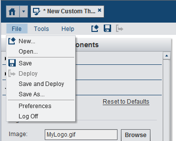
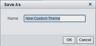
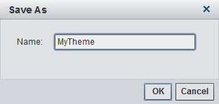
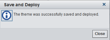
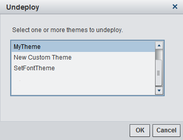
In the Save As window, enter a name for the custom theme. Click OK. The theme is saved and deployed.Note: Most special characters are not allowed in the theme name. The theme name can include alphabetic letters, digits, an underscore, and spaces.The theme is now available for use with other functions in your current session of SAS Theme Designer for Flex and with other applications that might use Flex themes. For example, you can undeploy the theme if needed. From the Tools menu, select Undeploy. The Undeploy window appears. In the display below, the custom theme named MyTheme is now available for selection. Select the theme that you want to undeploy and click OK.
Copyright © SAS Institute Inc. All rights reserved.