Getting Started with Time Series Forecasting
White Noise and Stationarity Plots
Select the fourth icon from the top in the vertical toolbar. This switches the Viewer to display a plot of white noise and stationarity tests on the model prediction errors, as shown in Figure 54.42.
Figure 54.42: Model Viewer: White Noise and Stationarity Plot
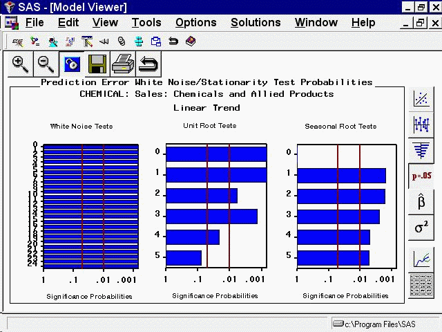
The white noise test bar chart shows significance probabilities of the Ljung-Box chi square statistic. Each bar shows the probability computed on autocorrelations up to the given lag. Longer bars favor rejection of the null hypothesis that the prediction errors represent white noise. In this example, they are all significant beyond the 0.001 probability level, so that you reject the null hypothesis. In other words, the high level of significance at all lags makes it clear that the linear trend model is inadequate for this series.
The second bar chart shows significance probabilities of the augmented Dickey-Fuller test for unit roots. For example, the bar at lag three indicates a probability of 0.0014, so that you reject the null hypothesis that the series is nonstationary. The third bar chart is similar to the second except that it represents the seasonal lags. Since this series has a yearly seasonal cycle, the bars represent yearly intervals.
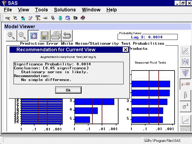
You can select any of the bars to display an interpretation. Select the fourth bar of the middle chart. This displays the
Recommendation for Current View, as shown in Figure 54.43. This window gives an interpretation of the test represented by the bar that was selected; it is significant, therefore a
stationary series is likely. It also gives a recommendation: You do not need to perform a simple difference to make the series
stationary.
Figure 54.43: Model Viewer: Recommendation for Current View