Working with Time Series Data
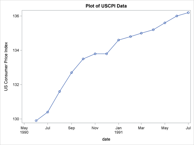
The following statements use the SGPLOT procedure to plot CPI in the USCPI data set against DATE. (The USCPI data set was shown in a previous example; the data set plotted in the following example contains more observations than shown previously.)
title "Plot of USCPI Data";
proc sgplot data=uscpi;
   series x=date y=cpi / markers;
run;
The plot is shown in Figure 3.8.
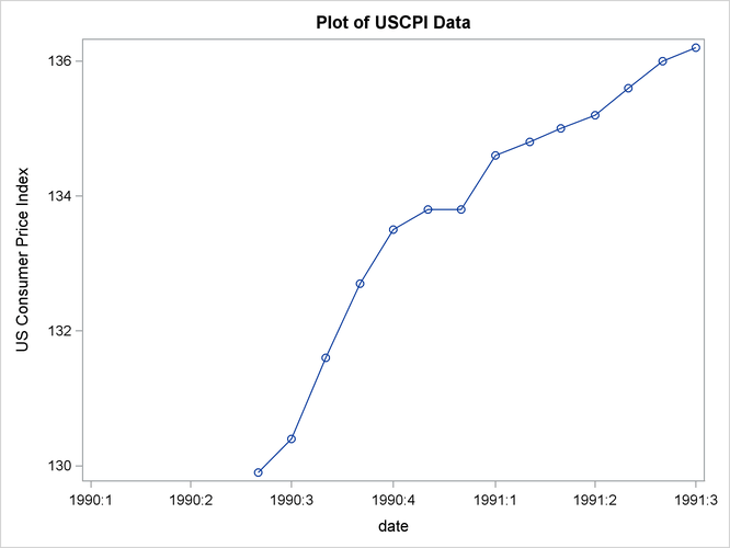
It is possible to control the spacing of the tick marks on the time axis. The following statements use the XAXIS statement to tell PROC SGPLOT to mark the axis at the start of each quarter:
proc sgplot data=uscpi;
   series x=date y=cpi / markers;
   format date yyqc.;
   xaxis values=('1jan90'd to '1jul91'd by qtr);
run;
The plot is shown in Figure 3.9.
You can plot two or more series stored in different variables on the same graph by specifying multiple plot requests in one SGPLOT statement.
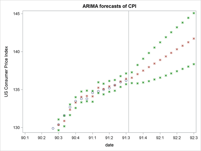
For example, the following statements plot the CPI, FORECAST, L95, and U95 variables produced by PROC ARIMA in a previous example. A reference line is drawn to mark the start of the forecast period. Quarterly tick marks with YYQC format date values are used.
title "ARIMA Forecasts of CPI";

proc arima data=uscpi;
   identify var=cpi(1);
   estimate q=1;
   forecast id=date interval=month lead=12 out=arimaout;
run;

title "ARIMA forecasts of CPI";
proc sgplot data=arimaout noautolegend;
   scatter x=date y=cpi;
   scatter x=date y=forecast / markerattrs=(symbol=asterisk);
   scatter x=date y=l95 / markerattrs=(symbol=asterisk color=green);
   scatter x=date y=u95 / markerattrs=(symbol=asterisk color=green);
   format date yyqc4.;
   xaxis values=('1jan90'd to '1jul92'd by qtr);
   refline '15jul91'd / axis=x;
run;
The plot is shown in Figure 3.10.
You can also plot several series on the same graph when the different series are stored in the same variable in interleaved form. Plot interleaved time series by using the values of the ID variable in GROUP= option to distinguish the different series.
The following example plots the output data set produced by PROC FORECAST in a previous example. Since the residual series has a different scale than the other series, it is excluded from the plot with a WHERE statement.
The _TYPE_ variable is used in the PLOT statement to identify the different series and to select the SCATTER statements to use for each plot.
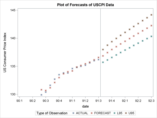
title "Plot of Forecasts of USCPI Data";

proc forecast data=uscpi interval=month lead=12
              out=foreout outfull outresid;
   var cpi;
   id date;
run;

proc sgplot data=foreout;
   where _type_ ^= 'RESIDUAL';
   scatter x=date y=cpi / group=_type_ markerattrs=(symbol=asterisk);
   format date yyqc4.;
   xaxis values=('1jan90'd to '1jul92'd by qtr);
   refline '15jul91'd / axis=x;
run;
The plot is shown in Figure 3.11.
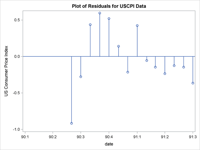
The following example plots the residuals series that was excluded from the plot in the previous example. The NEEDLE statement specifies a needle plot, so that each residual point is plotted as a vertical line showing deviation from zero.
title "Plot of Residuals for USCPI Data";
proc sgplot data=foreout;
   where _type_ = 'RESIDUAL';
   needle x=date y=cpi / markers;
   format date yyqc4.;
   xaxis values=('1jan90'd to '1jul91'd by qtr);
run;
The plot is shown in Figure 3.12.