Choosing the Best Forecasting Model
The Time Series Viewer is a graphical tool for viewing and analyzing time series. It can be used separately from the Time Series Forecasting System by using the TSVIEW command or by selecting Time Series Viewer from the Analysis pull-down menu under Solutions.
In this chapter you will use the Time Series Viewer to examine plots of your series before fitting models. Begin this example
by invoking the Forecasting system and selecting the View Series Graphically button, as shown in Figure 49.1, or the View Series toolbar icon.
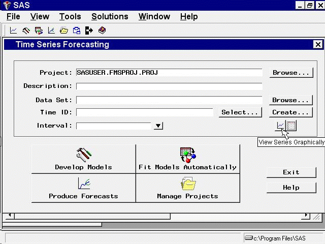
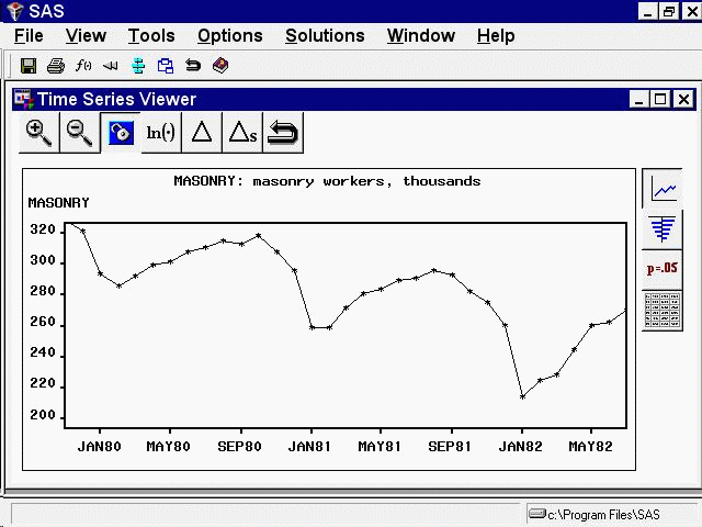
From the Series Selection window, select SASHELP as the library, WORKERS as the data set, and MASONRY as the time series,
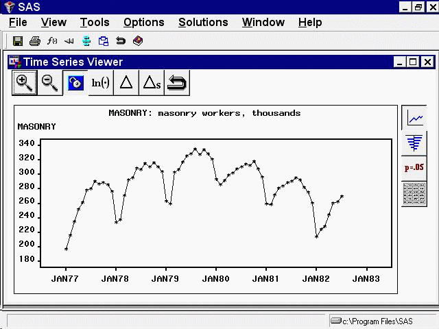
and then click the Graph button. The Time Series Viewer displays a plot of the series, as shown in Figure 49.2.
Select the Zoom In icon, the first one on the window’s horizontal toolbar. Notice that the mouse cursor changes shape and that "Note: Click on a corner of the region, then drag to the other corner" appears on the message line. Outline an area, as shown in Figure 49.3, by clicking the mouse at the upper-left corner, holding the button down, dragging to the lower-right corner, and releasing the button.
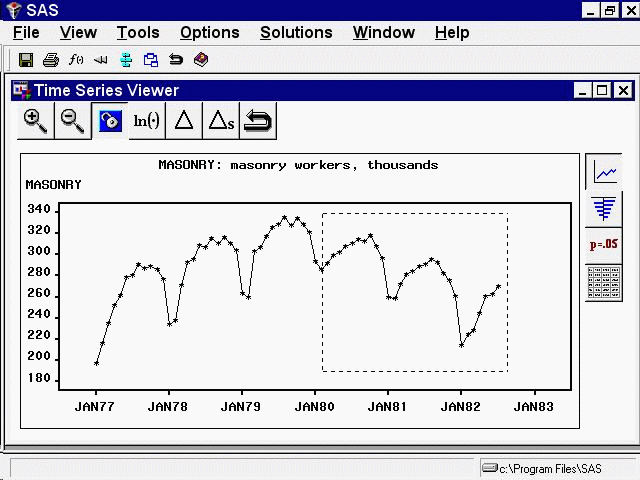
The zoomed plot should appear as shown in Figure 49.4.
You can repeat the process to zoom in still further. To return to the previous view, select the Zoom Out icon, the second icon on the window’s horizontal toolbar.
The third icon on the horizontal toolbar is used to link or unlink the viewer window. By default, the viewer is linked, meaning
that it is automatically updated to reflect selection of a different time series. To see this, return to the Series Selection
window by clicking on it or using the Window menu or Next Viewer toolbar icon. Select the Electric series in the Time Series Variables list box. Notice that the Time Series Viewer window is updated to show a plot of the ELECTRIC series. Select the Link/Unlink icon if you prefer to unlink the viewer so that it is not automatically updated in this way. Successive selections toggle
between the linked and unlinked state. A note on the message line informs you of the state of the Time Series Viewer window.
When a Time Series Viewer window is linked, selecting View Series again makes the linked Viewer window active. When no Time Series Viewer window is linked, selecting View Series opens an additional Time Series Viewer window. You can bring up as many Time Series Viewer windows as you want.
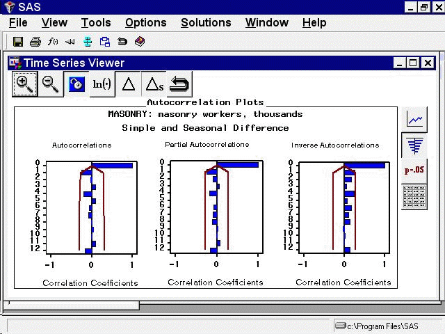
Having seen the plot in Figure 49.2, you might suspect that the series is nonstationary and seasonal. You can gain further insight into this by examining the sample autocorrelation function (ACF), partial autocorrelation function (PACF), and inverse autocorrelation function (IACF) plots. To switch the display to the autocorrelation plots, select the second icon from the top on the vertical toolbar at the right side of the Time Series Viewer. The plot appears as shown in Figure 49.5.
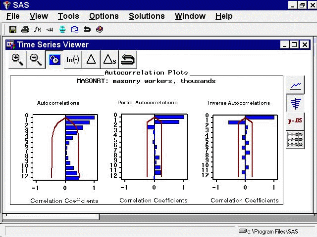
Each bar represents the value of the correlation coefficient at the given lag. The overlaid lines represent confidence limits
computed at plus and minus two standard errors. You can switch the graphs to show significance probabilities by selecting
Correlation Probabilities under the Options pull-down menu, or by selecting the Toggle ACF Probabilities toolbar icon.
The slow decline of the ACF suggests that first differencing might be warranted. To see the effect of first differencing, select the simple difference icon, the fifth icon from the left on the window’s horizontal toolbar. The plot now appears as shown in Figure 49.6.
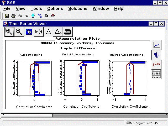
Since the ACF still displays slow decline at seasonal lags, seasonal differencing is appropriate (in addition to the first
differencing already applied). Select the Seasonal Difference icon, the sixth icon from the left on the horizontal toolbar. The plot now appears as shown in Figure 49.7.