Cluster Analysis
Overview
Cluster analysis is
often referred to as supervised classification because it attempts
to predict group or class membership for a specific categorical response
variable. Clustering, on the other hand, is referred to as unsupervised
classification because it identifies groups or classes within the
data based on all the input variables. These groups, or clusters,
are assigned numbers. However, the cluster number cannot be used to
evaluate the proximity between clusters.
Building the Process Flow Diagram
This example uses the
same diagram workspace that you created in Chapter 2. You have the
option to create a new diagram for this example, but instructions
to do so are not provided in this example. First, you need to add
the SAMPSIO.DMABASE data source to project.
This creates the All:
Baseball Data data source in your Project Panel. Drag
the All: Baseball Data data source to your
diagram workspace.
If you explore the data
in the All: Baseball Data data source, you
will notice that SALARY and LOGSALAR have missing values. Although
it is not always necessary to impute missing values, at times the
amount of missing data can prevent the Cluster node from obtaining
a solution. The Cluster node needs some complete observations in order
to generate the initial clusters. When the amount of missing data
is too extreme, use the Replacement or Impute node to handle the missing
values. This example uses imputation to replace missing values with
the median.
On the Modify tab,
drag an Impute node to your diagram workspace.
Connect the All: Baseball Data data source
to the Impute node. In the Interval
Variables property subgroup, set the value of the Default
Input Method property to Median.
On the Explore tab,
drag a Cluster node to your diagram workspace.
Connect the Impute node to the Cluster node.

By default, the Cluster
node uses the Cubic Clustering Criterion (CCC) to approximate the
number of clusters. The node first makes a preliminary clustering
pass, beginning with the number of clusters that is specified in the Preliminary
Maximum value in the Selection Criterion properties.
After the preliminary pass completes, the multivariate means of the
clusters are used as inputs for a second pass that uses agglomerative,
hierarchical algorithms to combine and reduce the number of clusters.
Then, the smallest number of clusters that meets all four of the following
criteria is selected.
Note: If the data to be clustered
is such that the four criteria are not met, then the number of clusters
is set to the first local peak. In this event, the following warning
is displayed in the Cluster node log:
WARNING: The number
                     of clusters selected based on the CCC values may not be valid. Please
                     refer to the documentation of the Cubic Clustering Criterion. There
                     are no number of clusters matching the specified minimum and maximum
                     number of clusters. The number of clusters will be set to the first
                     local peak.
After the number of clusters is determined,
a final pass runs to produce the final clustering for the Automatic
setting.
Using the Cluster Node
Right-click the Cluster node
and click Run. In the Confirmation window,
click Yes. Click Results in
the Run Status window.
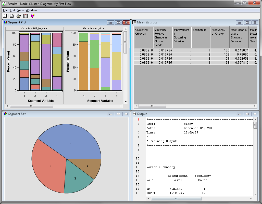
On the main menu, select View Cluster ProfileVariable Importance. The Variable
Importance window displays each variable that was used
to generate the clusters and their relative importance. Notice that
NO_ASSTS, NO_ERROR, and NO_OUTS have an Importance of
0. These variables were not used by the Cluster node when the final
clusters were created.
Cluster ProfileVariable Importance. The Variable
Importance window displays each variable that was used
to generate the clusters and their relative importance. Notice that
NO_ASSTS, NO_ERROR, and NO_OUTS have an Importance of
0. These variables were not used by the Cluster node when the final
clusters were created.
This plot displays the
normalized mean value for each variable, both inside each cluster
and for the complete data set. Notice that the in-cluster mean for
cluster 1 is always less than the overall mean. But, in cluster 4,
the in-cluster mean is almost always greater than the overall mean.
Clusters 2 and 3 each contain some in-cluster means below the overall
mean and some in-cluster means above the overall mean.
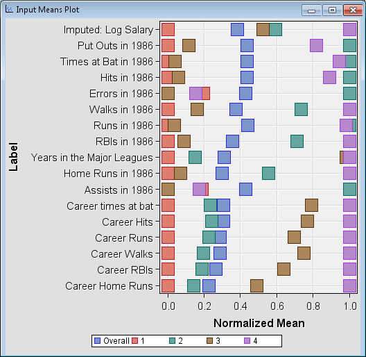
From the Input
Means Plot, you can infer that the players in cluster
1 are younger players that are earning a below average salary. Their
1986 and career statistics are also below average. Conversely, the
players in cluster 4 are veteran players with above average 1986 and
career statistics. These players receive an above average salary.
The players in clusters 2 and 3 excel in some areas, but perform poorly
in others. Their average salaries are slightly above average.
Examining the Clusters
Select the Cluster node
in your process flow diagram. Click the ellipsis button next to the Exported
Data property. The Exported Data —
Cluster window appears. Click TRAIN and
click Explore.
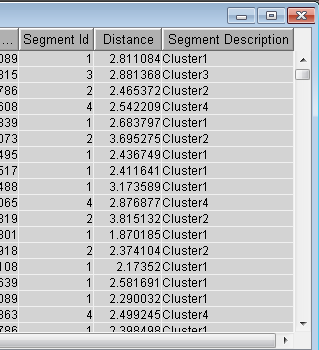
The Clus_TRAIN window
contains the entire input data set and three additional columns that
are appended to the end. Scroll to the right end of the window to
locate the Segment ID, Distance,
and Segment Description columns. The Segment
ID and Segment Description columns
display what cluster each observation belongs to.
Copyright © SAS Institute Inc. All rights reserved.