Example: Creating a Spark Table

Overview

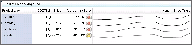
This example describes how to create a spark table indicator that displays a sparkline in one column and gauges in another column. Depending on how it’s defined, the spark table indicator can show summary data, detailed data, or trend data. Each row can include table data, gauges, or a sparkline.
The following spark table example displays data and gauges in the second column and a sparkline in the third column.
Example of a Spark Table Indicator with Gauges and a Sparkline Graph
example of a spark table with gauges and a sparkline graph
For more information, see Spark Table.

Identify the Indicator Data to Use

Before you can create the indicator, you must identify the indicator data that you want to use. In this example, the spark table has four columns:
  • Product Line
  • 2007 Total Sales
  • Avg Monthly Sales
  • Monthly Sales Trend
Three of these columns aggregate the data that they use:
  • The 2007 Total Sales column sums its data.
  • The Avg Monthly Sales column averages its data.
  • The Monthly Sales Trend column sums its data for the sparkline.
For each of these columns, there must be enough data points in the indicator data to be aggregated.
To display a sparkline, the data must provide the following variables:
  • an X-axis variable
  • a group-by variable
  • a metric variable
This example uses the following indicator data:
example indicator data
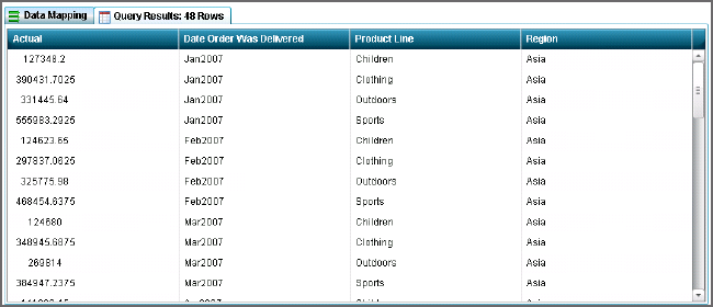
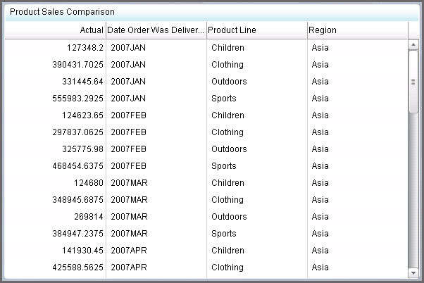
From this indicator data, the column data used for the sparkline variables are:
  • an X-axis variable: Date Order Was Delivered
  • a group-by variable: Product Line
  • a metric variable: Actual
To create the sparkline, the data points that are provided by the source data selection Actual are summed for each product line. Then the sum is plotted for each sparkline by using the Spark X axis selection Date Order Was Delivered. The resulting sparklines show the trend of sales by month for each product line.

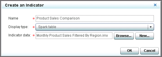
Create the Spark Table Indicator

To create a spark table indicator for use in a dashboard, complete the following steps in the SAS BI Dashboard designer:
  1. In the workspace, click New indicator icon. The Create an Indicator window appears.
  2. In the Name field, type the name.
  3. From the Display type list, select Spark table.
  4. Next to the Indicator data field, click Browse, navigate to the indicator data, and then open it.
    Create a spark table Indicator
  5. Click OK. The indicator tab opens in the workspace and the spark table indicator appears with all of the available indicator data columns.
    Initial spark table Indicator
  6. You can remove data columns from the spark table that you do not want to display. Complete the following steps.
    Note: This removal only affects what the spark table indicator displays. It does not affect the indicator data object itself.
    1. Hover over the column heading of the data column that you want to remove. The column menu appears.
      Spark table column menu appears
    2. Click Options menu and select Delete column. The column is removed from the spark table. In this example, the Region column and the Date Order Was Delivered column are deleted.
      Spark table column menu appears
  7. In the Properties pane, view the Display Settings section.
    • From the Spark group by list, select the value that you want to group by. In this example, Product Line is selected.
    • From the Spark X axis list, select the value that you want to use for the X axis of the sparkline. In this example, Date Order Was Delivered is selected.
  8. To add a column for the sparkline, hover over the column heading of the data column that is to the left of where you want to add the sparkline column. Click Options menu and select Add column. The new column appears in the spark table.
  9. To configure the new column to display a sparkline, complete the following steps:
    1. If the new column is not highlighted, click the column heading to highlight it.
    2. In the Properties pane, view the Column section.
    3. From the Source data list, select the metric column to display on the Y axis of the sparkline. In this example, Actual is selected.
    4. In the Column title field, enter a title that labels the sparkline. In this example, Monthly Sales Trend is entered. The title labels the trend data for the business user.
    5. In the Column width (%) field, select the width to use for the column. In this example, 50 is selected.
    6. From the Aggregate function list, select Sparkline to use the sparkline feature in the column.
      Note: The Group by selection is Product Line. The data points that are provided by the source data selection Actual are summed for each product line. Then the sum is plotted for each sparkline by using the Spark X axis selection Date Order Was Delivered. The resulting sparklines show the trend of sales by month for each product line.
  10. To configure the Avg Monthly Sales column, complete the following steps:
    1. Click the column heading to highlight the column and view its properties in the Column section.
    2. From the Source data list, select the metric column to display. In this example, Actual is selected.
    3. In the Column title field, enter a title that labels the column. In this example, Avg Monthly Sales is entered.
    4. In the Column width (%) field, enter the width to use for the column. In this example, 20 is selected.
    5. From the Aggregate function list, select Average to provide the average for each product row.
      Note: The data points provided by the source data selection Actual are averaged for each product line. The Group by selection is Product Line.
    6. From the Format list, select $123,456 to format the average monthly sales data.
    7. In the Range field, specify a range definition to use.
    8. From the Gauge type list, select the type of gauge that you want to use in the column. In this example, Dynamic radial dial is selected.
    9. From the Range Value list, select the value to which you want to apply the defined range intervals. In this example, Actual is selected.
  11. To configure the Sales Amount column, complete the following steps:
    1. Click the column heading to highlight the column and view its properties in the Column section.
    2. From the Source data list, select the metric column to display. In this example, Actual is selected.
    3. In the Column title field, enter a title that labels the column. In this example, 2007 Total Sales is entered.
    4. In the Column width (%) field, enter the width to use for the column. In this example, 20 is selected.
    5. From the Aggregate function list, select Total to provide the total for each product row.
      Note: The data points provided by the source data selection Actual are summed for each product line. The Group by selection is Product Line.
    6. From the Format list, select $123,456 to format the sales total data.
  12. To configure the Product Line column, complete the following steps:
    1. Click the column heading to highlight the column and view its properties in the Column section.
    2. From the Source data list, select the metric column to display. In this example, Product Line is selected.
    3. In the Column title field, enter a title that labels the column. In this example, Product Line is entered.
    4. In the Column width (%) field, enter the width to use for the column. In this example, 15 is selected.
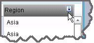
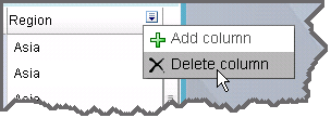
  13. Adjust the columns in the spark table by clicking to highlight each column heading. Then, in the Column section of the Properties pane, enter the width to use for the highlighted column in the Column width (%) field.
    Tip
    • When adjusting the width of the columns in a spark table, work from left to right in the spark table.
    • Use the Column width (%) list to change the column width instead of dynamically resizing the column by dragging the column border. Dragging causes all of the data in the column (such as sparklines) to be recalculated. The recalculation can cause performance delays.
    • Column size changes made by dragging are not saved with the indicator. Only column size changes in the Column width (%) field are saved with the indicator.
  14. Click Save icon to save the spark table indicator.
    the final spark table
The spark table is now available for use in a dashboard. For more information about creating a dashboard, see Laying Out Content in a Dashboard.