Create a Dashboard from Sample Data

Data File

The sample data file used in this section can be obtained from SAS Technical Support. Your SAS administrator must copy it to the sas-datasets folder under the SAS BI Dashboard configuration folder (for example C:\sas\<plan file name>\Lev1\Appdata\SASBIDashboard4.2\sas-datasets). It is necessary to do this only once.
The data file contains the following fields:
Example data file

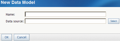
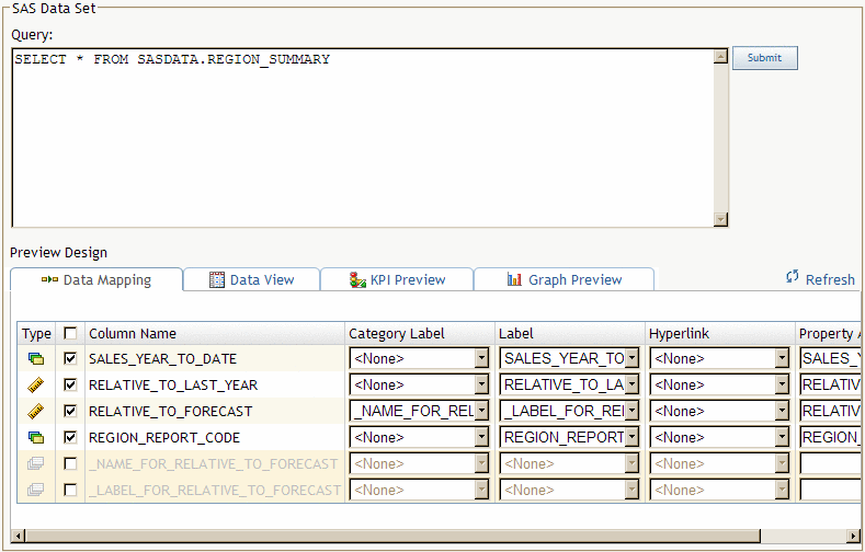
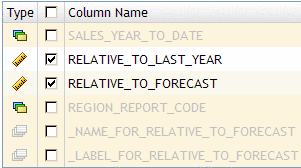
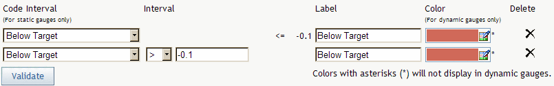
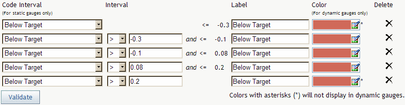
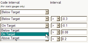
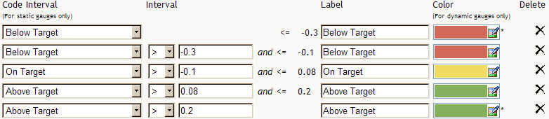
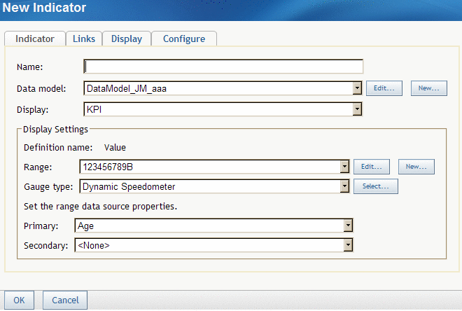
Create the Data Model

Your first step is to create a data model for the indicator. The data model can use a SAS data set data source, a SAS Information Map data source, a SAS metadata table data source, or a scorecard data source. This example uses a SAS data set data source.
Note: This example uses a SAS data set data source because it is available to all customers. Within your own organization, a SAS Information Map is usually the easiest data source to use because you do not have to create an SQL query.
To create the data model:
  1. In a collection portlet, click the item that starts the SAS BI Dashboard.
    The Manage Indicators page appears.
    Manage Indicators page
  2. Click the Data Models tab.
    The Manage Data Models page appears.
    Manage Data Models page
  3. Click New Model.
    The New Data Model page appears.
    New Data Model page
  4. In the Name field, type Regional Summary.
  5. Next to the Data source field, click Select, and select SAS Data Set.
    The Query field appears.
  6. In the Query field, type SELECT * FROM SASDATA.REGION_SUMMARY.
    If you are reading this document in an electronic format, you can copy and paste the query.
  7. Click Submit.
    The fields to define a SAS data source appear.
    Fields to define a SAS Data Set data source
  8. From the Column Name column, ensure that the RELATIVE_TO_LAST_YEAR and RELATIVE_TO_FORECAST check boxes are the only check boxes selected.
    Data columns selected
    The other data columns are not used in the dashboard.
  9. From the Category Label drop-down list in the RELATIVE_TO_FORECAST row, select _NAME_FOR_RELATIVE_TO_FORECAST.
    The value for Category Label is displayed on the KPI gauge. In this example, it appears at the top of the KPI gauge.
  10. From the Label drop-down list, select _LABEL_FOR_RELATIVE_TO_FORECAST.
    The value for Label is the value displayed by the KPI gauge. In this example, it appears at the bottom of the KPI gauge.
    Here is how these two values appear in the example gauge:
    How fields appear in a gauge
    Note: The value for Hyperlink, which specifies information about hyperlinks, and the value for Property Alias, which is text that replaces the value retrieved for Column Name, are not used in this example. The default values are used for this example.
  11. Click OK.
    You return to the Manage Data Models page.

Define the Range

Your next step is to create a range for the indicator.
  1. On the Manage Data Models page, click the Ranges tab.
    The Manage Ranges page appears.
    Manage Ranges page
  2. Click New Range.
    The New Range page appears.
    New Range page
    For this example, you create a range with intervals at -.3, -.1, .08, and .2.
  3. In the Range name field, type Range 1.
  4. In the Interval field, type -.1, and click Add Interval.
    The interval appears in the table.
    Interval added to the table
  5. Type the values .2, -.3, and .08, clicking Add Interval after each value.
  6. Notice that, although you typed the interval values in a random order, the intervals are ordered correctly in the table.
    Intervals appear in the correct order
  7. For the -.1 interval, select On Target from the drop-down list in the Code Interval column.
    Selecting an interval's target
  8. Notice that the value in the Label column for the -.1 interval is now On Target and that the color is yellow.
  9. For the intervals .08 and .2, specify the code interval as Above Target.
    The table now looks like this:
    Final table with all intervals specified
  10. Click OK.
    You return to the Manage Ranges page. Remain on this page.

Create the Indicator

Your next step is to create the indicator. There are four steps to create an indicator:
  1. Define the indicator.
    This step is the minimum required to create an indicator.
  2. Define the links.
    This example does not address links.
  3. Define the display.
    This example changes the display of the indicator only in a minor way.
  4. Configure the indicator.
    This example does not address configuration.
The settings necessary to perform each step are presented on separate tabs.
To create the indicator for this example:
  1. On the Manage Ranges page, click the Indicators tab.
    The Manage Indicators page appears.
    Manage Indicators page
  2. Click New Indicator.
    The New Indicator page appears.
    New Indicator page
  3. In the Name field, type Regional Sales KPIs.
  4. From the Data model drop-down list, select Regional Summary.
    This is the data model that you just created.
  5. From the Display drop-down list, select KPI.
    When you select a display, the information in the Display Settings area changes based on the display selected.
    Display Settings change based on the display selected
  6. From the Range drop-down list, select Range 1.
    This is the range that you just created.
  7. From the Gauge type drop-down list, select Dynamic Dial.
    The Dynamic Dial appears as a three-dimensional, colorful gauge in the dashboard.
  8. From the Primary drop-down list, select RELATIVE_TO_FORECAST.
    The page now looks like this:
    Page after selecting RELATIVE_TO_FORECAST
    The value in the data field RELATIVE_TO_FORECAST appears in the indicator.
    Although you have specified enough information to create the indicator, the following step will create a better display.
  9. Click the Display tab.
  10. Clear the Use Default check box, and in the Width field, type 900.
    Adjusting the width of the indicator
    This value widens the indicator so that it doesn’t wrap in the dashboard.
  11. Click OK.
    You return to the Manage Indicators page. Remain on this page.

Create the Dashboard

  1. On the Manage Indicators page, click the Dashboards tab.
    The Manage Dashboards page appears.
    Manage Dashboard page
  2. Click New Dashboard.
    The New Dashboard page appears.
    New Dashboard page
  3. In the Dashboard name field, type Example Dashboard.
  4. From the Available indicators list, select Regional Sales KPIs, and click the right arrow.
    Regional Sales KPIs moves to the Selected indicators list.
  5. Click OK.
    You return to the Manage Dashboards page.
  6. Reopen the SAS Information Delivery Portal.
  7. From the Dashboard drop-down list in the portal, select Example Dashboard.
    Selecting the example dashboard
    The example dashboard appears.
    Example dashboard
    Congratulations! You just created your first dashboard. Compare the dashboard to the underlying data:
    Compare the dashboard to the underlying data