| Descriptive Statistics |
Computing Correlations
You can use the Correlations task to compute pairwise correlation coefficients for the variables in your data set. The correlation is a measure of the strength of the linear relationship between two variables. This task can compute the standard Pearson product-moment correlations, nonparametric measures of association, partial correlations, and Cronbach's coefficient alpha. The task also can produce scatter plots with confidence ellipses.
The following example computes correlation coefficients for four variables in the Fitness data set. This data set contains measurements made on groups of men taking a physical fitness course at North Carolina State University. The variables are as follows:
- age
- age, in years
- weight
- weight, in kilograms
- oxygen
- oxygen intake rate, in milliliters per kilogram of body weight per minute
- runtime
- time taken to run 1.5 miles, in minutes
- rstpulse
- heart rate while resting
- runpulse
- heart rate while running
- maxpulse
- maximum heart rate recorded while running
- group
- group number
This example includes looking at correlations between the variables runtime, runpulse, maxpulse, and oxygen and also producing the corresponding scatter plots with confidence ellipses.
Open the Fitness Data Set
To open the Fitness data set, follow these steps:- Select Tools
 Sample Data ...
 - Select Fitness.
- Click OK to create the sample data set in your Sasuser directory.
- Select File Open By SAS Name ...
- Select Sasuser from the list of Libraries.
- Select Fitness from the list of members.
- Click OK to bring the Fitness data set into the data table.
Request Correlations
To compute correlations for variables in the Fitness data set, follow these steps:- Select Statistics Descriptive Correlations ...
- Select the variables runtime, runpulse, maxpulse, and oxygen to correlate.
Figure 7.18 displays the resulting Correlations dialog.
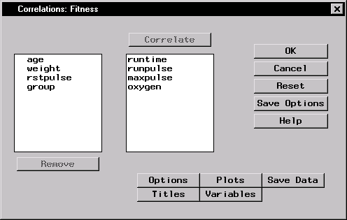 |
Figure 7.18: Correlations Dialog
If you click OK in the Correlations main dialog, the default output, which includes Pearson correlations, is produced. Or, you can request specific types of correlations by using the Options dialog.
Request a Scatter Plot
To request a scatter plot with a confidence ellipse, follow these steps:- Click on the Plots button.
- Select Scatter plots.
- Select Add confidence ellipses.
The confidence level used in calculating the confidence ellipse is 0.95. To use a different level, type that value in the Probability value: field, as displayed in Figure 7.19.
- Click OK.
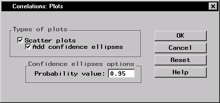 |
Figure 7.19: Correlations: Plots Dialog
Click OK in the main dialog to perform the analysis.
Review the Results
The results are presented in the project tree, as displayed in Figure 7.20.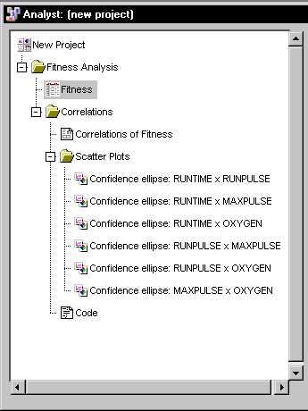 |
Figure 7.20: Correlations: Project Tree
You can double-click on any of the resulting nodes in the project tree to view the information in a separate window.
Figure 7.21 displays univariate statistics for each of the analysis variables. The table provides the number of observations, the mean, the standard deviation, the sum, and the minimum and maximum values for each variable.
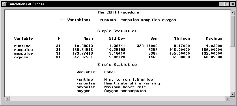 |
Figure 7.21: Correlations: Univariate Statistics
Figure 7.22 displays the table of correlations. The p-value, which is the significance probability of the correlation, is displayed under each of the correlation coefficients. For example, the correlation between the variables maxpulse and runtime is 0.22610, with an associated p-value of 0.2213, and the correlation between the variables oxygen and runpulse is -0.39797, with an associated p-value of 0.0266.
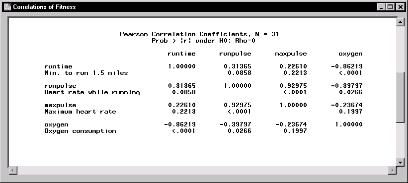 |
Figure 7.22: Correlations: Table of Correlations
Six scatter plots, each of which includes a 95% confidence ellipse, are produced in this analysis. Each plot displays the relationship between one pair of the analysis variables. The scatter plot of runtime versus oxygen is displayed in Figure 7.23.
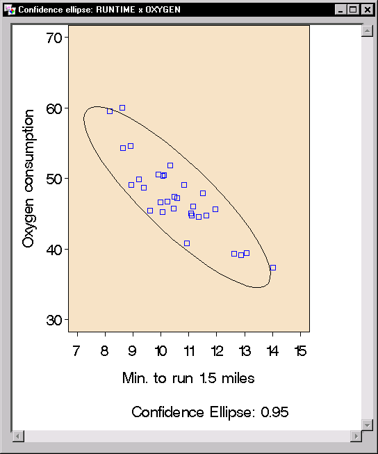 |
Figure 7.23: Correlations: Scatter Plot with Confidence Ellipse
Confidence ellipses are used as a graphical indicator of correlation. When two variables are uncorrelated, the confidence ellipse is circular in shape. The ellipse becomes more elongated the stronger the correlation is between two variables.
Copyright © 2007 by SAS Institute Inc., Cary, NC, USA. All rights reserved.