| Plackett-Burman Designs |
Exploring the Response Data
The main-effects plot, the scatter plot, and the box plot can all be used to visualize the data and to explore the relationship between the factors and the response. Interaction plots, ![]() -way effect plots, cube plots, and factorial plots all have limited usefulness with the Plackett-Burman designs.
-way effect plots, cube plots, and factorial plots all have limited usefulness with the Plackett-Burman designs.
Main-Effects Plot
To explore the data in the main-effects plot, follow these steps:- Open the Die Cast design from the ADX desktop.
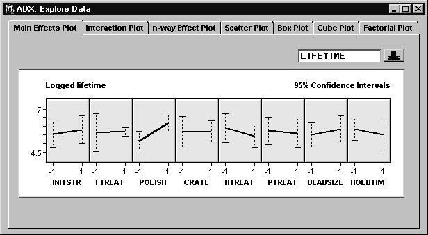
- Click Explore. The main-effects plot can quickly reveal which strains affect lifetime.
|
The polishing method (POLISH) seems to have a large effect on lifetime.
Scatter Plot
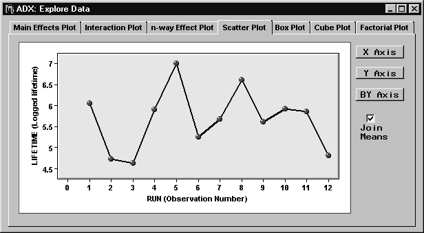
A scatter plot with LIFETIME on the Y axis and RUN (observation number) on the X axis might reveal any nonrandom pattern showing a possible effect due to time.To display a scatter plot, click the Scatter Plot tab in the Explore Data window. The default scatter plot is the LIFETIME by Observation Number plot. Selecting Join Means connects the points and reveals a pattern that suggests a serial effect.
|
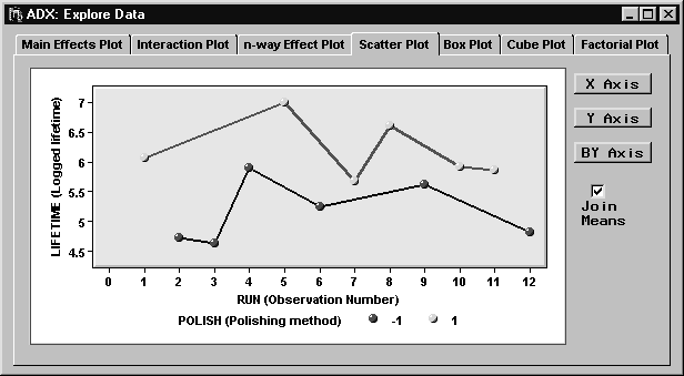
To explore this pattern in more tail, click BY Axis and select POLISH.
|
Now there are two groups of runs: one for the high level of POLISH and one for the low level. In this display, there is less evidence of a serial effect.
Box Plot
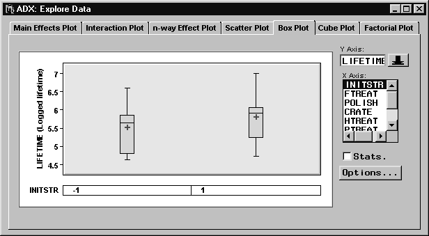
The box plot displays distributional differences in the response across levels of the factors. To use the box plot, click the Box Plot tab in the Explore Data window.
|
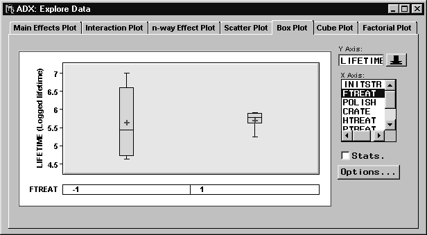
By default, the LIFETIME by INITSTR box plot appears. This provides yet another way of visualizing main effects. You can display important statistics for the response within each factor level by selecting the Stats box. The box plot can also indicate possible dispersion effects, or situations where a change in factor level affects the variance of the response. From the list, select INITSTR to clear it, and then select FTREAT to display a box plot of LIFETIME by FTREAT.
|
Note that the sizes of the boxes are different. Furthermore, the standard deviation of the LIFETIME at the low level of FTREAT is 1.05, while the standard deviation of the LIFETIME at the high level of FTREAT is 0.25. While there are not enough runs to test the difference of these standard deviations, it might be useful to study this effect with a follow-up experiment. One rough guideline for a significant difference in variances is a ratio of greater than 3 or less than one-third, with more than a factor of 4 between the variances.
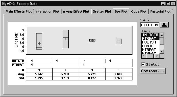
The box plot can display response distributions for more than one factor. Select INITSTR from the factor list. This time, a box plot with four boxes appears, one for each level combination of the two factors.
|
You can change the order of the nesting of the factors by clicking and dragging the factor names below the plot (when the arrow changes to a hand).
|
Copyright © 2008 by SAS Institute Inc., Cary, NC, USA. All rights reserved.